Basic Statistics in R
Overview
Teaching: 105 min
Exercises: 30 minQuestions
How can I use R to run statistical tests?
How can I add statistics to plots?
Objectives
To test differences in a numeric variable between two groups (e.g. t-test)
To test differences in a numeric variable across multiple groups (e.g. ANOVAs and post-hoc tests)
To generate a linear model between two numeric variables
To add results of statistical tests to plots
Contents
- How do you use statistics in your work?
- Limits of our lesson today
- Two-Group Comparisons
- Multi-Group Comparisons
- Correlations
- Linear Regression
- Bonus: Cleaning Stats Outputs
- Integrating it all together!
How do you use statistics in your work?
We’ve now learned to clean our data, calculate summary statistics, visualize trends, and combine these analyses into a shareable report. To finish our scientific report, we will also want to use statistical tests to estimate the significance the patterns we’ve observed in our data. R, from its inception, was designed to help scientists run statistical tests. This makes R a great tool to use for statistics!
Discussion
What statistical tests do you typically use when analyzing your data? What software do you use to run these tests? Put them in the Etherpad and describe when you use them.
Limits of our lesson today
Unfortunately, we can’t promise that you’ll walk out this workshop as a statistics expert. Statistics, just like programming, is a massive field which takes years to learn and master. Every research problem will have unique statistical needs and analyses, and so we cannot cover them all.
However, our goal in this section of the workshop is to demonstrate some of the most common statistical tests which biologists use in their work. We’ll focus on how we run these tests, without spending time on the mathematical and conceptual bases of these tests. Remember, running a test is almost always easier than interpreting a test. When in doubt, talk to your PI, another colleague, or book a consultation through the Cornell Statistical Consulting Unit.
Two-Group Comparisons
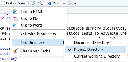
We’ll be using the same report which we started in our RMarkdown lesson. Please open this document and confirm that the Knit directory is set to “Project Directory”.
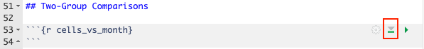
Let’s scroll to the bottom and make a new header (with two ##) called “Two-Group Comparisons”.
Then, make a new code-chunk called {r cells_vs_month}.
So that we’re set up to use the tidyverse and sample_and_taxon data, click the “Run All Chunks Above” button (highlighted in red below):
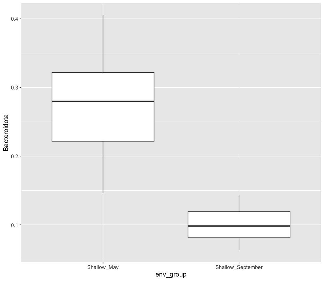
First, let’s visualize the comparison we plan on making. We want to test if the Phylum Bacteroidota is more abundant in Shallow May vs. Shallow September. Let’s make a ggplot which looks at that comparison. Notice how I’m first using filter to remove the Deep samples, and then making my ggplot. I’m also going to calculate the mean Bacteroidota relative abundance in each group.
no_deep <- sample_and_taxon %>%
    filter(env_group != "Deep")

ggplot(data = no_deep) +
    aes(x = env_group, y = Bacteroidota) +
    geom_boxplot()
no_deep %>%
    group_by(env_group) %>%
    summarize(mean_bact = mean(Bacteroidota))
# A tibble: 2 × 2
  env_group         mean_bact
  <chr>                 <dbl>
1 Shallow_May           0.280
2 Shallow_September     0.100
Just by eye, it does look like there are more Bacteroidota in May than there are in September! And the average Bacteroidota abundance in May is 0.280, 0.180 higher than in September. However, it’s possible that the Bacteroidota abundance we observed was higher in May due to random chance. We can use a statistical test to determine how likely the difference we observed in Bacteroidota abundance between May and September is due to chance versus a true difference in Bacteroidota abundances.
When we are comparing the differences in the mean of a numerical variable between two categorical variables, we can use a t-test. The t-test is a type of hypothesis test. Here are the two hypotheses we’ll test:
-
Null Hypothesis: There are no true differences between Bacteroidota counts in May and September - on average, Bacteroidota abundances are the same between months
-
Alternative Hypothesis: There is a difference in Bacteroidota abundances between May and September.
The t-test will look at how different the mean Bacteroidota counts are between May and September. It will also consider how much variability there was in Bacteroidota abundances within each group. With these two parameters in mind, the t-test will produce a p-value, which is the estimated probability that we would observe this difference in abundance if the null hypothesis was true. If the p-value is sufficiently low, that means our data indicates the null hypothesis is likely incorrect. As such, we can reject the null hypothesis and conclude the alternative hypothesis is true - there really is a difference in Bacteroidota abundance between May and September.
Let’s run our first t-test. Make a new chunk called {r t-test}. We’re going to use a new piece of syntax called “formula syntax”, which uses a ~, or tilde symbol. The ~ operator specifies our dependent variable (usually our y-axis) on the left, and our independent variable (or x-axis) on the right.
t.test(Bacteroidota ~ env_group, data = no_deep)
	Welch Two Sample t-test

data:  Bacteroidota by env_group
t = 12.888, df = 29.936, p-value = 9.503e-14
alternative hypothesis: true difference in means between group Shallow_May and group Shallow_September is not equal to 0
95 percent confidence interval:
 0.1514943 0.2085541
sample estimates:
      mean in group Shallow_May mean in group Shallow_September
                      0.2802874                       0.1002632
There is a lot of output here! The main point we’ll focus on today is the p-value: 9.503e-14, or 9.503x10⁻¹⁴. People typically set their threshold for “significant” p-values at 0.05. In this case, as our p-value is less than 0.05, we’ll reject the null hypothesis.
In our document, let’s write our interpretation of our statistical test. We can now say:
“The relative abundance of Bacteroidota is significantly higher in Shallow May compared to Shallow September.”
All statistical tests come with their own important assumptions, which need to be met for us to trust the outputs of the test. We won’t have time to cover those assumptions today, however. We reiterate that you are responsible for checking the assumptions of your statistical tests!
A t-test is what’s called a “parametric” test, which makes several assumptions about the distribution of our data. Other tests, called “non-parametric” tests, make fewer assumptions about the population from which we sampled our data, and so may be preferred for some datasets. To demonstrate how to run a common non-parametric test for two-sample tests, we’ll run a “Two-Sample Wilcoxon Test” (this test is also called a “Mann-Whitney Test”). Moving forward, we’ll trust you to create and name your own R chunks.
wilcox.test(Bacteroidota ~ env_group, data = no_deep)
	Wilcoxon rank sum exact test

data:  Bacteroidota by env_group
W = 625, p-value = 1.582e-14
alternative hypothesis: true location shift is not equal to 0
Notice the similarities in how we specify this test - we use the same formula notation and data argument as in our t-test. You can also see that our p-value is larger, though still very small. What type of test is correct for your data is an important consideration. When in doubt, consult your PI or a statistician.
Running more t-tests
Is there a significant difference between total phosphorus in Shallow May and Shallow September?
Solution
Use a t-test or a Wilcoxon test to compare average total phosphorus between months
t.test(total_phosphorus ~ env_group, data = no_deep)Welch Two Sample t-test data: total_phosphorus by env_group t = 1.7784, df = 36.729, p-value = 0.08362 alternative hypothesis: true difference in means between group Shallow_May and group Shallow_September is not equal to 0 95 percent confidence interval: -0.1253355 1.9205355 sample estimates: mean in group Shallow_May mean in group Shallow_September 5.5992 4.7016wilcox.test(total_phosphorus ~ env_group, data = no_deep)Warning in wilcox.test.default(x = DATA[[1L]], y = DATA[[2L]], ...): cannot compute exact p-value with tiesWilcoxon rank sum test with continuity correction data: total_phosphorus by env_group W = 373.5, p-value = 0.2404 alternative hypothesis: true location shift is not equal to 0Our p-values are all larger than 0.05. As such we do not reject our null hypothesis, and cannot conclude that total phosphorus is different between our two sampling months.
Multi-Group Comparisons
Our t-test and Wilcoxon test allowed us to compare the means of a numerical variable between two groups. But what if we have more than two groups? Let’s say I now want to test the abundance of Bacteroidota across all three env_groups: Deep, Shallow May, and Shallow September. We’ll need to use different tests when comparing means across categorical variables which have three or more groups.
The risks of multiple comparisons
Why does it matter if we have multiple groups? Can’t we just run t-tests between each group and see which t-tests are significant?
There is nothing, from a practical standpoint, that prevents us from running a t-test between each pair of environmental groups. These are called “pairwise t-tests.” This would result in us running three t-tests: one comparing Deep to Shallow May, one comparing Deep to Shallow September, and one comparing Shallow May to Shallow September. If I had four groups, I would instead need to run six t-tests, and at five groups, I’m now running ten t-tests. The number of tests we’re running increases rapidly as we add groups to our categorical variable. We call all these pairs of tests “multiple comparisons.”
The danger of multiple comparisons is that they increase our chances of incorrectly rejecting the null hypothesis, or detecting a significant difference when we shouldn’t have. When we set our threshold for significance at 0.05, this means that we’re okay with a 1 in 20 chance of incorrectly rejecting the null hypothesis. If we run twenty comparisons, and they all had a p-value right under 0.05, we’d expect that we’d reject the null hypothesis incorrectly at least once, just because of how many tests we’ve run.
Part of the reason multiple comparisons can be risky is that each test is only looking at a subset of the data and making conclusions within that subset. We can help mitigate the risk from multiple comparisons by first running a test that considers all of our observations, before running pairwise tests. We call these tests omnibus tests.
ANalysis Of VAriance (ANOVA)
One omnibus test is called an ANalysis Of VAriance, or “ANOVA”. You can read about the assumptions for an ANOVA test here. It will consider all the observations across our three groups, and estimate whether there is at least one significant difference in the means between our three groups.
Let’s first plot the comparison we plan to make.
ggplot(data = sample_and_taxon) +
    aes(x = env_group, y = Bacteroidota) +
    geom_boxplot()
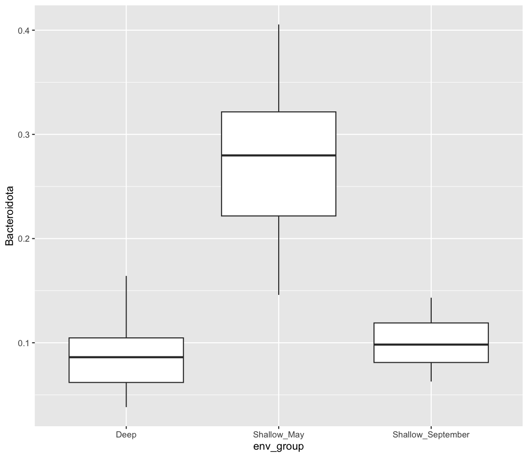
It looks like Shallow May is highest, but I’m not sure whether Deep will be significantly different from Shallow September.
Now let’s run an ANOVA, which will look at all our data and help us decide whether it’s worthwhile running pairwise comparisons. An ANOVA is another type of hypothesis test, which is testing these hypotheses:
-
Null Hypothesis: There are no true differences between Bacteroidota abundance between our three env_groups
-
Alternative Hypothesis: There is a difference in Bacteroidota abundances between at least two of our env_groups
Our ANOVA test will use a similar formula notation as our t-test, but its default output does not give us a p-value. To get that information, we’ll save our ANOVA output as an object, and then call summary on that object.
bact_anova <- aov(Bacteroidota ~ env_group, data = sample_and_taxon)

summary(bact_anova)
            Df Sum Sq Mean Sq F value Pr(>F)
env_group    2 0.5639 0.28197   139.4 <2e-16 ***
Residuals   68 0.1375 0.00202
---
Signif. codes:  0 '***' 0.001 '**' 0.01 '*' 0.05 '.' 0.1 ' ' 1
The key piece of this output is the p-value, which is given underneath “Pr(>F)”: <2e-16. Hence, we can reject the null hypothesis and conclude that the means of at least two groups are different, though we don’t yet know which ones. This test result gives us confidence to now run pairwise comparisons to find out which groups are significantly different. We call these “post-hoc” tests (latin for “after this”) because you should only run them after a significant result from an omnibus test. If our p-value from the ANOVA was greater than 0.05, we would fail to reject the null hypothesis, and would not run any pairwise tests.
Post-hoc Tests
The test we’ll use today is called a Tukey Honest Significant Differences test, often shortened to Tukey HSD test. To run this test, we’ll use the bact_anova object we created.
TukeyHSD(bact_anova)
  Tukey multiple comparisons of means
    95% family-wise confidence level

Fit: aov(formula = Bacteroidota ~ env_group, data = sample_and_taxon)

$env_group
                                     diff         lwr         upr     p adj
Shallow_May-Deep               0.19364869  0.16175009  0.22554730 0.0000000
Shallow_September-Deep         0.01362447 -0.01827413  0.04552308 0.5647669
Shallow_September-Shallow_May -0.18002422 -0.21050439 -0.14954405 0.0000000
This output shows each comparison on the far left, and the p-value for that pairwise test on the far right, rounded to seven decimals. We see significant differences between Shallow_May and Deep, and Shallow_May and Shallow_September. However, we see that there is no significant difference between Shallow_September and Deep.
Non-parametric tests for multiple comparisons
There are similar non-parametric tests for comparing differences across multiple groups. In this case, we’ll use a Kruskal-Wallis test instead of an ANOVA, and a Dunn’s test instead of a Tukey HSD test. To run a Dunn’s test, we need to install the FSA package.
kruskal.test(Bacteroidota ~ env_group, data = sample_and_taxon)
	Kruskal-Wallis rank sum test

data:  Bacteroidota by env_group
Kruskal-Wallis chi-squared = 48.968, df = 2, p-value = 2.326e-11
We have a significant p-value from our omnibus test. Let’s continue with a pairwise test.
# install.packages("FSA")
library(FSA)

dunnTest(Bacteroidota ~ env_group, data = sample_and_taxon)
                       Comparison         Z      P.unadj        P.adj
1              Deep - Shallow_May -6.400360 1.550106e-10 4.650319e-10
2        Deep - Shallow_September -1.103672 2.697356e-01 2.697356e-01
3 Shallow_May - Shallow_September  5.543177 2.970329e-08 5.940658e-08
While the outputs differ slightly, our conclusions (that there are significant differences between at least two groups, and that those groups are Shallow May compared to Deep and Shallow September) remain the same.
Adjusted p-values
You probably noticed that results from both the Tukey HSD test and Dunn’s test included either a “p adj” or “P.adj”, which stands for “adjusted p-value”. Because making multiple comparisons means we are at a greater risk of incorrectly assuming a significant difference, these tests adjust our p-values to be more strict, to help prevent erroneous conclusions. There are many ways to adjust p-values, some of which are more conservative and others which are more confident. What adjustment to use, like all of the tests we run today, is conditional on your data, your research question, and the norms in your field.
ANOVA Practice
Do deep samples have significantly different total_phosphorus compared to our shallow samples?
Solution
Let’s begin by running an omnibus test, to see if there are differences in total_phosphorus between at least two groups
phos_aov <- aov(total_phosphorus ~ env_group, data = sample_and_taxon)
summary(phos_aov)
Df Sum Sq Mean Sq F value Pr(>F) env_group 2 12.34 6.171 2.087 0.132 Residuals 68 201.04 2.956The p-value is greater than 0.05, meaning we failed to see signficant differences between our three groups. We should not continue on to pairwise tests!
Are there significant differences in chlorophyll between our groups? Use non-parametric tests to determine which groups, if any, are significantly different from each other.
Solution
kruskal.test(chlorophyll ~ env_group, data = sample_and_taxon)Kruskal-Wallis rank sum test data: chlorophyll by env_group Kruskal-Wallis chi-squared = 41.049, df = 2, p-value = 1.22e-09We passed our non-parametric omnibus test (Kruskal-Wallis), so we’ll continue with a post-hoc Dunn’s Test
dunnTest(chlorophyll ~ env_group, data = sample_and_taxon)Warning: env_group was coerced to a factor.Dunn (1964) Kruskal-Wallis multiple comparisonp-values adjusted with the Holm method.Comparison Z P.unadj P.adj 1 Deep - Shallow_May -5.8862778 3.949903e-09 1.184971e-08 2 Deep - Shallow_September -5.3227975 1.021835e-07 2.043669e-07 3 Shallow_May - Shallow_September 0.5897025 5.553901e-01 5.553901e-01We find chlorophyll is significantly higher when we compare Deep samples to Shallow samples. However our two shallow groups are not signficiantly different in their chlorophyll levels.
Correlations
So far, we’ve tested the relationship between a numerical variable (Bacteroidota counts) across a categorical variable (env_group). But what if we want to test the association between two numerical variables? One way for us to do this is to calculate the correlation between the values in each of these variables. For instance, we’ve previously visualized the fact that cell abundance tends to increase with temperature. Correlation is asking - when the temperature increases, does the cell abundance also increase?
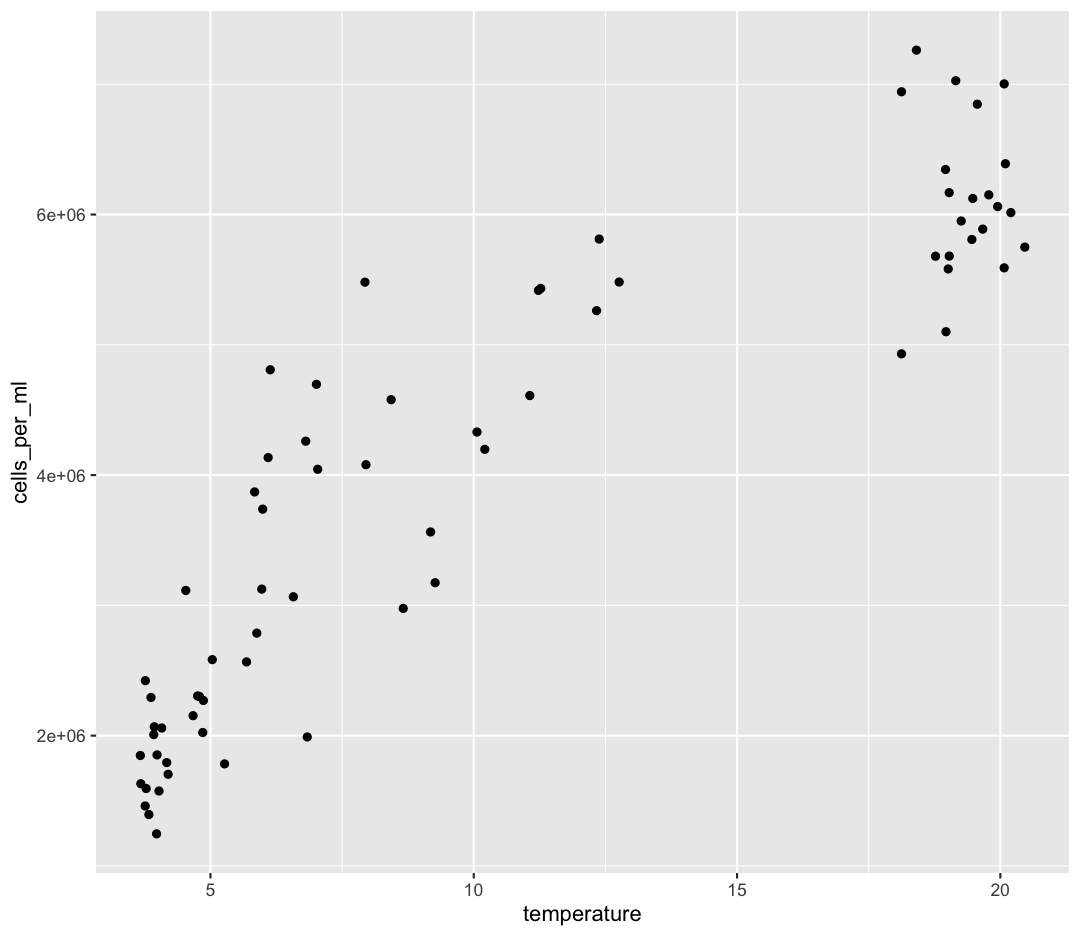
Let’s start by visualizing the comparison we intend to make:
ggplot(data = sample_and_taxon) +
    aes(x = temperature, y = cells_per_ml) +
    geom_point()
Let’s run a correlation test first, and then discuss the interpretation. You can read about our assumptions here
We’ll use the function cor.test, and provide it two columns from our dataframe between which we want to calculate the correlation.
cor.test(sample_and_taxon$cells_per_ml, sample_and_taxon$temperature)
	Pearson's product-moment correlation

data:  sample_and_taxon$cells_per_ml and sample_and_taxon$temperature
t = 17.276, df = 69, p-value < 2.2e-16
alternative hypothesis: true correlation is not equal to 0
95 percent confidence interval:
 0.8457586 0.9374310
sample estimates:
      cor
0.9012324
This function actually did two things for us.
First, it calculated the Pearson’s correlation coefficient. This can be found underneath “cor”, and is 0.9012324.
The correlation coefficient ranges from -1 up to 1. When the correlation coefficient is 1, the two variables are perfectly correlated: when variable one increases, variable two always increases proportionally. We would say these two variables also follow a perfect, positive, linear relationship.
When the correlation coefficient is -1, the variables follow a perfect, negative, linear relationship, where an increase in variable one is always linked to a proportional decrease in variable two.
Finally, a correlation coefficient of 0 means there is no correlation between our variables. An increase in variable one isn’t tied to any predictable increase or decrease in variable two.
Our correlation coefficient (0.9012324) is close to one, supporting our previous conclusions that as temperature increase, cell abundances also consistently increase.
The cor.test function did another step that was helpful, in that it ran a hypothesis test on the significance of this correlation coefficient. It was testing two hypotheses:
-
Null Hypothesis: The true correlation coefficient is 0: the observed correlation was the result of random chance
-
Alternative Hypothesis: There is a non-zero correlation between cell abundance and temperature
Our p-value for this test was as small as R can render: <2.2e-16. As such, we can reject our null hypothesis, and conclude that there is a significant correlation between cell abundance and temperature.
If you are married to formula notation, we can also run our cor.test using a formula, though it looks a little different because we provide two independent variables on the right side:
cor.test(~ cells_per_ml + temperature, data = sample_and_taxon)
	Pearson's product-moment correlation

data:  cells_per_ml and temperature
t = 17.276, df = 69, p-value < 2.2e-16
alternative hypothesis: true correlation is not equal to 0
95 percent confidence interval:
 0.8457586 0.9374310
sample estimates:
      cor
0.9012324
Finally, the Pearson correlation coefficient is a parametric measure which is calculated by default. We can instead calculate a non-parametric metric of correlation called the Spearman Rank Correlation Coefficient. We’ll use the same function, but specify a different method:
cor.test(sample_and_taxon$cells_per_ml, sample_and_taxon$temperature,
         method = "spearman")
	Spearman's rank correlation rho

data:  sample_and_taxon$cells_per_ml and sample_and_taxon$temperature
S = 4740, p-value < 2.2e-16
alternative hypothesis: true rho is not equal to 0
sample estimates:
      rho
0.9205231
The Spearman coefficient is called ρ or “rho”, is 0.9205231, and was also significantly different from zero (p < 2.2e-16).
Testing Other Correlations
Let’s test the correlation between some other variables. For example, how does the abundance of Cyanobacteria correlate to depth?
Solution
cor.test(sample_and_taxon$Cyanobacteria, sample_and_taxon$depth)Pearson's product-moment correlation data: sample_and_taxon$Cyanobacteria and sample_and_taxon$depth t = -3.0363, df = 69, p-value = 0.003378 alternative hypothesis: true correlation is not equal to 0 95 percent confidence interval: -0.5338529 -0.1195824 sample estimates: cor -0.3433082We see a weak to moderate, negative correlation between Cyanobacteria and depth. This means that as the depth of our sample increases, our Cyanobacterial abundances tend to decrease. Though the strength of the correlation isn’t exceptionally strong, it is significantly different from zero (p = 0.003378).
Now test the correlation between total_nitrogen and depth
Solution
cor.test(sample_and_taxon$total_nitrogen, sample_and_taxon$depth)Pearson's product-moment correlation data: sample_and_taxon$total_nitrogen and sample_and_taxon$depth t = 2.1721, df = 69, p-value = 0.03329 alternative hypothesis: true correlation is not equal to 0 95 percent confidence interval: 0.02091097 0.45918269 sample estimates: cor 0.2529805There is a weak, positive correlation (0.253), but we don’t have sufficient evidence to conclude this correlation is significantly different from zero.
Linear Regression
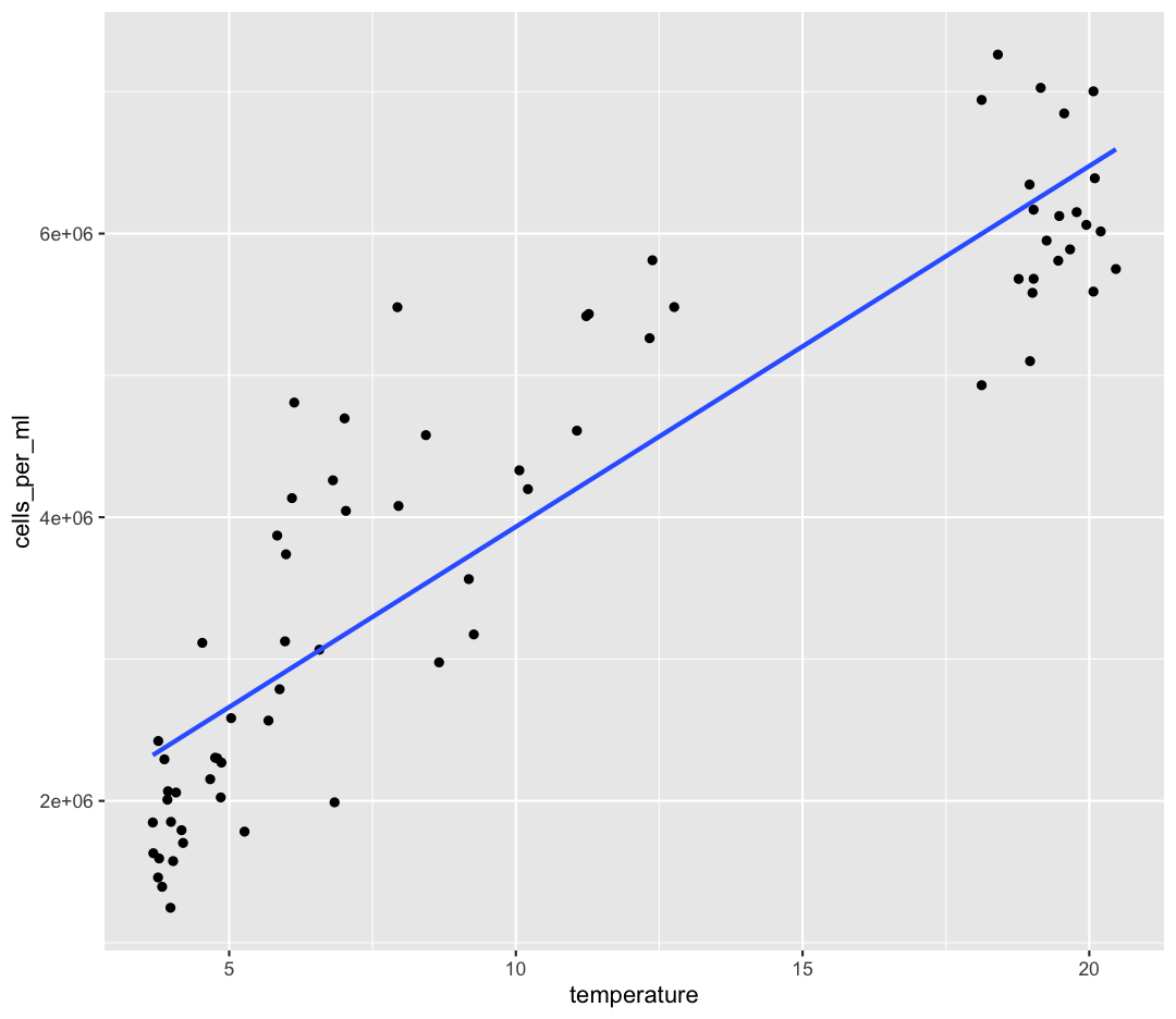
Our correlation tests confirmed there is a strong, positive correlation between temperature and cell abundance. We can quantify that relationship using a linear regression. We’ve already dipped our toes into linear regression by adding a line of best-fit onto some of our ggplots:
ggplot(data = sample_and_taxon) +
    aes(x = temperature, y = cells_per_ml) +
    geom_point() +
    geom_smooth(method = "lm", se = FALSE)
`geom_smooth()` using formula = 'y ~ x'
By fitting a linear model to our data, we answer the question: “When temperature increases by one degree, how much does cell abundance generally increase?”. We’re estimating coefficients in a linear model given by:
y = β0 + β1x
β0 corresponds to the intercept, or the value of our dependent variable (y) when our independent variable (x) is zero. β1 corresponds to the slope, which is the amount our dependent variable (y) increases when our independent variable (x) increases by one unit. For our cells vs. temperature model our linear model will be:
Cells = β0 + β1Temp
Now let’s fit our linear model. We’re going to use the lm function, and similar formula notation as we used for our t-tests and ANOVAs.
temp_lm <- lm(cells_per_ml ~ temperature, data = sample_and_taxon)

summary(temp_lm)
Call:
lm(formula = cells_per_ml ~ temperature, data = sample_and_taxon)

Residuals:
     Min       1Q   Median       3Q      Max
-1154539  -561733  -269119   619870  2073538

Coefficients:
            Estimate Std. Error t value Pr(>|t|)
(Intercept)  1389626     180167   7.713 6.69e-11 ***
temperature   254313      14721  17.276  < 2e-16 ***
---
Signif. codes:  0 '***' 0.001 '**' 0.01 '*' 0.05 '.' 0.1 ' ' 1

Residual standard error: 791200 on 69 degrees of freedom
Multiple R-squared:  0.8122,	Adjusted R-squared:  0.8095
F-statistic: 298.5 on 1 and 69 DF,  p-value: < 2.2e-16
There’s a lot of output here! Let’s work through it.
The first line gives the code which initially created the model.
The second section, “Residuals” describes the differences between our actual observed values of cells compare to our predicted values of cells. You can think of each “residual” as the vertical distance of our observation from our line of best fit, here shown in red:
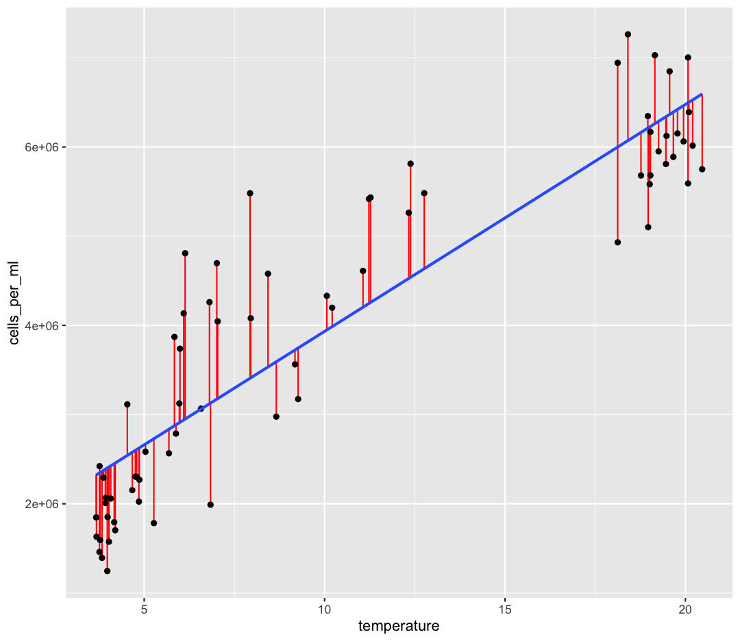
One of the statistical assumptions of linear regression is that the residuals are normally distributed. You can read about about other assumptions of linear regression here. We would expect the Median of the residuals to be close to zero, and the quartiles of the residuals to be symmetrical around zero. This output implies that our residuals might not be very normal. We can plot our residuals to check:
res_df <- data.frame(res = temp_lm$residuals)

ggplot(data = res_df) +
    aes(x = res) +
    geom_histogram()
`stat_bin()` using `bins = 30`. Pick better value with `binwidth`.
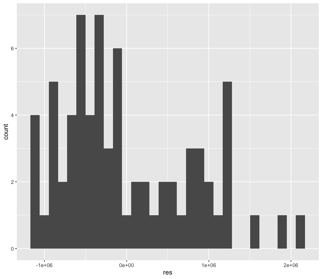
These residuals are not normally distributed, which may indicate that a linear model isn’t the best fit for these data. There are other diagnostic plots we could make to investigate the distribution of the residuals, and other relationships (like logarithmic or polynomial models) which could be a better fit, but we won’t discuss those today.
The next section in “Coefficients”. These are the values for β0 and β1 that we’ve estimated, which is under the Estimate column.
The (Intercept), or β0, is 1,389,626 cells. This means that when our temperatures are zero, we would still expect there to be 1,389,626 cells per ml.
The slope β1 temperature term is 254,313 cells/ml. This means that when the temperature rises by 1°, our average cells per ml rises by 254,313 cells per ml.
The next three columns of the Coefficients section help us estimate how confident we are in our model coefficients. We’ll focus on the Pr(>|t|) column. These are p-values that came from…hypothesis tests! The hypotheses that we were testing for each of the coefficients are as follows:
-
Null Hypothesis: The value of the coefficient is zero. As temperature changes, there is no predictable change in cell abundance.
-
Alternative Hypothesis: The value of the coefficient is not zero
Because both of our terms have very small p-values, we have high confidence that these coefficients are not zero. Especially for the slope, this allows us to conclude that there is statistically significant relationship between temperature and cell abundance.
Correlation vs. Causation
A common statistical phrase you might have already heard is “correlation does not imply causation.” This is important to keep in mind when interpreting a linear model based on observational (not experimental) data! Even if there is a statistically significant slope between our two variables, this does not allow use to conclude that the dependent variable causes the change in the independent variable.
Residual standard error is the average residual, which is the distance from each of our observations to our line of best fit. This is nice, because it’s in the same units as our dependent variable (cells/ml). So we can say something like “on average, our observations differed from our model by 791,200 cells/ml). Whether this is an acceptable amount of error depends on the system and variable we’re studying. Do we think 791,200 cells/mL is a lot?
We then have two measures of the R-squared (R2) value, also called the coefficient of determination. The Multiple R2 represents the percentage of variance in our dependent variable (cells/ml) which we can explain using our independent variable (temperature). The R2 ranges from 0 (no variance explained) to 1 (all our observations fall perfectly on our line of best fit). The Adjusted R-squared becomes more important as we add additional predictors (independent variables) to our model, which is called “multiple regression”, and which we won’t discuss today. Our R2 is 0.8122, which implies our model fits the data quite well (we can explain over 80% of the variance in cell abundances via temperature).
Finally, the last line contains the outputs of another hypothesis test! This test’s hypotheses are:
-
Null Hypothesis: Our model is no better at predicting cells/ml than just guessing the average cells/ml. There is no relationship between cells and temperature, and so knowing the temperature does not improve our ability to predict cells/ml.
-
Alternative Hypothesis: Our model is better at predicting cells/ml than just guessing the mean.
Because the p-value is very small, we can reject our null hypothesis and conclude that our model is still significantly better at predicting cells/ml than just guessing the average cell abundances every time!
Why so much output?!?
All these different metrics might feel overwhelming - sometimes you just want the slope! However the benefit of using a program like R is that you can be much more discerning about the quality of your linear regression. These considerations become increasingly important as your models become more complex and difficult to interpret.
Statistical Significance vs. Practical Significance
Throughout this lesson, we have focused on determining whether a relationship is statistically significant. Statistical significance generally depends on both the magnitude of the relationship (e.g., differences in means or linear correlation) as well as our sample size. What statistics does not tell us is whether the differences we observe are meaningful in the real world. At very large sample sizes, we may be discern differences between groups that are statistically significant, but so small as to be meaningless. Similarly, with a large sample size our linear model may be statistically significant, but with large residuals and a low coefficient of determination. How useful or applicable this model actually is in predicting relationships in the real world requires our own judgement.
Bonus: Cleaning Stats Output
You may have noticed the outputs of our statistical tests hold multiple pieces of information. This can include group means, confidence intervals, p-values, and coefficients. In order to store all these different pieces of information, many of these tests return objects called “lists”, which are good at holding multiple types of information. For beginning coders, however, lists (and the data they hold) can be difficult to parse. Even experienced coders often want simpler outputs from these statistical tests, to then include in their results or incorporate into larger workflows.
A favorite package of ours is called broom, which helps simplify the outputs of statistical tests to the most pertinent information. Let’s first install broom.
install.packages("broom")
The function we’ll use from the broom package is called tidy. Let’s see what tidy does to our t-test and ANOVA outputs.
library(broom)
Warning: package 'broom' was built under R version 4.3.3
t.test(Bacteroidota ~ env_group, data = no_deep) %>%
    tidy()
# A tibble: 1 × 10
  estimate estimate1 estimate2 statistic  p.value parameter conf.low conf.high
     <dbl>     <dbl>     <dbl>     <dbl>    <dbl>     <dbl>    <dbl>     <dbl>
1    0.180     0.280     0.100      12.9 9.50e-14      29.9    0.151     0.209
# ℹ 2 more variables: method <chr>, alternative <chr>
aov(Bacteroidota ~ env_group, data = sample_and_taxon) %>%
    tidy()
# A tibble: 2 × 6
  term         df sumsq  meansq statistic   p.value
  <chr>     <dbl> <dbl>   <dbl>     <dbl>     <dbl>
1 env_group     2 0.564 0.282        139.  8.76e-25
2 Residuals    68 0.138 0.00202       NA  NA
aov(Bacteroidota ~ env_group, data = sample_and_taxon) %>%
    TukeyHSD() %>%
    tidy()
# A tibble: 3 × 7
  term      contrast          null.value estimate conf.low conf.high adj.p.value
  <chr>     <chr>                  <dbl>    <dbl>    <dbl>     <dbl>       <dbl>
1 env_group Shallow_May-Deep           0   0.194    0.162     0.226        0
2 env_group Shallow_Septembe…          0   0.0136  -0.0183    0.0455       0.565
3 env_group Shallow_Septembe…          0  -0.180   -0.211    -0.150        0
lm(cells_per_ml ~ temperature, data = sample_and_taxon) %>%
    tidy()
# A tibble: 2 × 5
  term        estimate std.error statistic  p.value
  <chr>          <dbl>     <dbl>     <dbl>    <dbl>
1 (Intercept) 1389626.   180167.      7.71 6.69e-11
2 temperature  254313.    14721.     17.3  9.24e-27
The output of tidy is always a tibble/data.frame, which we have lots of experience working with! For instance, you could use your knowledge of the filter command to select a specific contrast from your Tukey HSD test, or only select terms in a linear model which are significant.
Integrating it all together!
You’ve learned so much in the past two days - how to use the Unix Shell to move around your computer, how to make effective plots, summarize and clean data, and run simple statistical tests in R, and how to incorporate it all into a report which you can share with Collaborators via Github! For the reminder of class time, or on your own, we encourage you to apply these skills, using the exercises below.
Don’t worry - if you have questions, the instructor and helpers are here to help you out!
- Make a new R Markdown file.
- Give it an informative title.
- Delete all the unnecessary Markdown and R code (everything below the setup R chunk).
- Save it to the
reportsdirectory as LASTNAME_Ontario_Report.Rmd
Work through the exercises below, adding code chunks to analyze, plot, and test the data, and prose to explain what you’re doing. Make sure to knit as you go, to make sure everything is working.
The exercises below give you some ideas of directions to pursue. These are nice exercises because we have the solutions saved. However, you’re welcome to branch out as well! Maybe you have your own hypotheses you’d like to test. Maybe you want to explore a new type of ggplot.
Just remember to use a combination of prose (writing) and code to document the goals, process, and outputs of your analysis in your RMarkdown report.
Once you’re done, add your report to your Git repo, commit those changes, and push those changes to Github. If you feel comfortable, post a link to the repo on the Etherpad, and change your repo’s settings to Public, so that others in the class can admire what you’ve accomplished!
Bonus Exercises
[1] The very first step is to read in the sample_and_taxon dataset, so do that first! Also load the tidyverse package.
Solution
library(tidyverse)
sample_and_taxon <- read_csv('data/sample_and_taxon.csv')
Rows: 71 Columns: 15 ── Column specification ──────────────────────────────────────────────────────────────────────────────────────────────── Delimiter: "," chr (2): sample_id, env_group dbl (13): depth, cells_per_ml, temperature, total_nitrogen, total_phosphorus... ℹ Use `spec()` to retrieve the full column specification for this data. ℹ Specify the column types or set `show_col_types = FALSE` to quiet this message.
Investigating nutrients and cell density
[2] Make a scatter plot of total_nitrogen vs. cells_per_ml, separated into a plot for each env_group. Hint: you can use facet_wrap(~column_name) to separate into different plots based on that column.
Solution
ggplot(sample_and_taxon, aes(x=total_nitrogen,y=cells_per_ml)) +
geom_point() +
facet_wrap(~env_group)
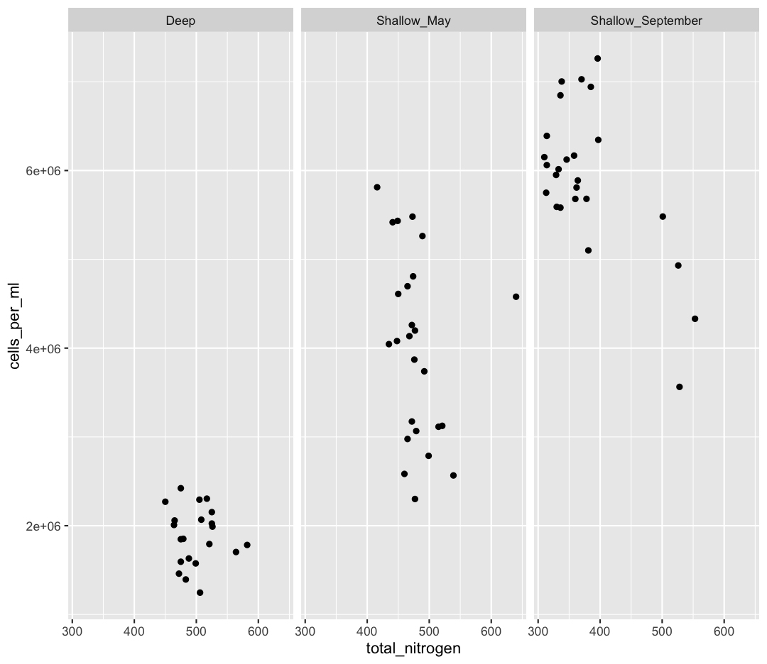
[3] It seems like there is an outlier in Shallow_May with very high nitrogen levels. What is this sample? Use a combination of filter and arrange to find out.
Solution
sample_and_taxon %>%
 filter(env_group == "Shallow_May") %>%
 arrange(desc(total_nitrogen))
# A tibble: 25 × 15 sample_id env_group depth cells_per_ml temperature total_nitrogen <chr> <chr> <dbl> <dbl> <dbl> <dbl> 1 May_8_E Shallow_May 5 4578830. 8.43 640 2 May_29_M Shallow_May 19 2566156. 5.69 539 3 May_29_E Shallow_May 5 3124920. 5.97 521 4 May_33_M Shallow_May 20 3114433. 4.53 515 5 May_43_E Shallow_May 5 2787020. 5.88 499 6 May_17_E Shallow_May 5 3738681. 5.99 492 7 May_66_E Shallow_May 5 5262156. 12.3 489 8 May_35_B Shallow_May 27 3066162. 6.57 479 9 May_48_B Shallow_May 35 2300782. 4.79 477 10 May_717_E Shallow_May 5 4197941. 10.2 477 # ℹ 15 more rows # ℹ 9 more variables: total_phosphorus <dbl>, diss_org_carbon <dbl>, # chlorophyll <dbl>, Proteobacteria <dbl>, Actinobacteriota <dbl>, # Bacteroidota <dbl>, Chloroflexi <dbl>, Verrucomicrobiota <dbl>, # Cyanobacteria <dbl>
[4] Where was this sample again? Let’s look at a map:
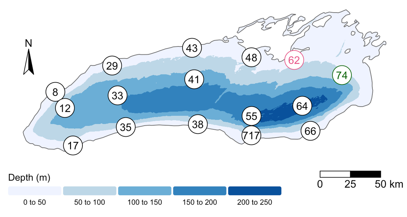
Wow! This sample is right outside of Toronto.
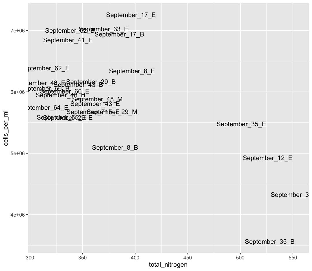
We also see that Shallow September has four strange points, with high nitrogen and low cell counts. Let’s use a new geom, geom_text to figure out what those samples are (this might take some googling!). Also, let’s use filter to only plot samples from “Shallow_September”.
Solution
sample_and_taxon %>%
  filter(env_group == "Shallow_September") %>%
  ggplot(aes(x = total_nitrogen, y = cells_per_ml)) +
  geom_text(aes(label = sample_id))

Interesting…these are mostly from Station 35. I wonder why these stations have such high nitrogen and such low cell abundances?
Solution
Here, I show surface temperatures across the lake in September. Station 35 was on the edge an upwelling event, where cold, nutrient rich water is pulled to the surface of the lake! Stn. 38, which was smack dab in the upwelling itself, was so similar to deep samples that its env_group is “Deep” rather than “Shallow_September”.
If you want to investigate this phenomenon further, spend time analyzing the relative composition of Phyla in these upwelling stations compared to the rest of Shallow_September. If you want to go further, you can use the buoy_data from the Niagara and South Shore buoys to see if you can detect when this upwelling event began.
Comparing Dominant Phylum Across Environmental Groups
[6] We want to know which Phyla tend to live in which environments. Previously, we focused on Chloroflexi, and found it preferred Deep environments. What if we want to look at the relative abundances of all our Phyla between env_groups at once?
First, let’s remind ourselves how we looked at Chloroflexi across env_groups. Make a boxplot with env_group on the x-axis, and Chloroflexi relative abundance on the y axis.
Solution
sample_and_taxon %>%
  ggplot(aes(x = env_group, y = Chloroflexi)) +
  geom_boxplot()
[7] Is Chloroflexi significantly different between our env_groups? Run statistical tests to determine where Chloroflexi is significantly higher.
Solution
chlor_aov <- aov(Chloroflexi ~ env_group, data = sample_and_taxon)

summary(chlor_aov)
Df Sum Sq Mean Sq F value Pr(>F) env_group 2 0.3478 0.17389 140.1 <2e-16 *** Residuals 68 0.0844 0.00124 --- Signif. codes: 0 '***' 0.001 '**' 0.01 '*' 0.05 '.' 0.1 ' ' 1Our omnibus test (ANOVA) has a small p-value. Let’s use a TukeyHSD test to look at pairwise differences.
TukeyHSD(chlor_aov)Tukey multiple comparisons of means 95% family-wise confidence level Fit: aov(formula = Chloroflexi ~ env_group, data = sample_and_taxon) $env_group diff lwr upr p adj Shallow_May-Deep -0.12005680 -0.1450435 -0.09507013 0.0e+00 Shallow_September-Deep -0.17162112 -0.1966078 -0.14663445 0.0e+00 Shallow_September-Shallow_May -0.05156432 -0.0754399 -0.02768873 6.5e-06All pairwise differences have very small adjusted p-values. This means Chloroflexi is significantly different between all three groups.
[8] Now, we want to analyze multiple Phyla at once. Because our taxa abundances are in wide format, we can’t use multiple Phyla in a single ggplot. As such, we will need to convert our data to long format. Using pivot_longer, convert the columns containing our Phyla abundances from wide to long.
Solution
sample_and_taxon %>%
  pivot_longer(cols = Proteobacteria:Cyanobacteria, names_to = "Phylum", values_to = "Abundance")
# A tibble: 426 × 11 sample_id env_group depth cells_per_ml temperature total_nitrogen <chr> <chr> <dbl> <dbl> <dbl> <dbl> 1 May_12_B Deep 103. 2058864. 4.07 465 2 May_12_B Deep 103. 2058864. 4.07 465 3 May_12_B Deep 103. 2058864. 4.07 465 4 May_12_B Deep 103. 2058864. 4.07 465 5 May_12_B Deep 103. 2058864. 4.07 465 6 May_12_B Deep 103. 2058864. 4.07 465 7 May_12_E Shallow_May 5 4696827. 7.01 465 8 May_12_E Shallow_May 5 4696827. 7.01 465 9 May_12_E Shallow_May 5 4696827. 7.01 465 10 May_12_E Shallow_May 5 4696827. 7.01 465 # ℹ 416 more rows # ℹ 5 more variables: total_phosphorus <dbl>, diss_org_carbon <dbl>, # chlorophyll <dbl>, Phylum <chr>, Abundance <dbl>
You can see that we’ve now made size rows per sample, one for each Phylum. This does mean that our metadata has been duplicated, which is okay right now.
Now, our data is in the correct format for plotting with ggplot. In the end, we want a plot that shows, for each env_group, the relative abundance of each Phylum. There are actually many plotting styles we could use to answer that question! We’ll try out three.
[9] Pipe your long dataframe into a boxplot with env_group on the x-axis, and Abundance on the y-axis. Use fill to differentiate different Phyla
Solution
sample_and_taxon %>%
  pivot_longer(cols = Proteobacteria:Cyanobacteria, names_to = "Phylum", values_to = "Abundance") %>%
  ggplot(aes(x = env_group, y = Abundance, fill = Phylum)) +
  geom_boxplot()
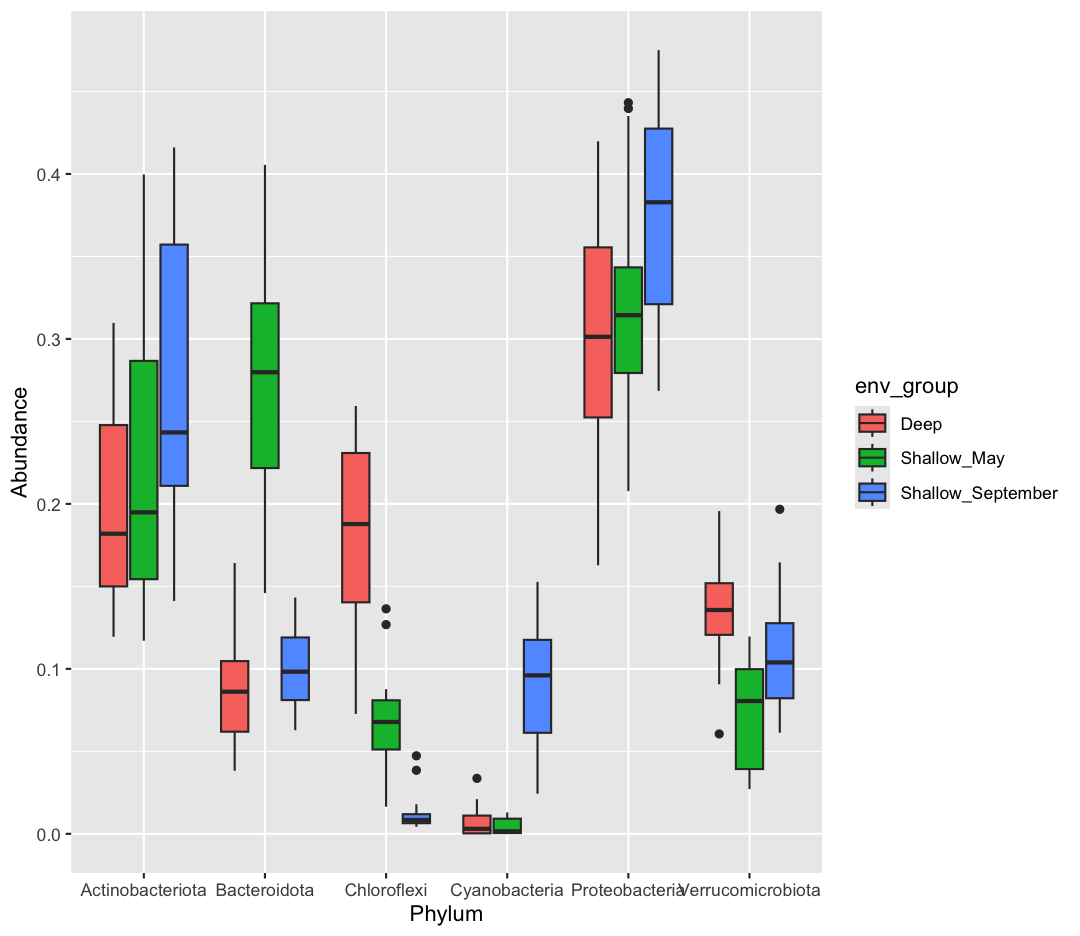
[10] Okay, what does this plot tell us? Make sure to write a quick summary in your report. Next, make a new plot, where Phylum is now on the x-axis, and the fill is determined by the env_group.
Solution
sample_and_taxon %>%
  pivot_longer(cols = Proteobacteria:Cyanobacteria, names_to = "Phylum", values_to = "Abundance") %>%
  ggplot(aes(x = Phylum, y = Abundance, fill = env_group)) +
  geom_boxplot()
[11] Which do you prefer? Which do you feel is easier to understand? Finally, let’s use faceting, rather than fill, to separate out Phyla
Solution
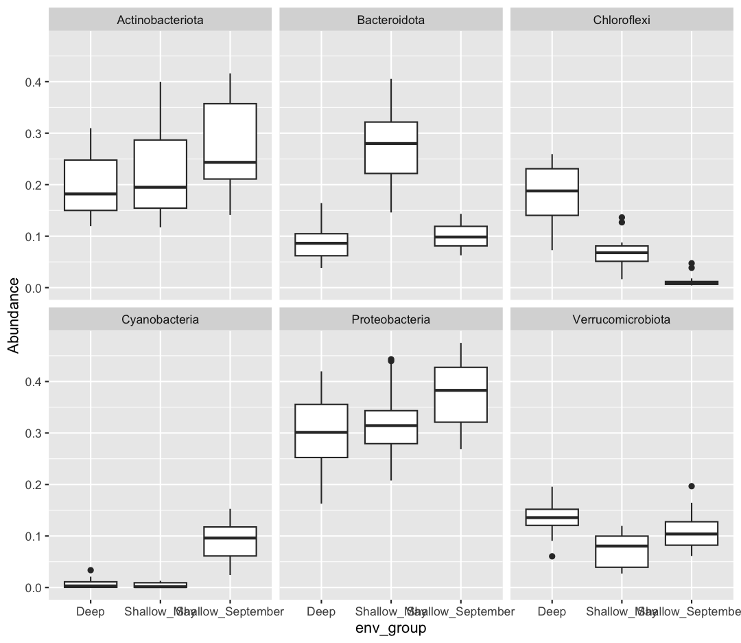
sample_and_taxon %>%
  pivot_longer(cols = Proteobacteria:Cyanobacteria, names_to = "Phylum", values_to = "Abundance") %>%
  ggplot(aes(x = env_group, y = Abundance)) +
  geom_boxplot() +
  facet_wrap(~Phylum)

If you want to investigate this dataset further, consider changing the x-axis to a continuous variable, like temperature, rather than the categorical env_group. Can you find associations between different environmental conditions and the abundance of specific taxa?
Key Points
R comes pre-loaded with many statistical tests
Running tests in R is straightforward, but evaluating their output is our responsibility