Introduction to the Workshop
Overview
Teaching: 15 min
Exercises: 0 minQuestions
What is The Carpentries?
What will the workshop cover?
What else do I need to know about the workshop?
Objectives
Introduce The Carpentries.
Go over logistics.
Introduce the workshop goals.
What is The Carpentries?
The Carpentries is a global organization whose mission is to teach researchers, and others, the basics of coding so that you can use it in your own work. We believe everyone can learn to code, and that a lot of you will find it very useful for things such as data analysis and plotting.
Our workshops are targeted to absolute beginners, and we expect that you have zero coding experience coming in. That being said, you’re welcome to attend a workshop if you already have a coding background but want to learn more!
To provide an inclusive learning environment, we follow The Carpentries Code of Conduct. We expect that instructors, helpers, and learners abide by this code of conduct, including practicing the following behaviors:
- Use welcoming and inclusive language.
- Be respectful of different viewpoints and experiences.
- Gracefully accept constructive criticism.
- Focus on what is best for the community.
- Show courtesy and respect towards other community members.
You can report any violations to the Code of Conduct by filling out this form.
Introducing the instructors and helpers
Now that you know a little about The Carpentries as an organization, the instructors and helpers will introduce themselves and what they’ll be teaching/helping with.
The etherpad & introducing participants
Now it’s time for the participants to introduce themselves. Instead of verbally, the participants will use the etherpad to write out their introduction. We use the etherpad to take communal notes during the workshop. Feel free to add your own notes on there whenever you’d like. Go to the etherpad and write down your name, role, affiliation, and work/research area.
The “goal” of the workshop
Now that we all know each other, let’s learn a bit more about why we’re here. We have gathered data looking at the microbial communities of Lake Ontario. We want to analyze this data in a way that is reproducible and approachable, and share our findings with the world. By the end of the workshop, you will have written a report which combines plots, stats, and analysis (prose) that helps the reader understand how physical conditions in Lake Ontario can affect its microbial communities.
To get to that point, we’ll need to learn how to manage data, make plots, and generate reports. The next section discusses in more detail exactly what we will cover.
What will the workshop cover?
This workshop will introduce you to some of the programs used everyday in computational workflows in diverse fields: microbiology, statistics, neuroscience, genetics, the social and behavioral sciences, such as psychology, economics, public health, and many others.
A workflow is a set of steps to read data, analyze it, and produce numerical and graphical results to support an assertion or hypothesis encapsulated into a set of computer files that can be run from scratch on the same data to obtain the same results. This is highly desirable in situations where the same work is done repeatedly – think of processing data from an annual survey, or results from a high-throughput sequencer on a new sample. It is also desirable for reproducibility, which enables you and other people to look at what you did and produce the same results later on. It is increasingly common for people to publish scientific articles along with the data and computer code that generated the results discussed within them.
The programs to be introduced are:
- R, RStudio, and R Markdown: a statistical analysis and data management program, a graphical interface to it, and a method for writing reproducible reports. We’ll use it to manage data and make pretty plots!
- The Unix shell (command line): A tool that is extremely useful for managing both data and program files and chaining together discrete steps in your workflow (automation).
- Git and Github a program to help you keep track of changes to your programs over time, and a web application that makes sharing your programs and working on them with others much easier.
We will not try to make you an expert or even proficient with any of them, but we hope to demonstrate the basics of controlling your code, automating your work, and creating reproducible programs. We also hope to provide you with some fundamentals that you can incorporate in your own work.
At the end, we provide links to resources you can use to learn about these topics in more depth than this workshop can provide.
Asking questions and getting help
One last note before we get into the workshop.
If you have general questions about a topic, please raise your hand (in person or virtually) to ask it. The instructor will definitely be willing to answer!
For more specific nitty-gritty questions about issues you’re having individually, we use sticky notes to indicate whether you are on track or need help. We’ll use these throughout the workshop to help us determine when you need help with a specific issue (a helper will come help), whether our pace is too fast, and whether you are finished with exercises. If you indicate that you need help because, for instance, you get an error in your code (e.g. red sticky), a helper will message you. Feel free to also call helpers over through a hand wave if we don’t see your sticky!
Other miscellaneous things
If you’re in person, we’ll tell you where the bathrooms are! Let us know if there are any accommodations we can provide to help make your learning experience better!
Key Points
We follow The Carpentries Code of Conduct.
Our goal is to generate a shareable and reproducible report by the end of the workshop.
This lesson content is targeted to absolute beginners with no coding experience.
R for Plotting
Overview
Teaching: 150 min
Exercises: 20 minQuestions
What are R and R Studio?
How do I write code in R?
What is the tidyverse?
How do I read data into R?
What are geometries and aesthetics?
How can I use R to create and save professional data visualizations?
Objectives
To become oriented with R and R Studio.
To create plots with both discrete and continuous variables.
To understand mapping and layering using
ggplot2.To be able to modify a plot’s color, theme, and axis labels.
To be able to save plots to a local directory.
Contents
- Introduction to R and RStudio
- Introduction to the tidyverse
- Loading and reviewing data
- Understanding commands
- Creating our first plot
- Plotting for data exploration
- Glossary of terms
Bonus: why learn to program?
Share why you’re interested in learning how to code.
Solution:
There are lots of different reasons, including to perform data analysis and generate figures. I’m sure you have more specific reasons for why you’d like to learn! Add a
Introduction to R and RStudio
Over this workshop, we will be working with data from the Schmidt Lab, here at Cornell. They collected microbial samples across Lake Ontario on the US EPA RV Lake Guardian. They want to understand how environmental conditions in the lake (things like temperature and nutrients) affect the abundance of different bacterial taxa.
To test this hypothesis, we’ll need two things: data and a platform to analyze the data.
You already downloaded the data. But what platform will we use to analyze the data? We have many options!
We could try to use a spreadsheet program like Microsoft Excel or Google sheets that have limited access, less flexibility, and don’t easily allow for things that are critical to “reproducible” research, like easily sharing the steps used to explore and make changes to the original data.
Instead, we’ll use a programming language to test our hypothesis. Today we will use R, but we could have also used Python for the same reasons we chose R (and we teach workshops for both languages). Both R and Python are freely available, the instructions you use to do the analysis are easily shared, and by using reproducible practices, it’s straightforward to add more data or to change settings like colors or the size of a plotting symbol.
But why R and not Python?
There’s no great reason. Although there are subtle differences between the languages, it’s ultimately a matter of personal preference. Both are powerful and popular languages that have very well developed and welcoming communities of scientists that use them. As you learn more about R, you may find things that are annoying in R that aren’t so annoying in Python; the same could be said of learning Python. If the community you work in uses R, then you’re in the right place.
To run R, all you really need is the R program, which is available for computers running the Windows, Mac OS X, or Linux operating systems. You downloaded R while getting set up for this workshop.
To make your life in R easier, there is a great (and free!) program called RStudio that you also downloaded and used during set up. As we work today, we’ll use features that are available in RStudio for writing and running code, managing projects, installing packages, getting help, and much more. It is important to remember that R and RStudio are different, but complementary programs. You need R to use RStudio.
Bonus Exercise: Can you think of a reason you might not want to use RStudio?
Solution:
On some high-performance computer systems (e.g. Amazon Web Services) you typically can’t get a display like RStudio to open. In that case, you’ll write your code in R Scripts, and then run those scripts from the command line.
To get started, we’ll spend a little time getting familiar with the RStudio environment and setting it up to suit your tastes. When you start RStudio, you’ll have three panels.
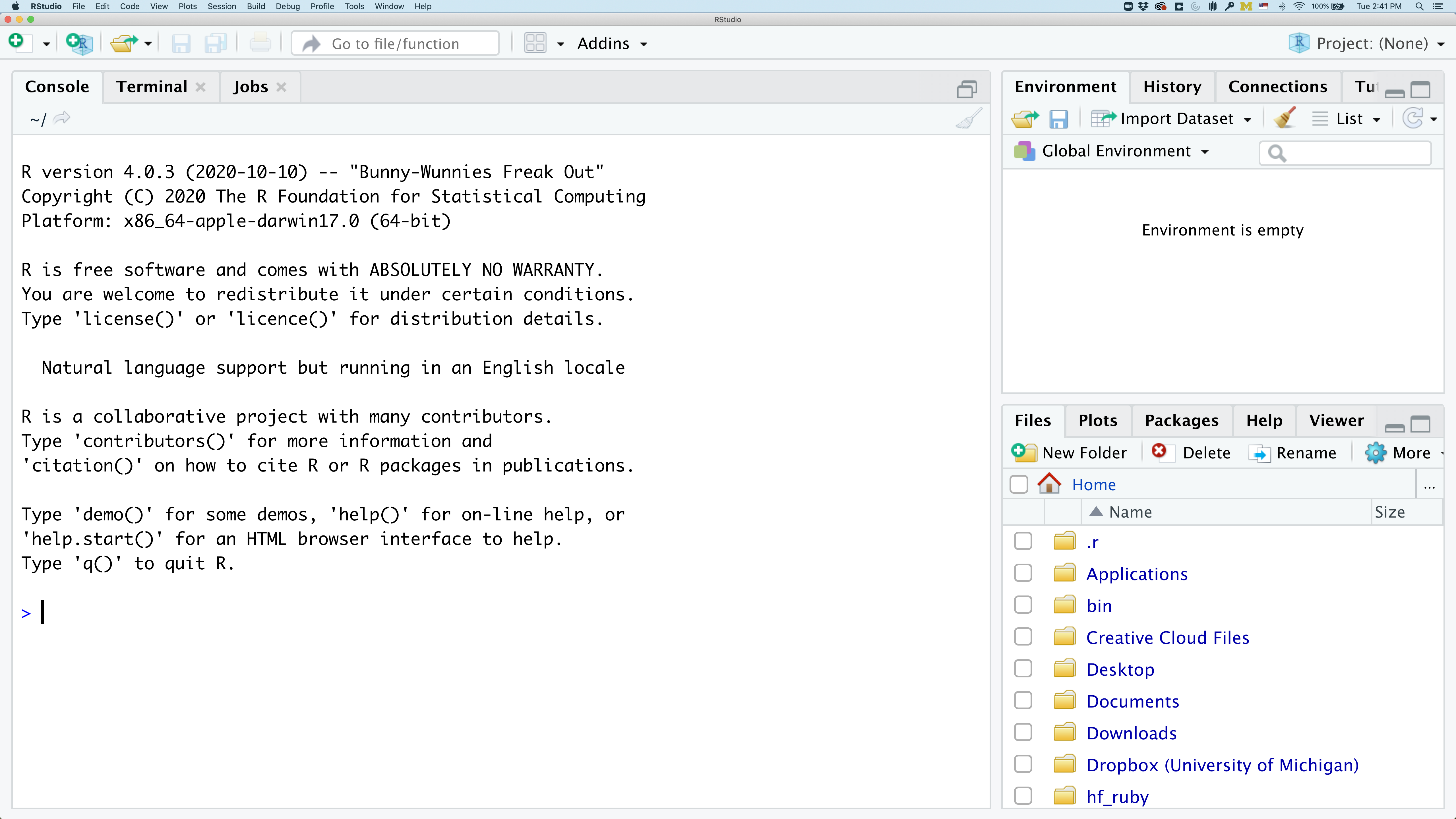
On the left you’ll have a panel with three tabs - Console, Terminal, and Jobs. The Console tab is what running R from the command line looks like. This is where you can enter R code. Try typing in 2+2 at the prompt (>). In the upper right panel are tabs indicating the Environment, History, and a few other things. If you click on the History tab, you’ll see the command you ran at the R prompt.
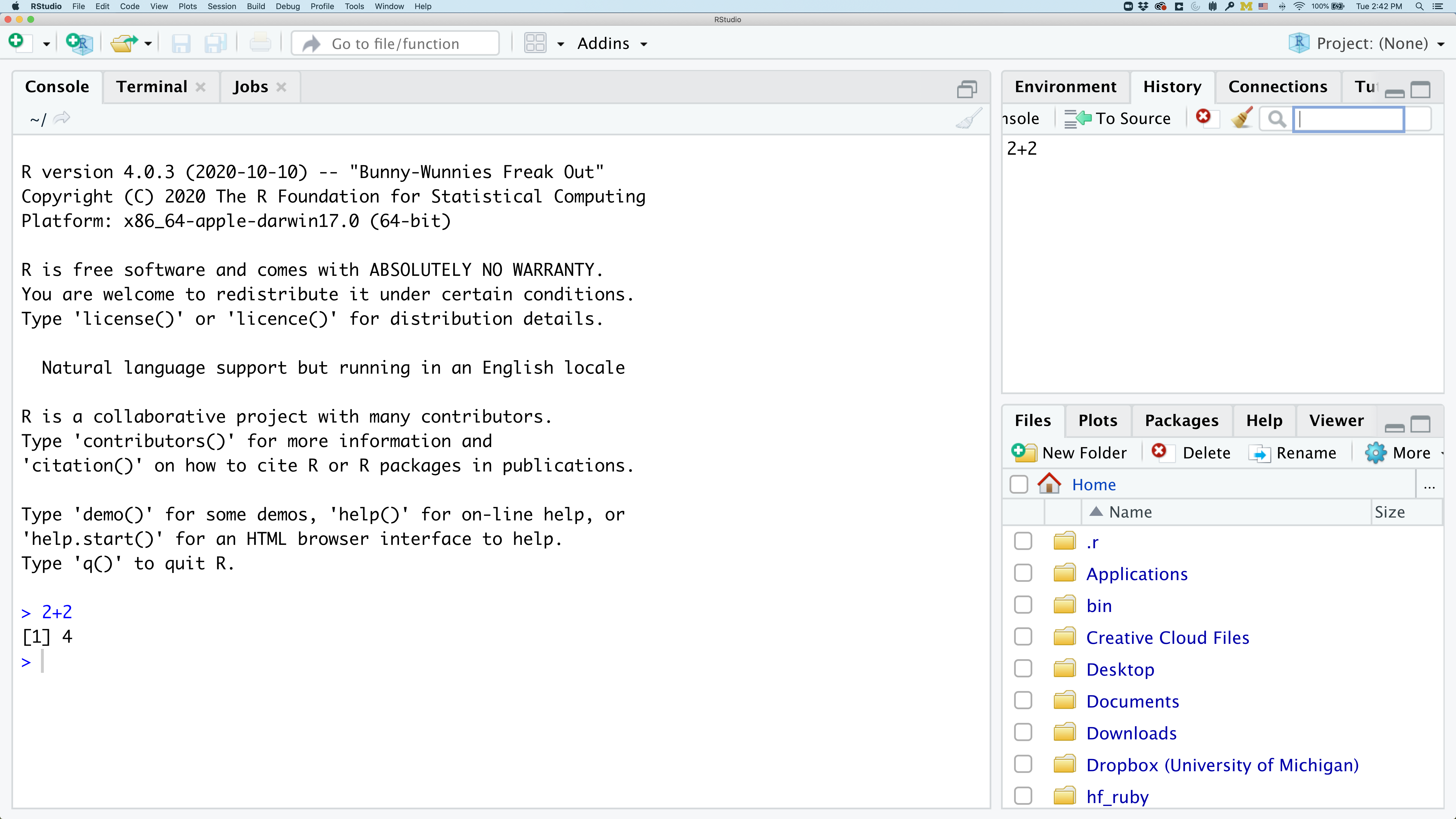
In the lower right panel are tabs for Files, Plots, Packages, Help, and Viewer.
We’ll spend more time in each of these tabs as we go through the workshop, so we won’t spend a lot of time discussing them now.
You might want to alter the appearance of your RStudio window. The default appearance has a white background with black text. If you go to the Tools menu at the top of your screen, you’ll see a “Global options” menu at the bottom of the drop down; select that.
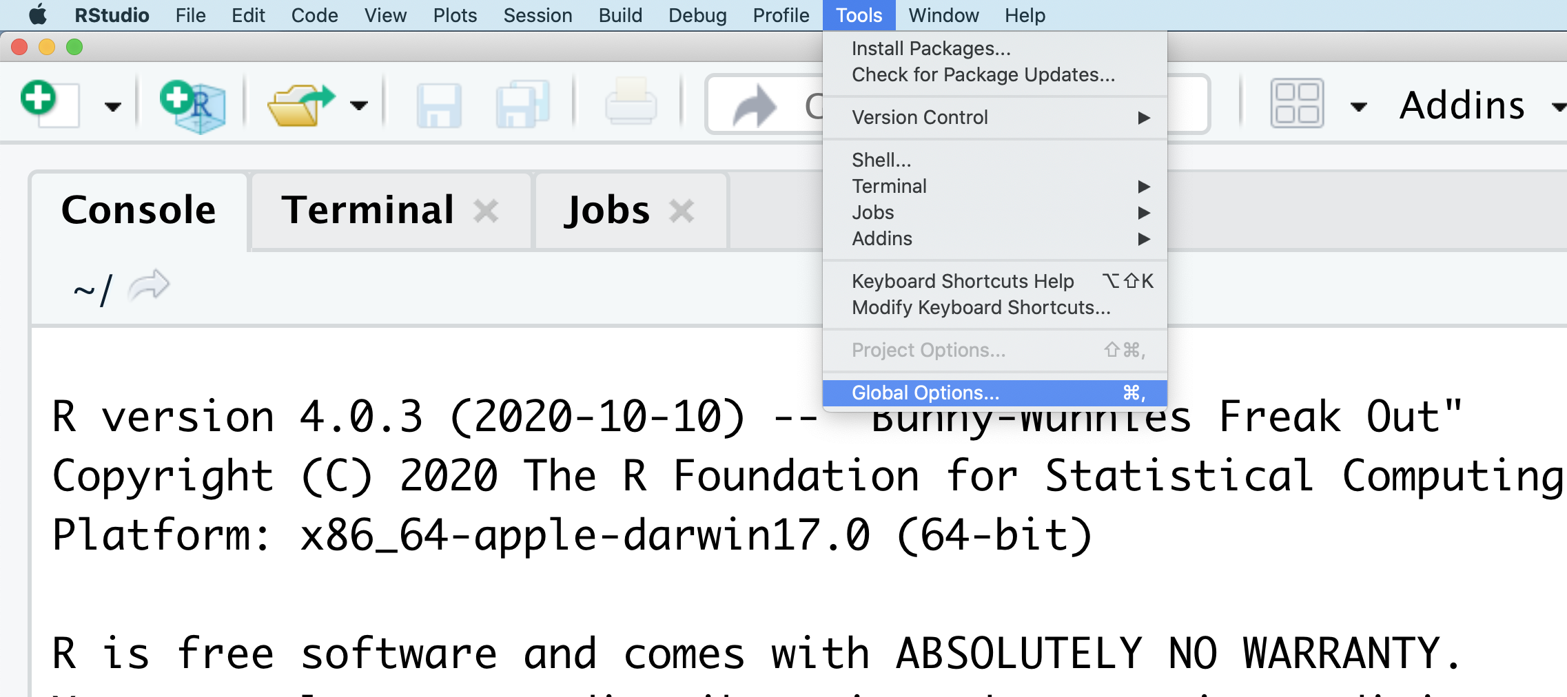
From there you will see the ability to alter numerous things about RStudio. Under the Appearances tab you can select the theme you like most. As you can see there’s a lot in Global options that you can set to improve your experience in RStudio. Most of these settings are a matter of personal preference.
However, you can update settings to help you to insure the reproducibility of your code. In the General tab, none of the selectors in the R Sessions, Workspace, and History should be selected. In addition, the toggle next to “Save workspace to .RData on exit” should be set to never. These setting will help ensure that things you worked on previously don’t carry over between sessions.
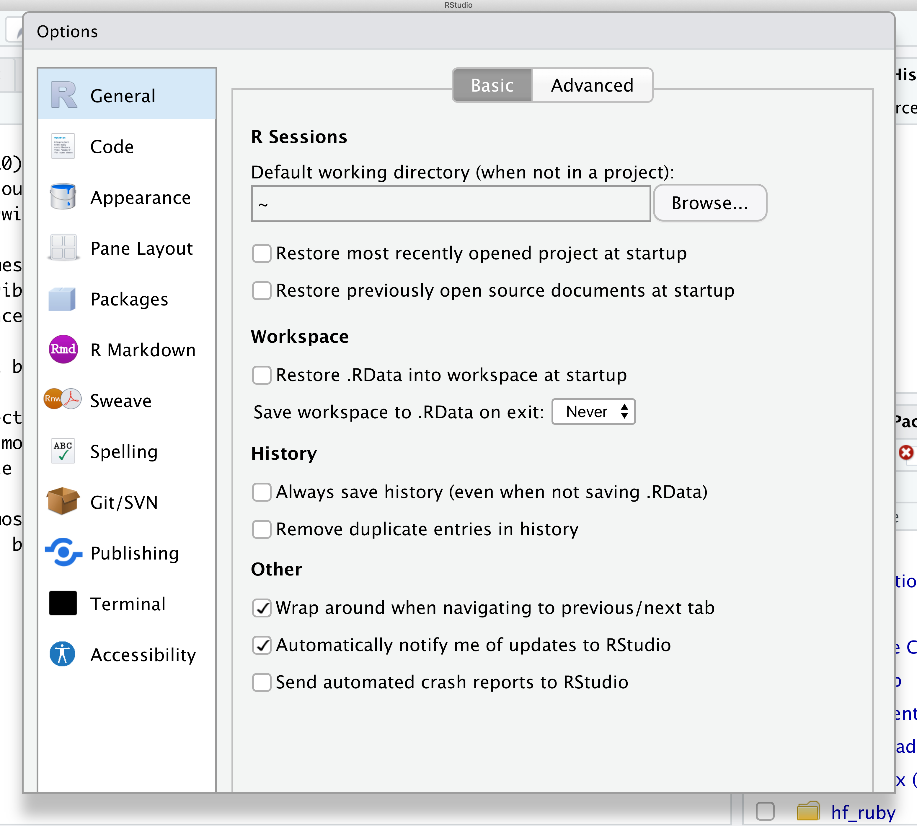
Let’s get going on our analysis!
One of the helpful features in RStudio is the ability to create a project. A project is a special directory that contains all of the code and data that you will need to run an analysis.
At the top of your screen you’ll see the “File” menu. Select that menu and then the menu for “New Project…”.
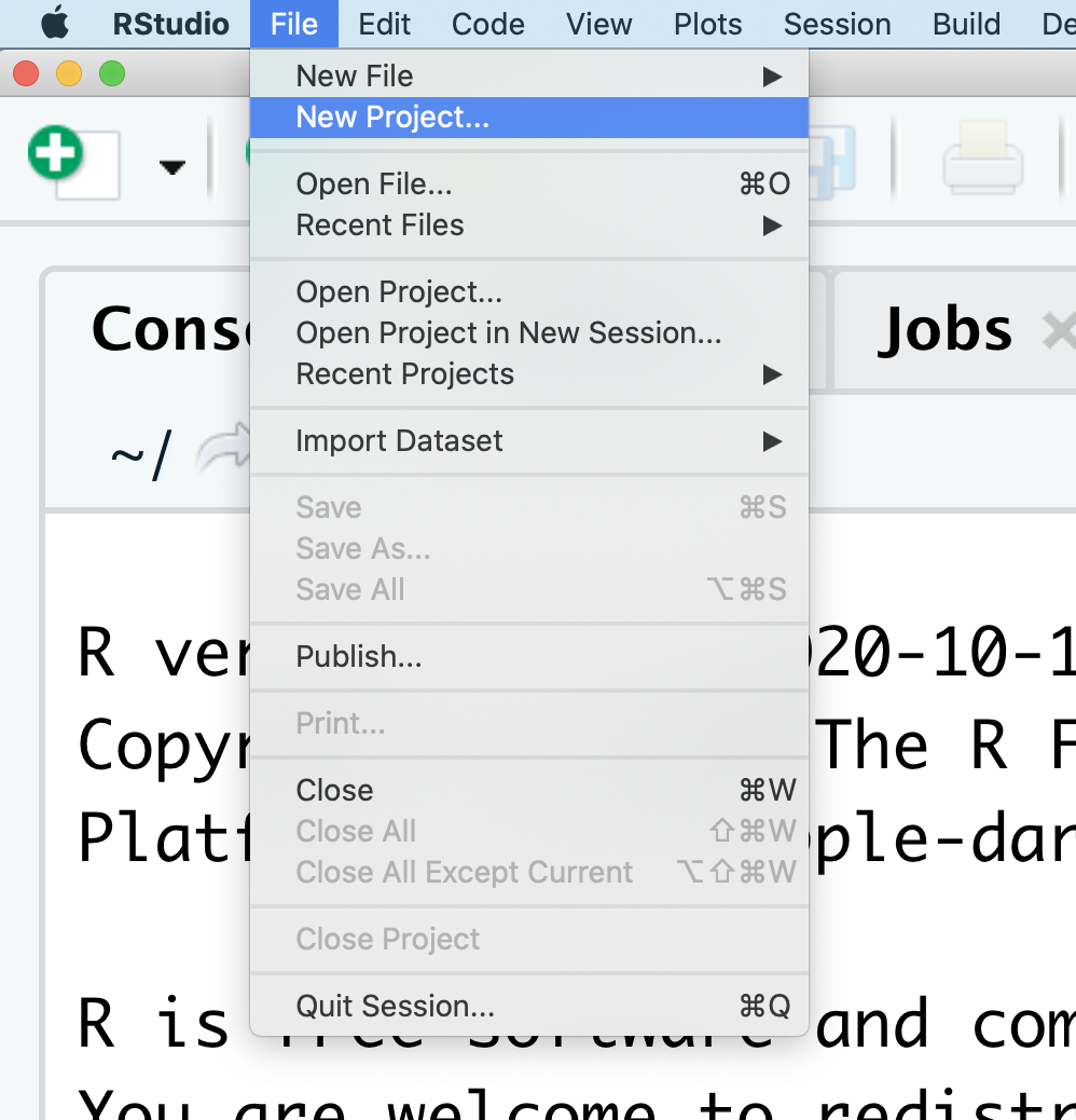
When the smaller window opens, select “Existing Directory” and then the “Browse” button in the next window.
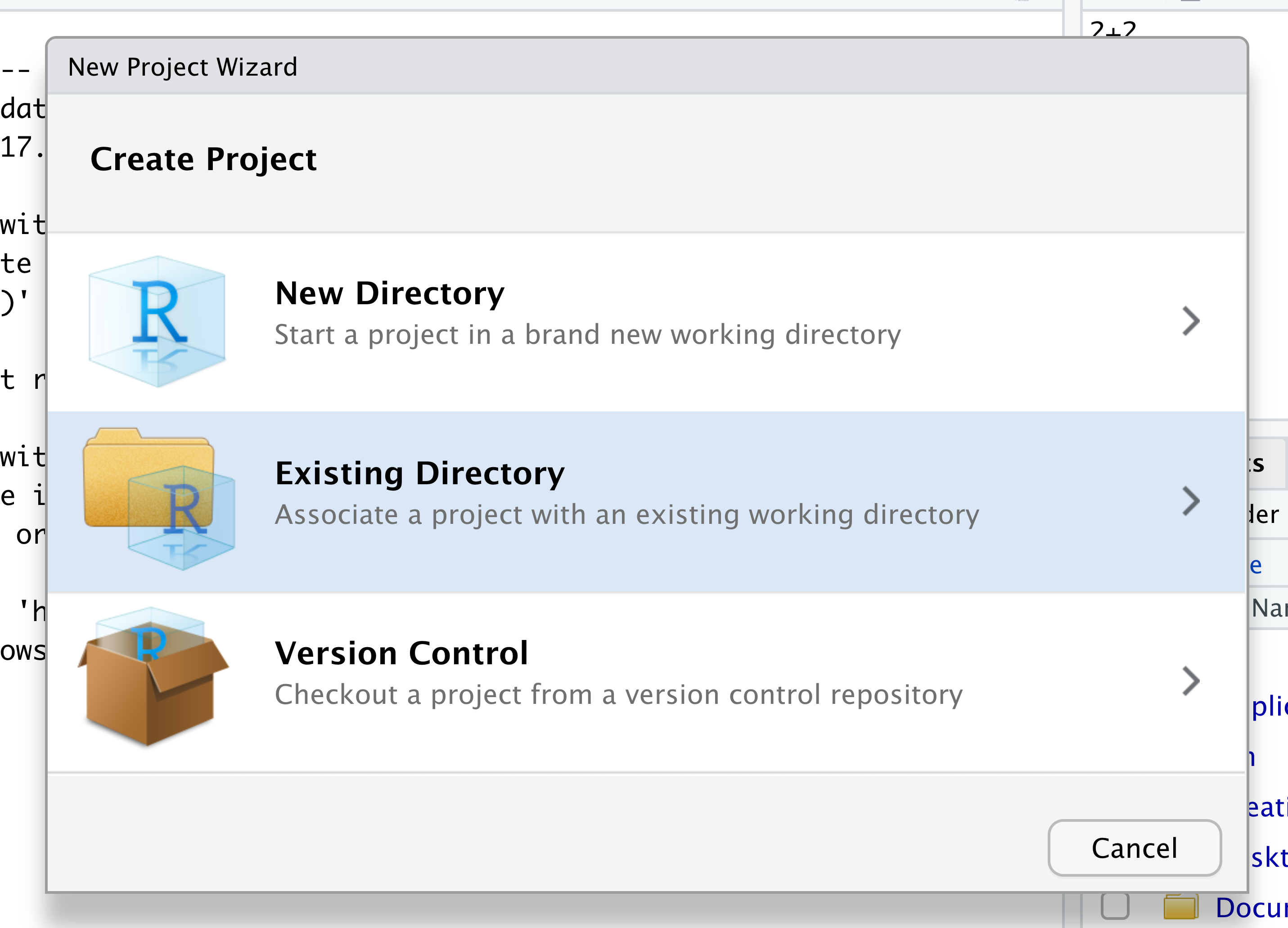
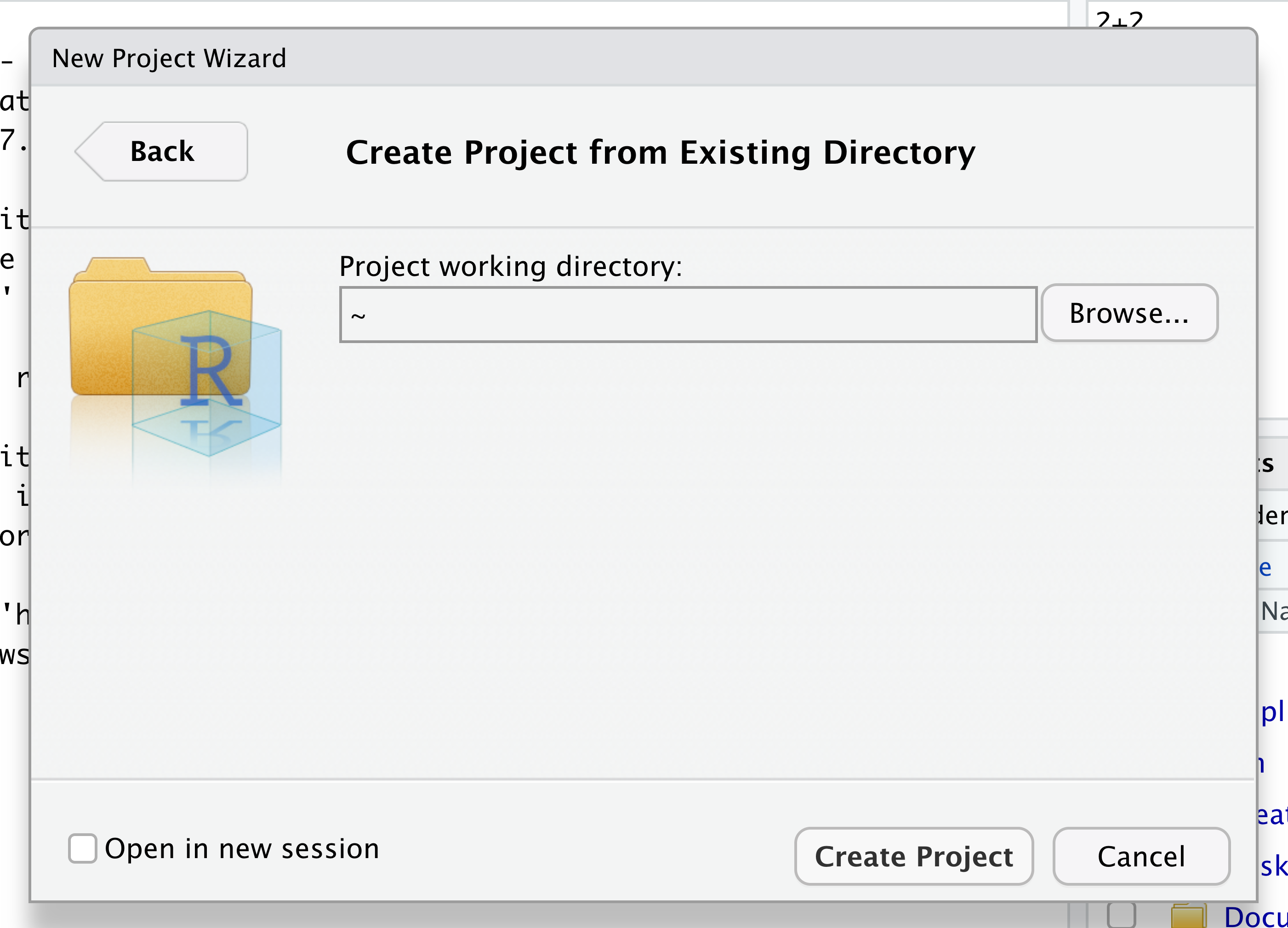
Navigate to the directory that contains your code and data from the setup instructions and click the “Open” button. Note that in the screenshots below, this folder says “un-report” - for us, it should say “ontario-report”.
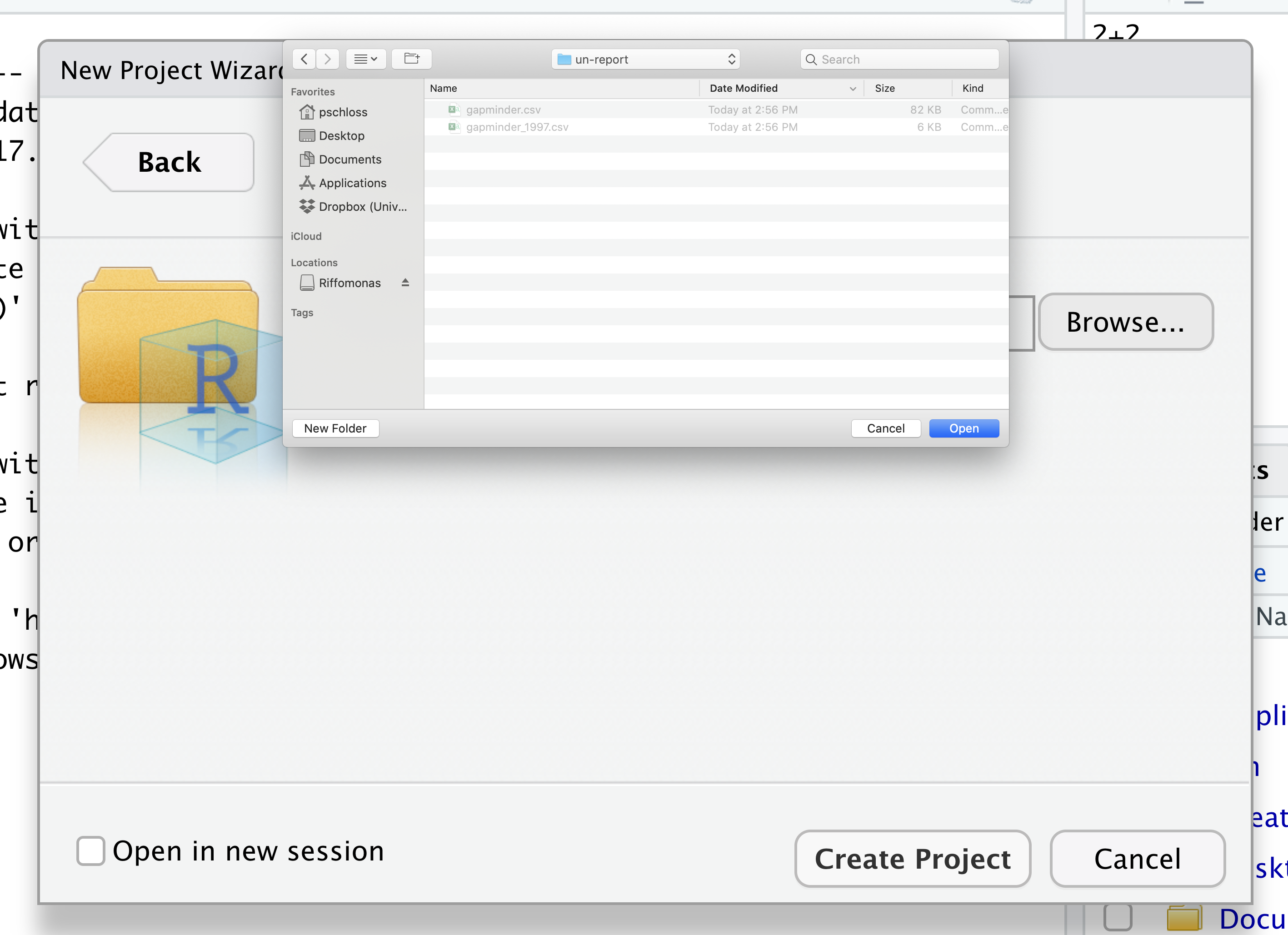
Then click the “Create Project” button.
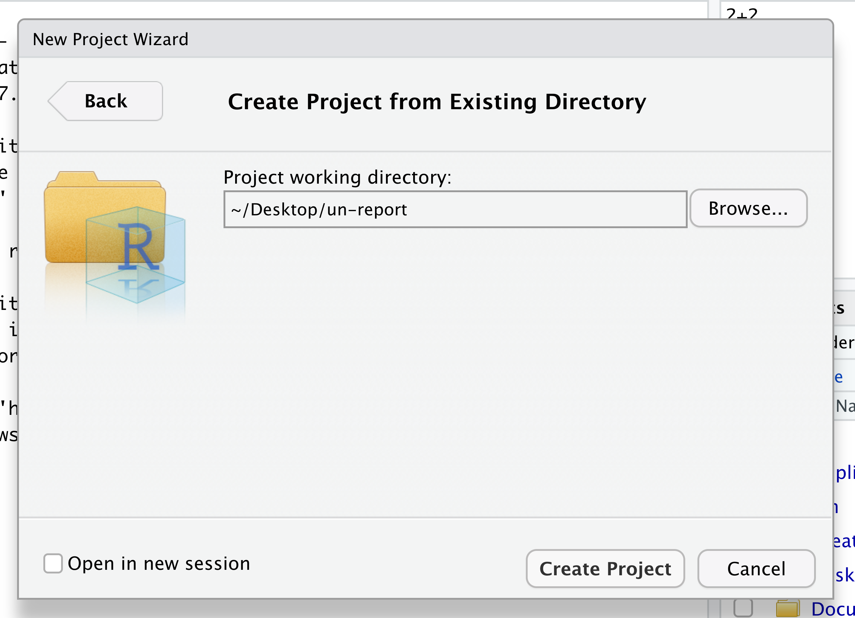
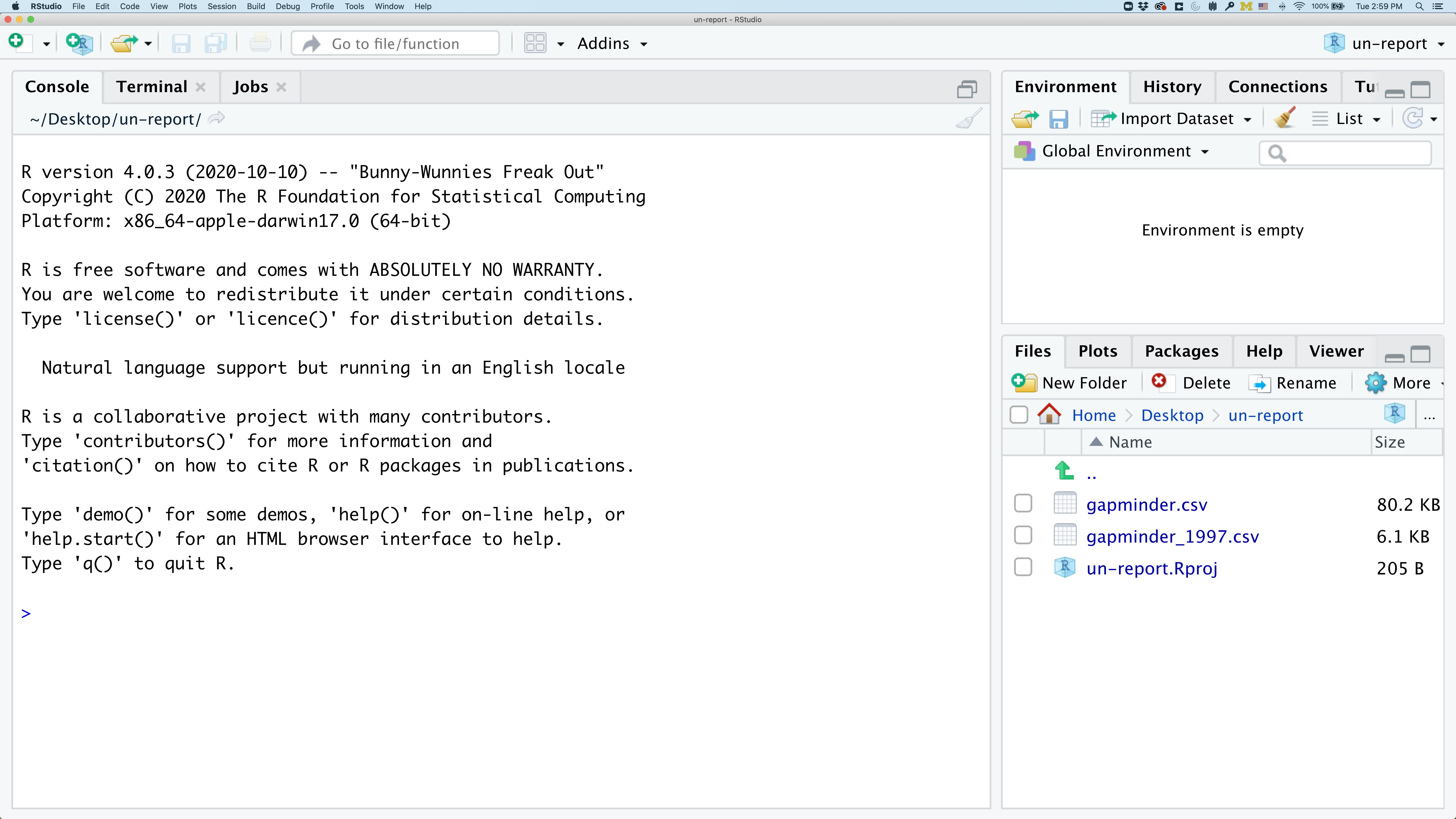
Did you notice anything change?
In the lower right corner of your RStudio session, you should notice that your Files tab is now your project directory. You’ll also see a file called ontario-report.Rproj in that directory.
From now on, you should start RStudio by double clicking on that file. This will make sure you are in the correct directory when you run your analysis.
We’d like to create a file where we can keep track of our R code.
Back in the “File” menu, you’ll see the first option is “New File”. Selecting “New File” opens another menu to the right and the first option is “R Script”. Select “R Script”.
Now we have a fourth panel in the upper left corner of RStudio that includes an Editor tab with an untitled R Script. Let’s save this file as plotting.R in our project directory. Go to “File” -> “Save” and enter “plotting.R”
We will be entering R code into the Editor tab to run in our Console panel.
On line 1 of plotting.R, type 2+2.
With your cursor on the line with the 2+2, click the button that says Run. You should be able to see that 2+2 was run in the Console.
As you write more code, you can highlight multiple lines and then click Run to run all of the lines you have selected.
Introduction to the Tidyverse
In this session we will learn how to read data into R and plot it, allowing us to explore how environmental variables affect the microbes of Lake Ontario. We’ll use functions from the tidyverse to make working with our data easier.
The tidyverse vs Base R
If you’ve used R before, you may have learned commands that are different than the ones we will be using during this workshop. We will be focusing on functions from the tidyverse. The “tidyverse” is a collection of R packages that have been designed to work well together and offer many convenient features that do not come with a fresh install of R (aka “base R”). These packages are very popular and have a lot of developer support including many staff members from RStudio. These functions generally help you to write code that is easier to read and maintain. We believe learning these tools will help you become more productive more quickly.
Let’s start by loading a package called tidyverse. In plotting.R, type and run:
library(tidyverse)
Warning: package 'lubridate' was built under R version 4.3.3
── Attaching core tidyverse packages ─────────────────────────────────────────────────────────────────────── tidyverse 2.0.0 ──
✔ dplyr     1.1.4     ✔ readr     2.1.5
✔ forcats   1.0.0     ✔ stringr   1.5.1
✔ ggplot2   3.5.1     ✔ tibble    3.2.1
✔ lubridate 1.9.4     ✔ tidyr     1.3.1
✔ purrr     1.0.2
── Conflicts ───────────────────────────────────────────────────────────────────────────────────────── tidyverse_conflicts() ──
✖ dplyr::filter() masks stats::filter()
✖ dplyr::lag()    masks stats::lag()
ℹ Use the conflicted package (<http://conflicted.r-lib.org/>) to force all conflicts to become errors
What’s with all those messages???
When you loaded the
tidyversepackage, you probably got a message like the one we got above. Don’t panic! These messages are just giving you more information about what happened when you loadedtidyverse. Thetidyverseis actually a collection of several different packages, so the first section of the message tells us what packages were installed when we loadedtidyverse(these includeggplot2, which we’ll be using a lot in this lesson, anddyplr, which you’ll be introduced to tomorrow in the R for Data Analysis lesson).The second section of messages gives a list of “conflicts.” Sometimes, the same function name will be used in two different packages, and R has to decide which function to use. For example, our message says that:
dplyr::filter() masks stats::filter()This means that two different packages (
dyplrfromtidyverseandstatsfrom base R) have a function namedfilter(). By default, R uses the function that was most recently loaded, so if we try using thefilter()function after loadingtidyverse, we will be using thefilter()function > fromdplyr().
Pro-tip
Those of us that use R on a daily basis use cheat sheets to help us remember how to use various R functions.
You can find them in RStudio by going to the “Help” menu and selecting “Cheat Sheets”. The four that will be most helpful in this workshop are “Data Visualization with ggplot2”, “Data Transformation with dplyr”, “R Markdown Cheat Sheet”, and “R Markdown Reference Guide”.
For things that aren’t on the cheat sheets, Google is your best friend. Even expert coders use Google when they’re stuck or trying something new!
Loading and reviewing data
We will import a file containing data from Ontario samples called sample_data.csv. We will import it into R using a function from the tidyverse called read_csv:
sample_data <- read_csv("sample_data.csv")
Rows: 71 Columns: 9
── Column specification ───────────────────────────────────────────────────────────────────────────────────────────────────────
Delimiter: ","
chr (2): sample_id, env_group
dbl (7): depth, cells_per_ml, temperature, total_nitrogen, total_phosphorus, diss_org_carbon, chlorophyll

ℹ Use `spec()` to retrieve the full column specification for this data.
ℹ Specify the column types or set `show_col_types = FALSE` to quiet this message.
read_csvvs.read.csvWhen you began typing the
read_csvcommand, a very similarly named function,read.csv, may have popped up. These commands both do the same thing - they read in data from .csv files. Theread.csvfunction is from “base” R (the packages and code that is automatically loaded), whileread_csvis from thereadrpackage in the tidyverse. They are very similar and are often interchangeable. The way they print data tables in the console is different, though, as is how they handle messier data tables. In later lessons, these functions won’t be interchangeable for us. So to keep us consistent, please confirm that you are usingread_csv.
Look at the “Environment” tab. Here you will see a list of all the objects you’ve created or imported during your R session. Do you see an object called sample_data? Click on the small table to the right of sample_data to View our dataset. This is a quick way to browse your data to make sure everything looks like it has been imported correctly.
We see that our data has 9 columns (variables).
Each row contains a unique Sample Id (“sample_id”), the depth of the sample (“depth”, in meters), the number of microbial cells per mL (“cells_per_ml”), and environmental data like temperature (“temperature”, in °C), total nitrogen (“total_nitrogen”, in µg N/L), total phosphorus (“total_phosphorus”, in µg P/L), dissolved organic carbon (“diss_org_carbon”, in mg C/L), and Chlorophyll-a (“chlorophyll”, in µg/L).
The Sample ID corresponds to the month, station, and depth of the sample (E for “epilimnion”, M for “mid”, and B for “bottom”). Below, you can see a map of where these stations are in Lake Ontario. Stations 62 was only sampled in September, while Station 74 was only sampled in May.
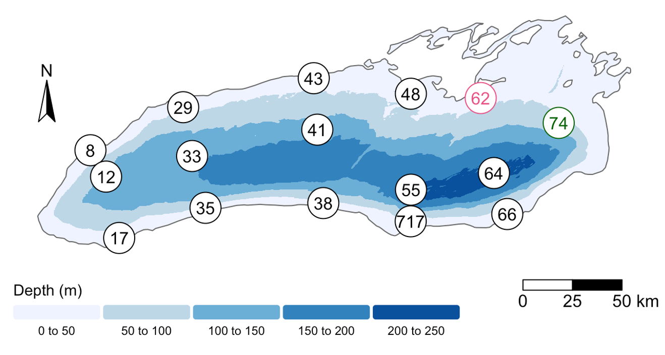
We also found that the samples fell into three main groups based on their depth (shallow vs. deep) and the month in which they were collected (May or September). Deep samples were similar between months, so they are in the same group. These classifications are held in the “env_group” column.
After we’ve reviewed the data, you’ll want to make sure to click the tab in the upper left to return to your plotting.R file so we can return to our R script.
Data frames vs. tibbles
Functions from the “tidyverse” such as
read_csvwork with objects called “tibbles”, which are a specialized kind of “data.frame.” Another common way to store data is a “data.table”. All of these types of data objects (tibbles, data.frames, and data.tables) can be used with the commands we will learn in this lesson to make plots. We may sometimes use these terms interchangeably.
Understanding commands
Let’s take a closer look at the read_csv command we typed.
Starting from the left, the first thing we see is sample_data. We viewed the contents of this file after it was imported so we know that sample_data acts as a placeholder for our data.
If we highlight just sample_data within our code file and press Ctrl+Enter on our keyboard, what do we see?
We should see a data table outputted, similar to what we saw in the Viewer tab.
In R terms, sample_data is a named object that references or stores something. In this case, sample_data stores a specific table of data.
When we’re coding in R, we often want to assign a value, or a collection of values, to an object, which means we gave those values a name. To create an object in R, we’ll use the <- symbol, which is the assignment operator. It assigns values generated or typed on the right to objects on the left. We can see our objects in the Environment pane.
An alternative symbol that you might see used as an assignment operator is the = but it is clearer to only use <- for assignment. We use this symbol so often that RStudio has a keyboard short cut for it: Alt+- on Windows, and Option+- on Mac. You can retrieve the values you stored by typing the name of the object.
Assigning values to objects
Try to assign values to some objects and observe each object after you have assigned a new value. What do you notice?
name <- "agar"
name
year <- 1881
year
name <- "Fanny Hesse"
name
Solution
When we assign a value to an object, the object stores that value so we can access it later. However, if we store a new value in an object we have already created (like when we stored “Fanny Hesse” in the
nameobject), it replaces the old value. Theyearobject does not change, because we never assign it a new value.
Guidelines on naming objects
- You want your object names to be explicit and not too long.
- They cannot start with a number (2x is not valid, but x2 is).
- R is case sensitive, so for example, weight_kg is different from Weight_kg.
- You cannot use spaces in the name.
- There are some names that cannot be used because they are the names of fundamental functions in R (e.g., if, else, for; see here for a complete list). If in doubt, check the help to see if the name is already in use (
?function_name).- It’s best to avoid dots (.) within names. Many function names in R itself have them and dots also have a special meaning (methods) in R and other programming languages.
- It is recommended to use nouns for object names and verbs for function names.
- Be consistent in the styling of your code, such as where you put spaces, how you name objects, etc. Using a consistent coding style makes your code clearer to read for your future self and your collaborators. One popular style guide can be found through the tidyverse.
Bonus Exercise: Bad names for objects
Try to assign values to some new objects. What do you notice? After running all four lines of code bellow, what value do you think the object
Flowerholds?1number <- 3 Flower <- "marigold" flower <- "rose" favorite number <- 12Solution
Notice that we get an error when we try to assign values to
1numberandfavorite number. This is because we cannot start an object name with a numeral and we cannot have spaces in object names. The objectFlowerstill holds “marigold.” This is because R is case-sensitive, so runningflower <- "rose"does NOT change theFlowerobject. This can get confusing, and is why we generally avoid having objects with the same name and different capitalization.
The next part of the command is read_csv("sample_data.csv"). This has a few different key parts. The first part is the read_csv function. You call a function in R by typing it’s name followed by opening then closing parenthesis. Each function has a purpose, which is often hinted at by the name of the function. Let’s try to run the function without anything inside the parenthesis.
read_csv()
Error in read_csv(): argument "file" is missing, with no default
We get an error message. Don’t panic! Error messages pop up all the time, and can be super helpful in debugging code.
In this case, the message tells us “argument “file” is missing, with no default.” Many functions, including read_csv, require additional pieces of information to do their job. We call these additional values “arguments” or “parameters.” You pass arguments to a function by placing values in between the parenthesis. A function takes in these arguments and does a bunch of “magic” behind the scenes to output something we’re interested in.
For example, when we loaded in our data, the command contained "sample_data.csv" inside the read_csv() function. This is the value we assigned to the file argument. But we didn’t say that that was the file. How does that work?
Pro-tip
Each function has a help page that documents what arguments the function expects and what value it will return. You can bring up the help page a few different ways. You can go to the “Help” tab in the lower right and search for a function. You can also type
?followed by the function name in the console.For example, try running
?read_csv. A help page should pop up with information about what the function is used for and how to use it, as well as useful examples of the function in action. As you can see, the first argument ofread_csvis the file path.
The read_csv() function took the file path we provided, did who-knows-what behind the scenes, and then outputted an R object with the data stored in that csv file. All that, with one short line of code!
Do all functions need arguments? Let’s test some other functions:
Sys.Date()
[1] "2025-01-16"
getwd()
"/Users/augustuspendleton/Desktop/ontario-report"
While some functions, like those above, don’t need any arguments, in other
functions we may want to use multiple arguments. When we’re using multiple
arguments, we separate the arguments with commas. For example, we can use the
sum() function to add numbers together:
sum(5, 6)
[1] 11
Learning more about functions
Look up the function
round. What does it do? What will you get as output for the following lines of code?round(3.1415) round(3.1415,3)Solution
roundrounds a number. By default, it rounds it to zero digits (in our example above, to 3). If you give it a second number, it rounds it to that number of digits (in our example above, to 3.142)
Notice how in this example, we didn’t include any argument names. But you can use argument names if you want:
read_csv(file = 'sample_data.csv')
Rows: 71 Columns: 9
── Column specification ───────────────────────────────────────────────────────────────────────────────────────────────────────
Delimiter: ","
chr (2): sample_id, env_group
dbl (7): depth, cells_per_ml, temperature, total_nitrogen, total_phosphorus, diss_org_carbon, chlorophyll

ℹ Use `spec()` to retrieve the full column specification for this data.
ℹ Specify the column types or set `show_col_types = FALSE` to quiet this message.
# A tibble: 71 × 9
   sample_id env_group   depth cells_per_ml temperature total_nitrogen total_phosphorus diss_org_carbon chlorophyll
   <chr>     <chr>       <dbl>        <dbl>       <dbl>          <dbl>            <dbl>           <dbl>       <dbl>
 1 May_12_B  Deep         103.     2058864.        4.07            465             3.78            2.48        0.05
 2 May_12_E  Shallow_May    5      4696827.        7.01            465             4.39            2.38        2.53
 3 May_12_M  Shallow_May   15      4808339.        6.14            474             5.37            2.60        3.2
 4 May_17_E  Shallow_May    5      3738681.        5.99            492             4.67            2.44        0.55
 5 May_29_B  Deep          27      2153086.        4.67            525             4.44            2.40        0.48
 6 May_29_E  Shallow_May    5      3124920.        5.97            521             3.71            2.28        0.79
 7 May_29_M  Shallow_May   19      2566156.        5.69            539             4.23            2.33        0.44
 8 May_33_B  Deep         135      2293177.        3.87            505             4.18            2.34        0.22
 9 May_33_E  Shallow_May    5      5480859.        7.93            473             6.64            2.51        3.44
10 May_33_M  Shallow_May   20      3114433.        4.53            515             4.14            2.23        1.27
# ℹ 61 more rows
Position of the arguments in functions
Which of the following lines of code will give you an output of 3.14? For the one(s) that don’t give you 3.14, what do they give you?
round(x = 3.1415)
round(x = 3.1415, digits = 2)
round(digits = 2, x = 3.1415)
round(2, 3.1415)
Solution
The 2nd and 3rd lines will give you the right answer because the arguments are named, and when you use names the order doesn’t matter. The 1st line will give you 3 because the default number of digits is 0. Then 4th line will give you 2 because, since you didn’t name the arguments, x=2 and digits=3.1415.
Sometimes it is helpful - or even necessary - to include the argument name, but often we can skip the argument name, if the argument values are passed in a certain order. If all this function stuff sounds confusing, don’t worry! We’ll see a bunch of examples as we go that will make things clearer.
Comments
Sometimes you may want to write comments in your code to help you remember what your code is doing, but you don’t want R to think these comments are a part of the code you want to evaluate. That’s where comments come in! Anything after a
#symbol in your code will be ignored by R. For example, let’s say we wanted to make a note of what each of the functions we just used do:Sys.Date() # outputs the current date[1] "2025-01-16"getwd() # outputs our current working directory (folder)[1] "/Users/augustuspendleton/Desktop/Coding/Carpentries_Workshops/Cornell_Carpentries_Jan2025/_episodes_rmd"sum(5, 6) # adds numbers[1] 11read_csv(file = 'sample_data.csv') # reads in csv fileRows: 71 Columns: 9 ── Column specification ─────────────────────────────────────────────────────────────────────────────────────────────────────── Delimiter: "," chr (2): sample_id, env_group dbl (7): depth, cells_per_ml, temperature, total_nitrogen, total_phosphorus, diss_org_carbon, chlorophyll ℹ Use `spec()` to retrieve the full column specification for this data. ℹ Specify the column types or set `show_col_types = FALSE` to quiet this message.# A tibble: 71 × 9 sample_id env_group depth cells_per_ml temperature total_nitrogen total_phosphorus diss_org_carbon chlorophyll <chr> <chr> <dbl> <dbl> <dbl> <dbl> <dbl> <dbl> <dbl> 1 May_12_B Deep 103. 2058864. 4.07 465 3.78 2.48 0.05 2 May_12_E Shallow_May 5 4696827. 7.01 465 4.39 2.38 2.53 3 May_12_M Shallow_May 15 4808339. 6.14 474 5.37 2.60 3.2 4 May_17_E Shallow_May 5 3738681. 5.99 492 4.67 2.44 0.55 5 May_29_B Deep 27 2153086. 4.67 525 4.44 2.40 0.48 6 May_29_E Shallow_May 5 3124920. 5.97 521 3.71 2.28 0.79 7 May_29_M Shallow_May 19 2566156. 5.69 539 4.23 2.33 0.44 8 May_33_B Deep 135 2293177. 3.87 505 4.18 2.34 0.22 9 May_33_E Shallow_May 5 5480859. 7.93 473 6.64 2.51 3.44 10 May_33_M Shallow_May 20 3114433. 4.53 515 4.14 2.23 1.27 # ℹ 61 more rows
Creating our first plot
We will be using the ggplot2 package today to make our plots. This is a very
powerful package that creates professional looking plots and is one of the
reasons people like using R so much. All plots made using the ggplot2 package
start by calling the ggplot() function. So in the tab you created for the
plotting.R file, type the following:
ggplot(data=sample_data)

To run code that you’ve typed in the editor, you have a few options. Remember that the quickest way to run the code is by pressing Ctrl+Enter on your keyboard. This will run the line of code that currently contains your cursor or any highlighted code.
When we run this code, the Plots tab will pop to the front in the lower right corner of the RStudio screen. Right now, we just see a big grey rectangle.
What we’ve done is created a ggplot object and told it we will be using the data
from the sample_data object that we’ve loaded into R. We’ve done this by
calling the ggplot() function with sample_data as the data argument.
So we’ve made a plot object, now we need to start telling it what we actually
want to draw in this plot. The elements of a plot have a bunch of properties
like an x and y position, a size, a color, etc. These properties are called
aesthetics. When creating a data visualization, we map a variable in our
dataset to an aesthetic in our plot. In ggplot, we can do this by creating an
“aesthetic mapping”, which we do with the aes() function.
To create our plot, we need to map variables from our sample_data object to
ggplot aesthetics using the aes() function. Since we have already told
ggplot that we are using the data in the sample_data object, we can
access the columns of sample_data using the object’s column names.
(Remember, R is case-sensitive, so we have to be careful to match the column
names exactly!)
We are interested in whether there is a relationship between temperature and microbial abundance, so let’s start by telling our plot object that we want to map our
temperature values to the x axis of our plot. We do this by adding (+) information to
our plot object. Add this new line to your code and run both lines by
highlighting them and pressing Ctrl+Enter on your
keyboard:
ggplot(data = sample_data) +
aes(x = temperature)
Note that we’ve added this new function call to a second line just to make it
easier to read. To do this we make sure that the + is at the end of the first
line otherwise R will assume your command ends when it starts the next row. The
+ sign indicates not only that we are adding information, but to continue on
to the next line of code.
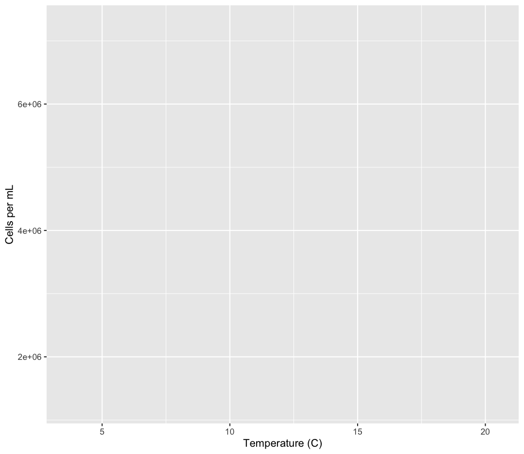
Observe that our Plot window is no longer a grey square. We now see that
we’ve mapped the temperature column to the x axis of our plot. Note that that
column name isn’t very pretty as an x-axis label, so let’s add the labs()
function to make a nicer label for the x axis
ggplot(data = sample_data) +
aes(x = temperature) +
labs(x = "Temperature (C)")
OK. That looks better.
Quotes vs No Quotes
Notice that when we added the label value we did so by placing the values inside quotes. This is because we are not using a value from inside our data object - we are providing the name directly. When you need to include actual text values in R, they will be placed inside quotes to tell them apart from other object or variable names.
The general rule is that if you want to use values from the columns of your data object, then you supply the name of the column without quotes, but if you want to specify a value that does not come from your data, then use quotes.
Mapping cell abundance to the y axis
Map our
cells_per_mlvalues to the y axis and give them a nice label.Solution
ggplot(data = sample_data) + aes(x = temperature) + labs(x = "Temperature (C)") + aes(y = cells_per_ml) + labs(y = "Cells per mL")
Excellent. We’ve now told our plot object where the x and y values are coming
from and what they stand for. But we haven’t told our object how we want it to
draw the data. There are many different plot types (bar charts, scatter plots,
histograms, etc). We tell our plot object what to draw by adding a “geometry”
(“geom” for short) to our object. We will talk about many different geometries
today, but for our first plot, let’s draw our data using the “points” geometry
for each value in the data set. To do this, we add geom_point() to our plot
object:
ggplot(data = sample_data) +
aes(x = temperature) +
labs(x = "Temperature (C)") +
aes(y = cells_per_ml) +
labs(y = "Cells per mL") +
geom_point()
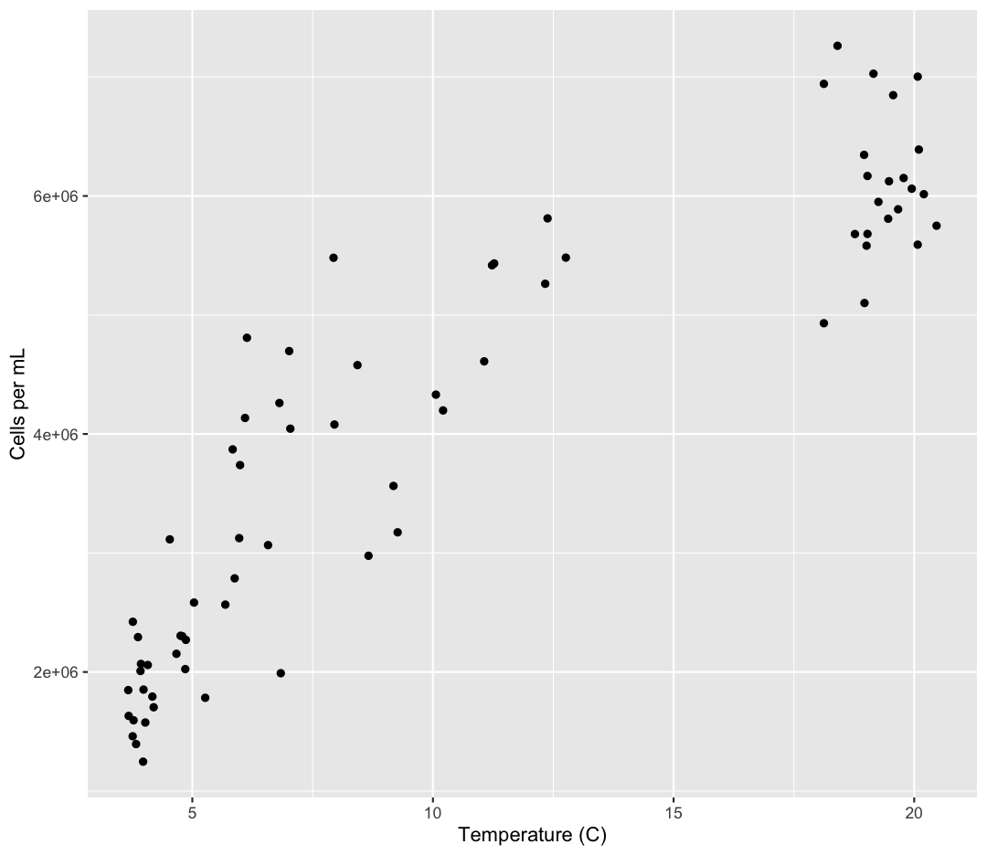
Now we’re really getting somewhere. It finally looks like a proper plot! We can
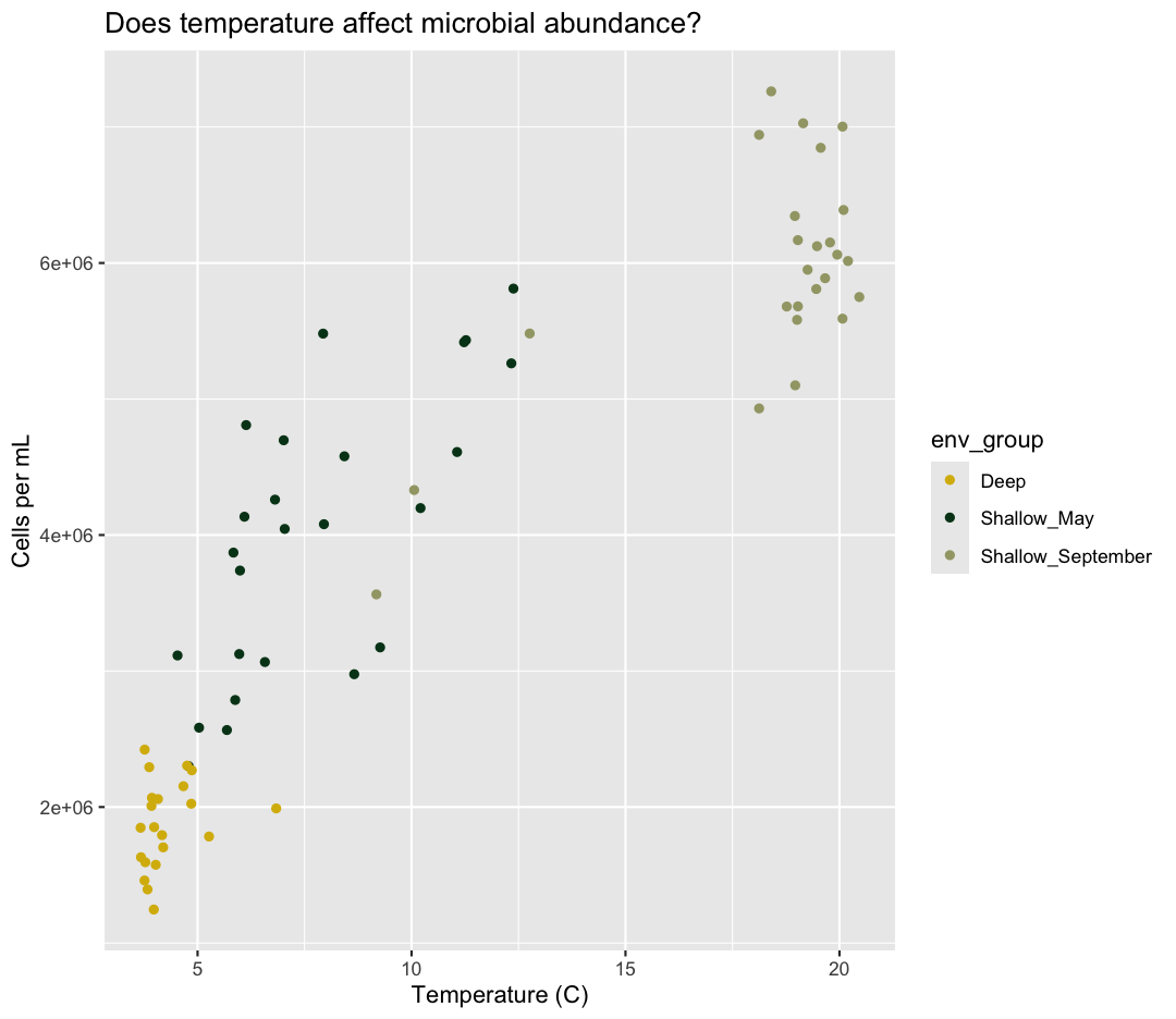
now see a trend in the data. It looks like samples with a higher temperature tend to
have a higher cell abundance. Let’s add a title to our plot to make that
clearer. Again, we will use the labs() function, but this time we will use the
title = argument.
ggplot(data = sample_data) +
aes(x = temperature) +
labs(x = "Temperature (C)") +
aes(y = cells_per_ml) +
labs(y = "Cells per mL") +
geom_point() +
labs(title = "Does temperature affect microbial abundance?")
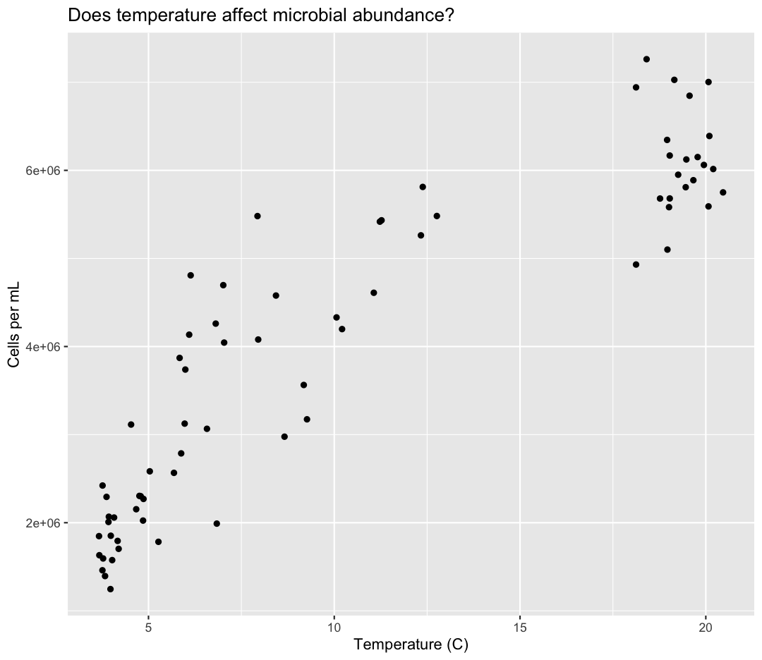
No one can deny we’ve made a very handsome plot! But now looking at the data, we
might be curious about learning more - for example, it seems like the data separates into at least two distinct groups. We know that there are pieces of data in the sample_data
object that we haven’t used yet. Maybe we are curious if the trend between temperature and cell abundance is consistent between our three environmental groups. One thing we
could do is use a different color for each of these groups. To map the
env_group of each point to a color, we will again use the aes() function:
ggplot(data = sample_data) +
aes(x = temperature) +
labs(x = "Temperature (C)") +
aes(y = cells_per_ml) +
labs(y = "Cells per mL") +
geom_point() +
labs(title = "Does temperature affect microbial abundance?") +
aes(color = env_group)
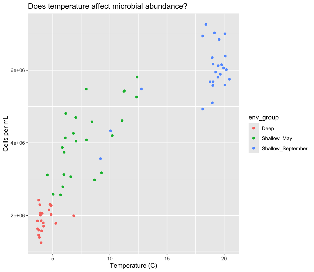
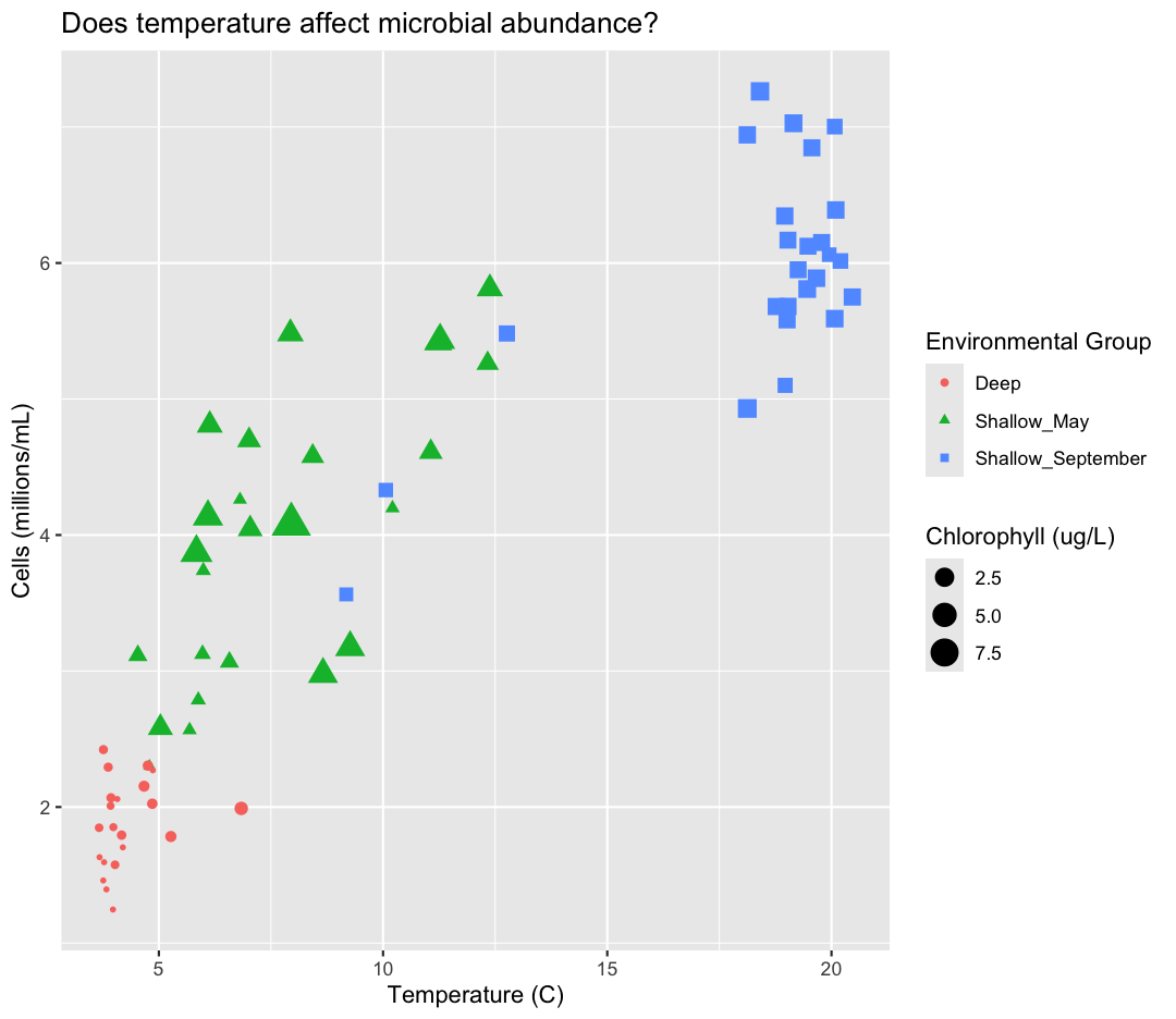
Here we can see that Deep samples have fewer cells than Shallow samples. Notice that when we add a mapping for
color, ggplot automatically provided a legend for us. It took care of assigning
different colors to each of our unique values of the env_group variable. (Note
that when we mapped the x and y values, those drew the actual axis labels, so in
a way the axes are like the legends for the x and y values).
What other variables might we expect to affect cell abundance? Perhaps microbial cell abundance is correlated to other measures of productivity, like the abundance of phytoplankton. Let’s find out by mapping the chlorophyll levels of each sample to the size of our points.
ggplot(data = sample_data) +
aes(x = temperature) +
labs(x = "Temperature (C)") +
aes(y = cells_per_ml) +
labs(y = "Cells per mL") +
geom_point() +
labs(title = "Does temperature affect microbial abundance?") +
aes(color = env_group) +
aes(size = chlorophyll)
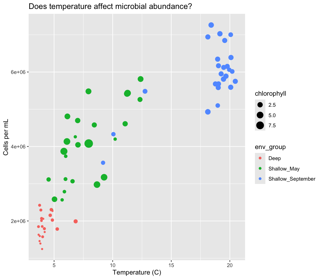
There doesn’t seem to be a very strong association with chlorophyll, besides low chlorophyll in deep samples. We got another legend here for size
which is nice, but the titles aren’t very informative. Let’s change those, using another calls to labs()
ggplot(data = sample_data) +
aes(x = temperature) +
labs(x = "Temperature (C)") +
aes(y = cells_per_ml) +
labs(y = "Cells per mL") +
geom_point() +
labs(title = "Does temperature affect microbial abundance?") +
aes(color = env_group) +
aes(size = chlorophyll) +
labs(size = "Chlorophyll (ug/L)",
color = "Environmental Group")
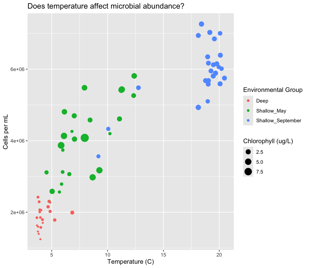
While we’re at it, I don’t love the scientific notation along the y-axis. Let’s change it by dividing our cells_per_ml by 1,000,000 and updating our axis title to match.
ggplot(data = sample_data) +
aes(x = temperature) +
labs(x = "Temperature (C)") +
aes(y = cells_per_ml/1000000) +
labs(y = "Cells (millions/mL)") +
geom_point() +
labs(title = "Does temperature affect microbial abundance?") +
aes(color = env_group) +
aes(size = chlorophyll) +
labs(size = "Chlorophyll (ug/L)",
color = "Environmental Group")
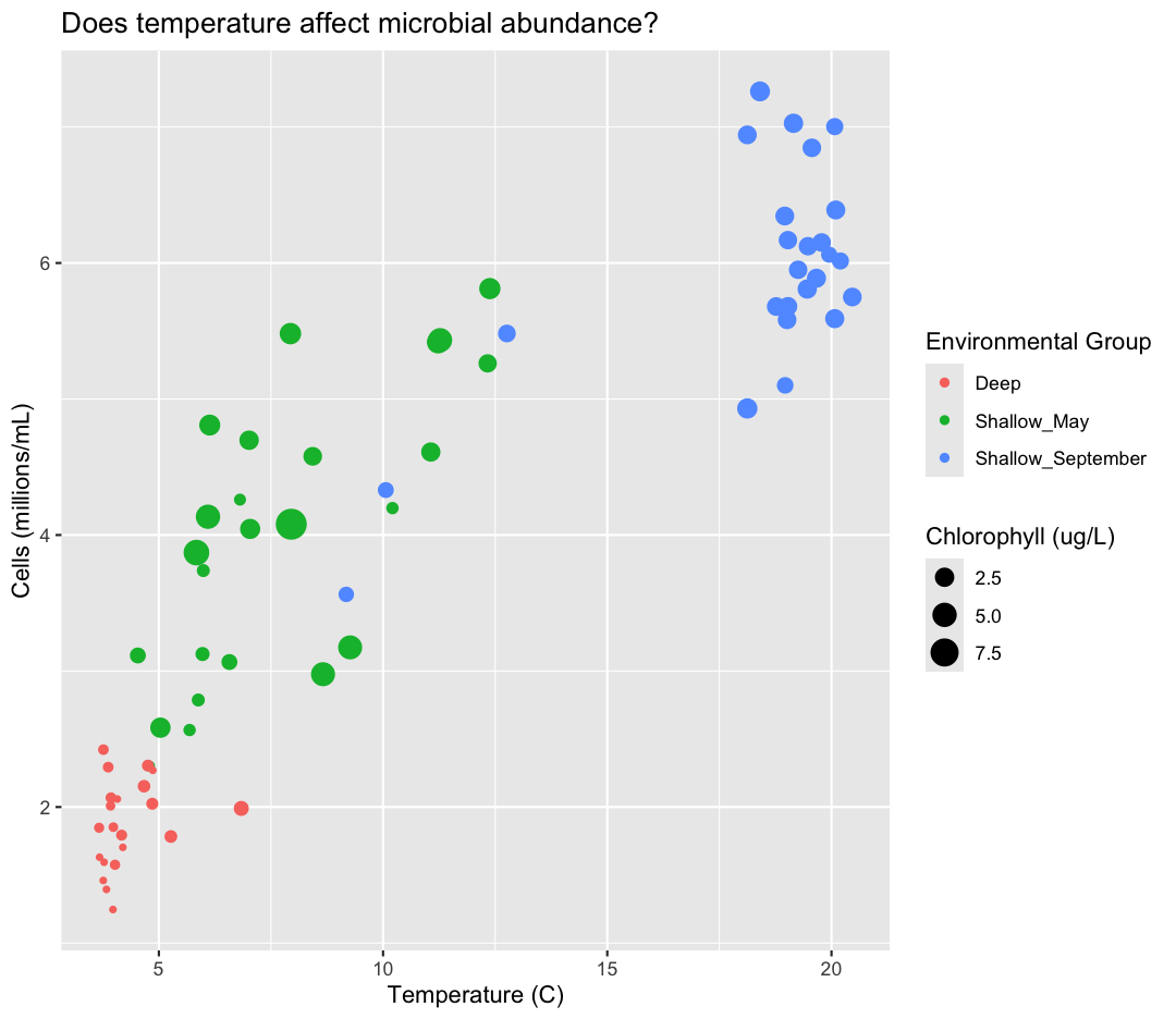
This works because you can treat the columns in the aesthetic mappings just like any other variables and can use functions to transform or change them at plot time rather than having to transform your data first.
Good work! Take a moment to appreciate what a cool plot you made with a few lines of code. In order to fully view its beauty you can click the “Zoom” button in the Plots tab - it will break free from the lower right corner and open the plot in its own window.
Changing shapes
Instead of (or in addition to) color, change the shape of the points so each env_group has a different shape. (I’m not saying this is a great thing to do - it’s just for practice!) HINT: Is size an aesthetic or a geometry? If you’re stuck, feel free to Google it, or look at the help menu.
Solution
You’ll want to use the
aesaesthetic function to change the shape:ggplot(data = sample_data) + aes(x = temperature) + labs(x = "Temperature (C)") + aes(y = cells_per_ml/1000000) + labs(y = "Cells (millions/mL)") + geom_point() + labs(title = "Does temperature affect microbial abundance?") + aes(color = env_group) + aes(size = chlorophyll) + aes(shape = env_group) + labs(size = "Chlorophyll (ug/L)", color = "Environmental Group", shape = "Environmental Group")
For our first plot we added each line of code one at a time so you could see the
exact affect it had on the output. But when you start to make a bunch of plots,
we can actually combine many of these steps so you don’t have to type as much.
For example, you can collect all the aes() statements and all the labs()
together. A more condensed version of the exact same plot would look like this:
ggplot(data = sample_data) +
aes(x = temperature,
y = cells_per_ml/1000000,
color = env_group,
size = chlorophyll) +
geom_point() +
labs(x = "Temperature (C)",
y = "Cells (millions/mL)",
title = "Does temperature affect microbial abundance?",
size = "Chlorophyll (ug/L)",
color = "Environmental Group")

Plotting for data exploration
Within a project, we often have to work with many different data types, which require different methods of analysis and visualization. One of the most enjoyable parts of data analysis is trying out different plotting techniques to find patterns in your data.
Importing datasets
In the first plot, we found that temperature had a major influence on microbial abundance in Lake Ontario. We also learned, using color, that deep samples have cool temperatures, and water temperatures were colder in May compared to September. However, our sample_data object only contained data from two sampling time points. It would be useful for us to understand how temperatures vary in Lake Ontario over a fuller time series.
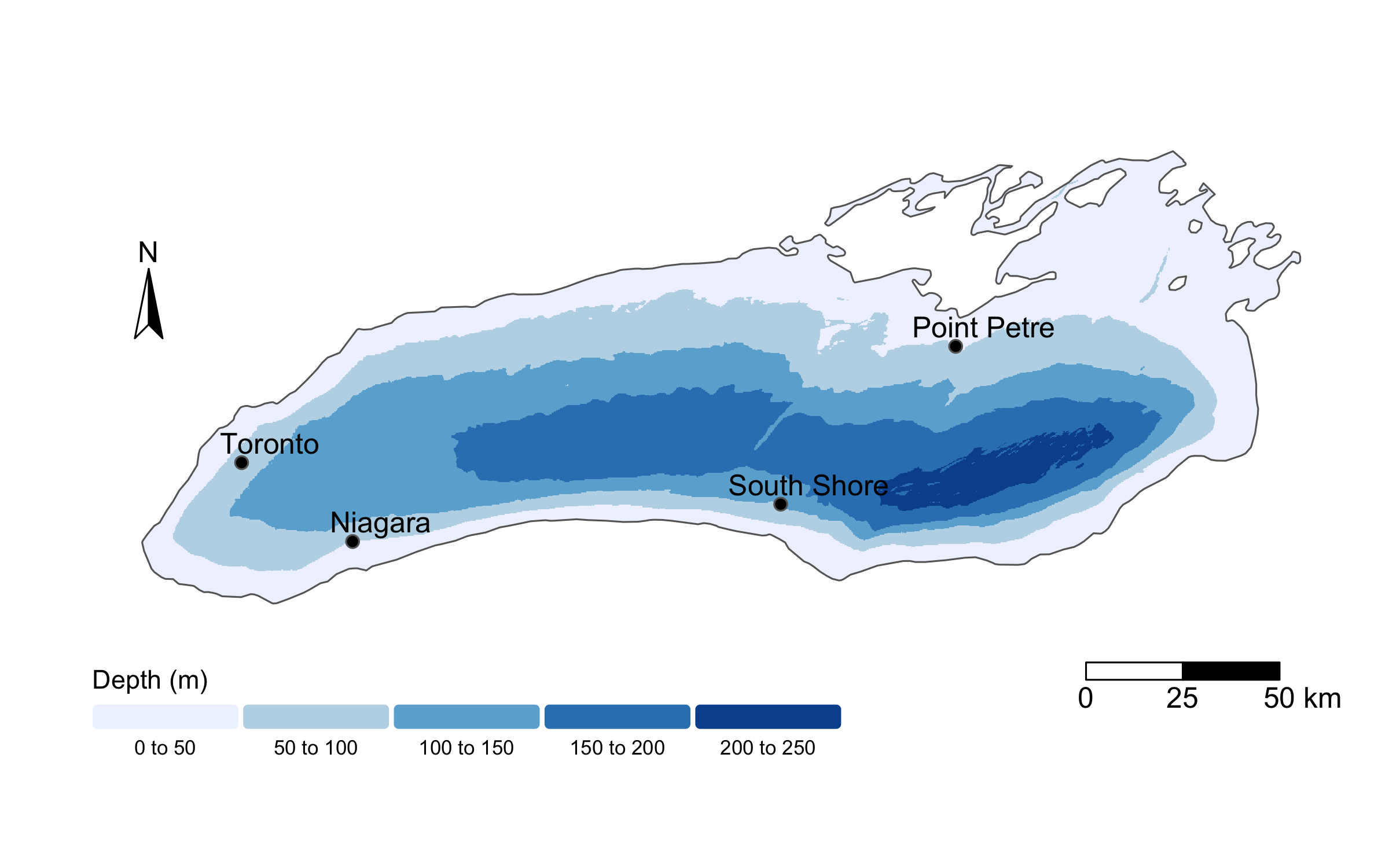
To do so, we will read in a new dataset, called buoy_data.csv. This file contains daily temperature measurements from buoys across Lake Ontario in 2023, collected and provided by the Ontario Ministry of Natural Resources, Fisheries and Oceans Canada, the U.S. Fish and Wildlife Service, U.S. Geological Survey, and Queen’s University. Raw data are publicly available through the GLOS Seagull platform, though today we’ll be working with a cleaned and simplified version of the dataset. Below, I show a map of the buoys whose data we’ll analyze.
To start, we will read in the data using read_csv.
Read in your own data
What argument should be provided in the below code to read in the full dataset?
buoy_data <- read_csv()Solution
buoy_data <- read_csv("buoy_data.csv")
Let’s take a look at the full dataset. We could use View(), the way we did for the smaller dataset, but if your data is too big, it might take too long to load. Luckily, R offers a way to look at parts of the data to get an idea of what your dataset looks like, without having to examine the whole thing. Here are some commands that allow us to get the dimensions of our data and look at a snapshot of the data. Try them out!
dim(buoy_data)
[1] 2945 6
head(buoy_data)
# A tibble: 6 × 6
sensor buoy depth day_of_year month temperature
<chr> <chr> <chr> <dbl> <chr> <dbl>
1 Niagara_Bottom Niagara Bottom 1 January 3.81
2 Niagara_Bottom Niagara Bottom 2 January 3.80
3 Niagara_Bottom Niagara Bottom 3 January 3.76
4 Niagara_Bottom Niagara Bottom 4 January 3.56
5 Niagara_Bottom Niagara Bottom 5 January 3.18
6 Niagara_Bottom Niagara Bottom 6 January 3.19
This dataset has six variables. We have four buoy locations (“Niagara”, “Toronto”,”South Shore”, and “Point Petre”), and temperature sensors at two depths: the surface and the bottom for each location. sensor is a combination of these values, to create a unique idea for each temperature sensor. We also have day_of_year, where 1 corresponds to January 1st and 365 corresponds to 365. We also have the month that sample was collected. Finally, we have temperature, in degrees Celsius.
Predicting
ggplotoutputsNow that we have the full dataset read into our R session, let’s plot the data placing
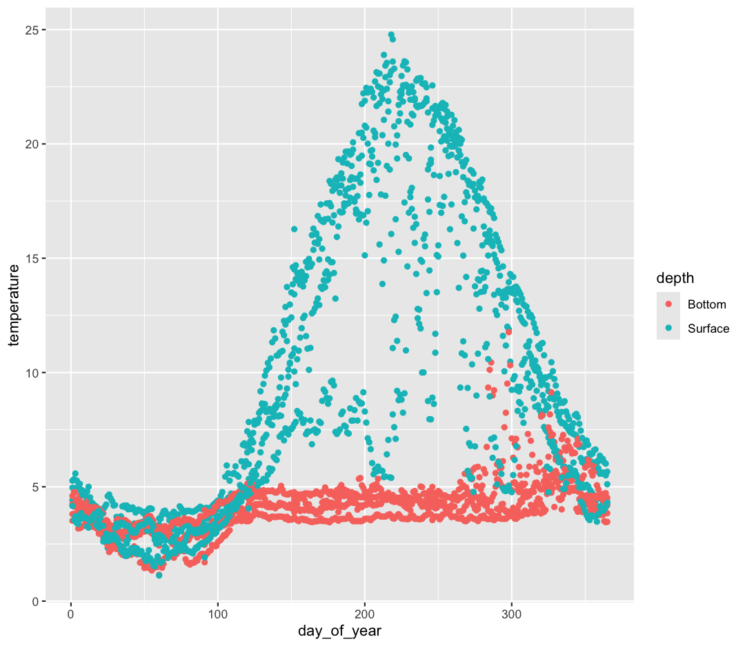
day_of_yearvariable on the x axis and temperature on the y axis. We’ve provided the code below. Notice that we’ve collapsed the plotting function options and left off some of the labels so there’s not as much code to work with. Before running the code, read through it and see if you can predict what the plot output will look like. Then run the code and check to see if you were right!ggplot(data = buoy_data) + aes(x=day_of_year, y=temperature, color=depth) + geom_point()
Hmm, the plot we created in the last exercise is a good start but it’s hard to tell which points should be connected in this time series. What’s going on? Since the dataset is more complex, the plotting options we used for the smaller dataset aren’t as useful for interpreting these data. Luckily, we can add additional attributes to our plots that will make patterns more apparent. For example, we can generate a different type of plot – perhaps a line plot – and assign attributes for columns where we might expect to see patterns.
Let’s review the columns and the types of data stored in our dataset to decide how we should group things together. To get an overview of our data object, we can look at the structure of buoy_data using the str() function.
str(buoy_data)
Pro-tip
The tidyverse also comes with a function for quickly seeing the structure of your
data.framecalledglimpse(). Try it and compare to the output fromstr()!
(You can also review the structure of your data in the Environment tab by clicking on the blue circle with the arrow in it next to your data object name.)
So, what do we see? The column names are listed after a $ symbol, and then we have a : followed by a text label. These labels correspond to the type of data stored in each column.
What kind of data do we see?
- “num” = Numeric (or non-whole number)
- “chr” = Character (categorical data)
Depending on the function and your R version, you may also see “int” or “dbl”, which corresponds to “integer” (whole numbers) and “double” (numbers with decimals).
Note In anything before R 4.0, categorical variables used to be read in as factors, which are a special data object that are used to store categorical data and have limited numbers of unique values. The unique values of a factor are tracked via the “levels” of a factor. A factor will always remember all of its levels even if the values don’t actually appear in your data. The factor will also remember the order of the levels and will always print values out in the same order (by default this order is alphabetical).
If your columns are stored as character values but you need factors for plotting, ggplot will convert them to factors for you as needed.
Our plot has a lot of points in columns which makes it hard to see trends over time. A better way to view the data showing changes over time is to use a line plot. Let’s try changing the geom to a line and see what happens.
ggplot(data = buoy_data) +
aes(x = day_of_year, y = temperature, color = depth) +
geom_line()
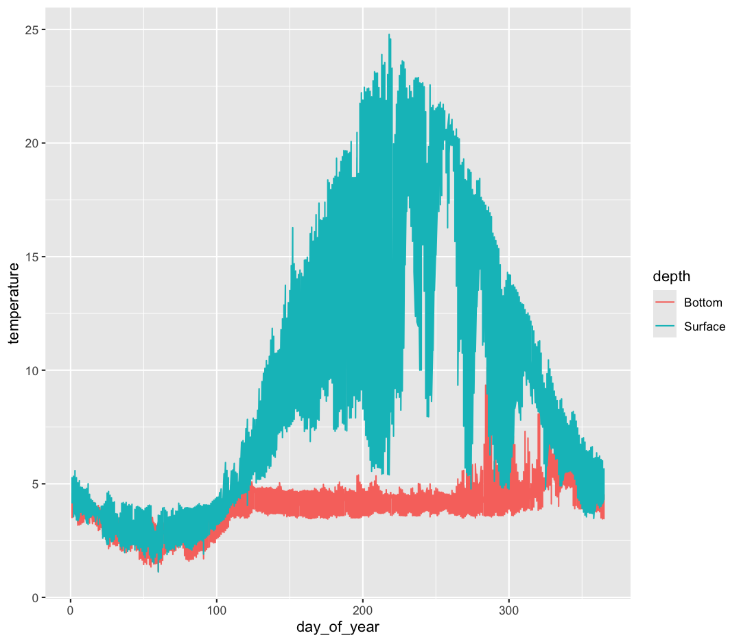
Hmm. This doesn’t look right. By setting the color value, we got a line for each depth, but the line covers all four buoy locations as well. What we really want is a line for each temperature sensor. We need to tell ggplot that we want to connect the values for each sensor value instead. To do this, we need to use the group= aesthetic.
ggplot(data = buoy_data) +
aes(x = day_of_year, y = temperature, group = sensor, color = depth) +
geom_line()
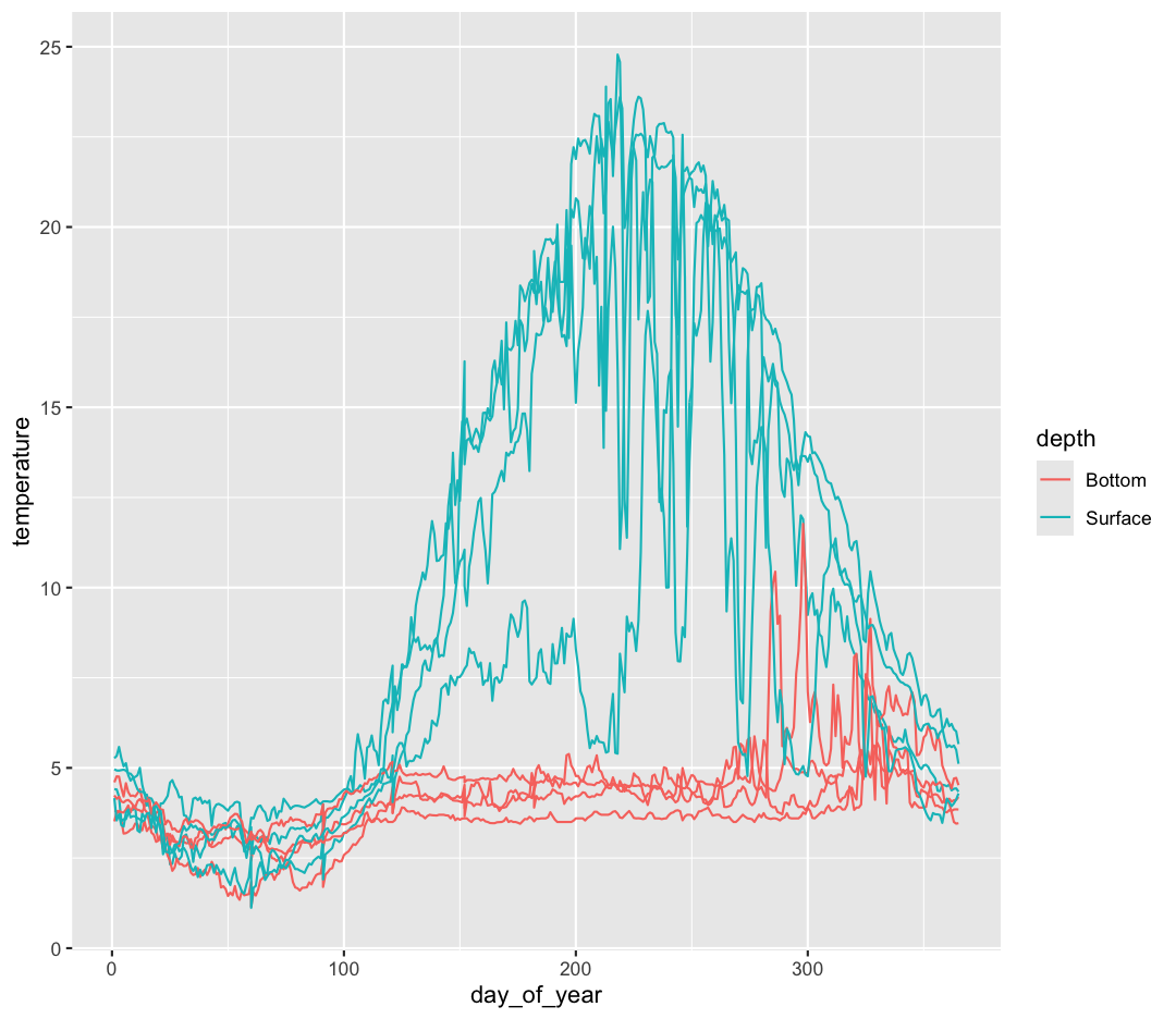
That’s looking much better!
Bonus Exercise: More line plots
Great job making your first line plot! Hmmm – one of the surface sensors warms up much slower compared to the others. What
aesargument can you change to figure out which buoy this comes from?Solution
ggplot(data = buoy_data) + aes(x = day_of_year, y = temperature, group = sensor, color = buoy) + geom_line()
The Toronto buoy warms up much slower compared to the other three buoys.
Facets
The plot we made above does a good job of demonstrating the overall differences between surface and bottom sensors. However, it in some sections it’s difficult to see trends for each buoy because the lines vary so much on top of each other. If you have a lot of different columns to try to plot or have distinguishable subgroups in your data, a powerful plotting technique called faceting might come in handy. When you facet your plot, you basically make a bunch of smaller plots and combine them together into a single image. Luckily, ggplot makes this very easy. Let’s start with our plot from above.
ggplot(data = buoy_data) +
aes(x = day_of_year, y = temperature, group = sensor, color = depth) +
geom_line()

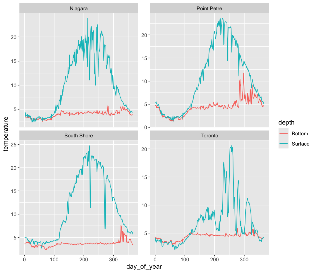
Now, let’s make four separate plots, which correspond to each buoy. We can do this with facet_wrap()
ggplot(data = buoy_data) +
aes(x = day_of_year, y = temperature, group = sensor, color = depth) +
geom_line() +
facet_wrap(~buoy)
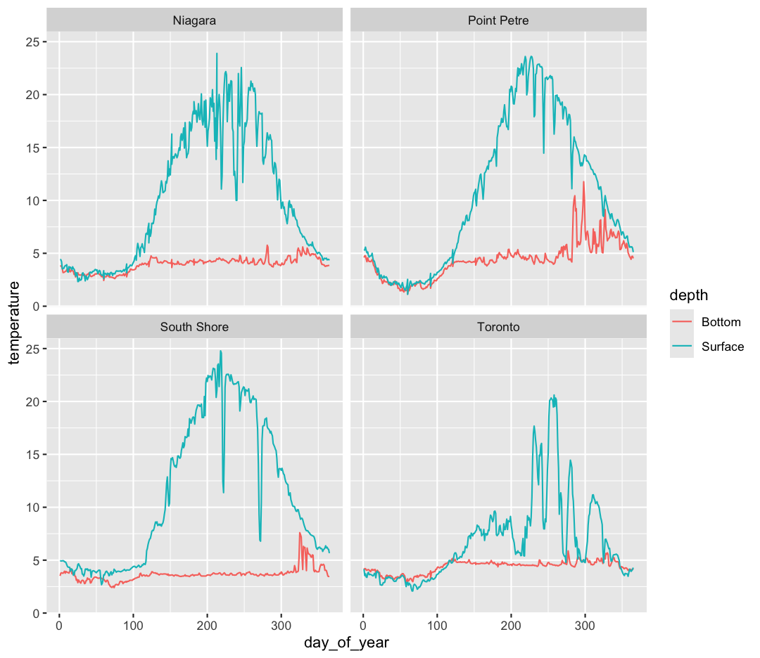
Note that facet_wrap requires this ~ in order to pass in the column names. You can interpret the ~ as “facet by this. We can see in this output that we get a separate box with a label for each buoy so that only the lines for the buoy are in that box. Now it is much easier to see trends in our data! We see that while surface waters are often much warmer than bottom waters, there can be sudden drops in temperature. As limnologists (people who study lakes), we call these “upwellings”. Through our analyses, we can see these upwellings are more common near Toronto than near Niagara!
Bonus Exercise: Free axes on faceted plots
Often, the range of values between facets is very different; for example, Toronto’s max temperature is five degrees less than the South Shore station. Perhaps we want to emphasise the trends within each group, with less concern about comparing values between facets. We can modify the range of facet axes by adding the argument
scales =inside ourfacet_wrapcommand.Example solution
ggplot(data = buoy_data) + aes(x = day_of_year, y = temperature, group = sensor, color = depth) + geom_line() + facet_wrap(~buoy, scales = "free_y")
The other faceting function ggplot provides is facet_grid(). The main difference is that facet_grid() will make sure all of your smaller boxes share a common axis. In this example, we will stack all the boxes on top of each other into rows so that their x axes all line up.
ggplot(data = buoy_data) +
aes(x = day_of_year, y = temperature, group = sensor, color = depth) +
geom_line() +
facet_grid(rows = vars(buoy))
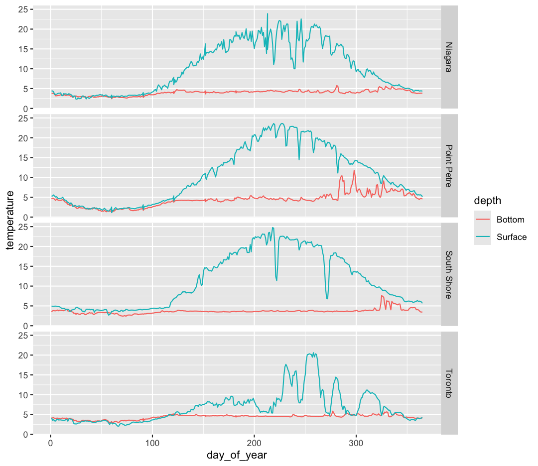
Unlike the facet_wrap output where each box got its own x and y axis, with facet_grid(), there is only one x axis along the bottom. We also used the function vars() to make it clear we’re referencing the column buoy.
Discrete Plots
So far we’ve looked at two plot types (geom_point and geom_line) which work when both the x and y values are numeric. But sometimes you may have one of your values be discrete (a factor or character).
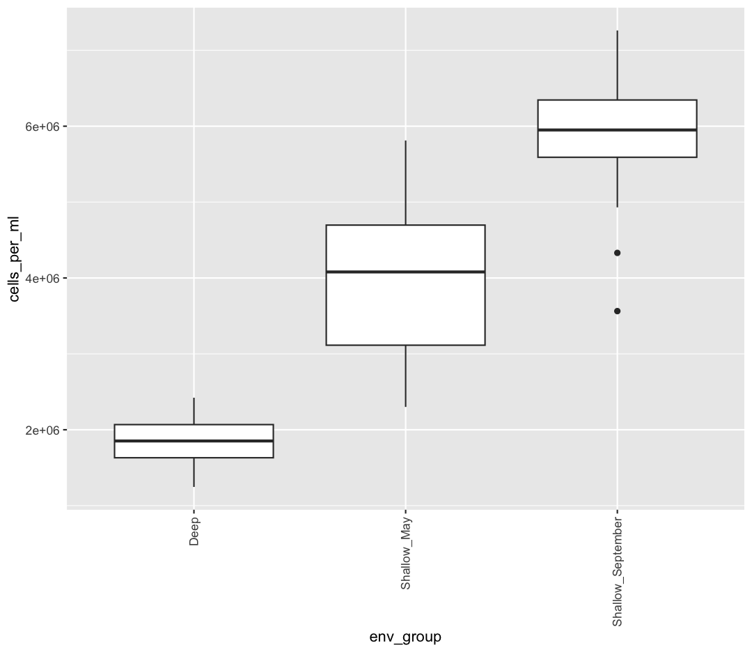
We are going to return to our sample_data dataframe to practice some new plot types. We’ve previously used the discrete values of the env_group column to color in our points. But now let’s try moving that variable to the x axis. Let’s say we are curious about comparing the distribution of the cell abundance values for each of the different env_groups. We can do so using a box plot. Try this out yourself in the exercise below!
Box plots
Using the
sample_datadata, use ggplot to create a box plot with env_group on the x axis and cells_per_ml on the y axis. You can use the examples from earlier in the lesson as a template to remember how to pass ggplot data and map aesthetics and geometries onto the plot. If you’re really stuck, feel free to use the internet as well!Solution
ggplot(data = sample_data) + aes(x = env_group, y = cells_per_ml) + geom_boxplot()
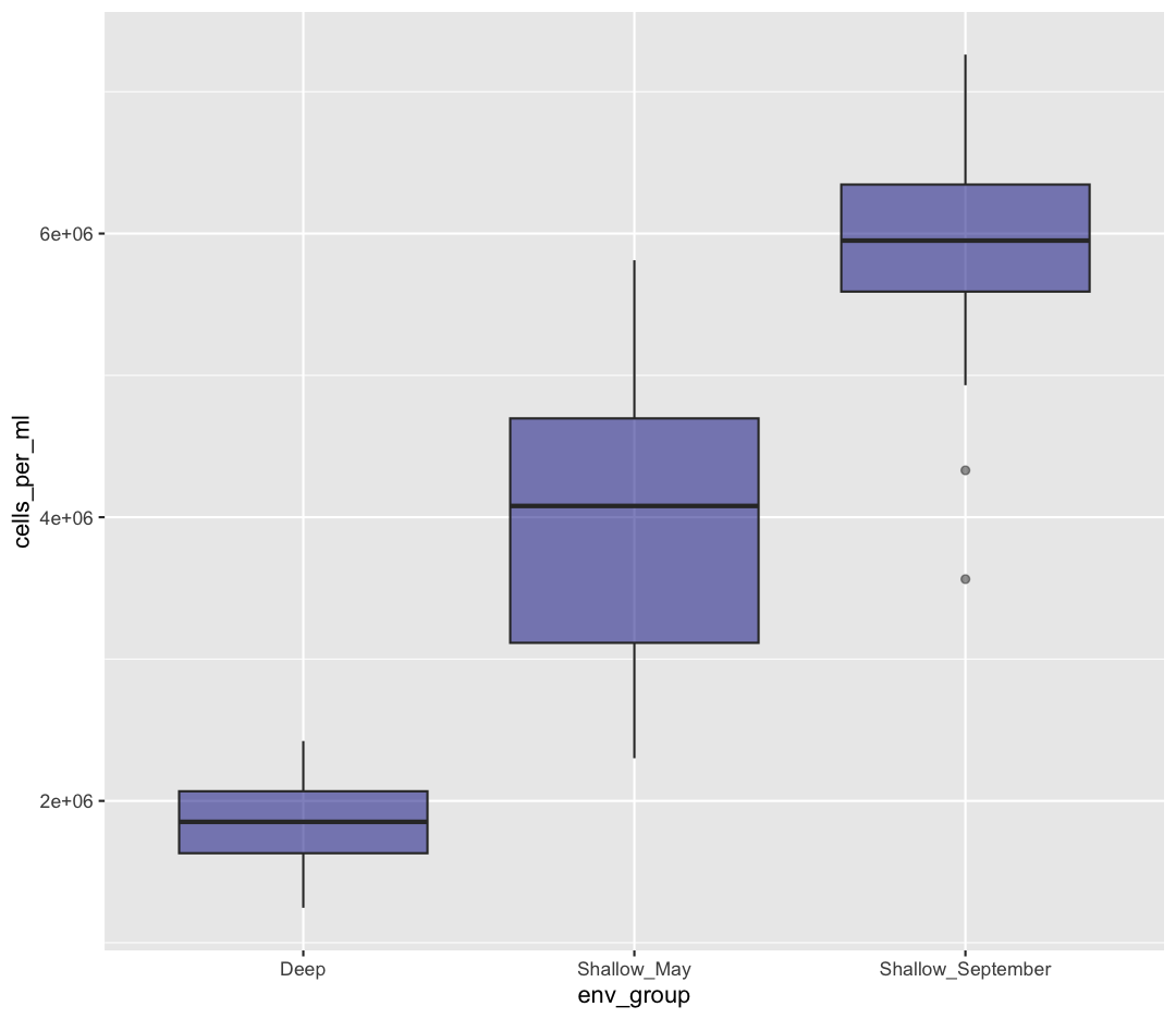
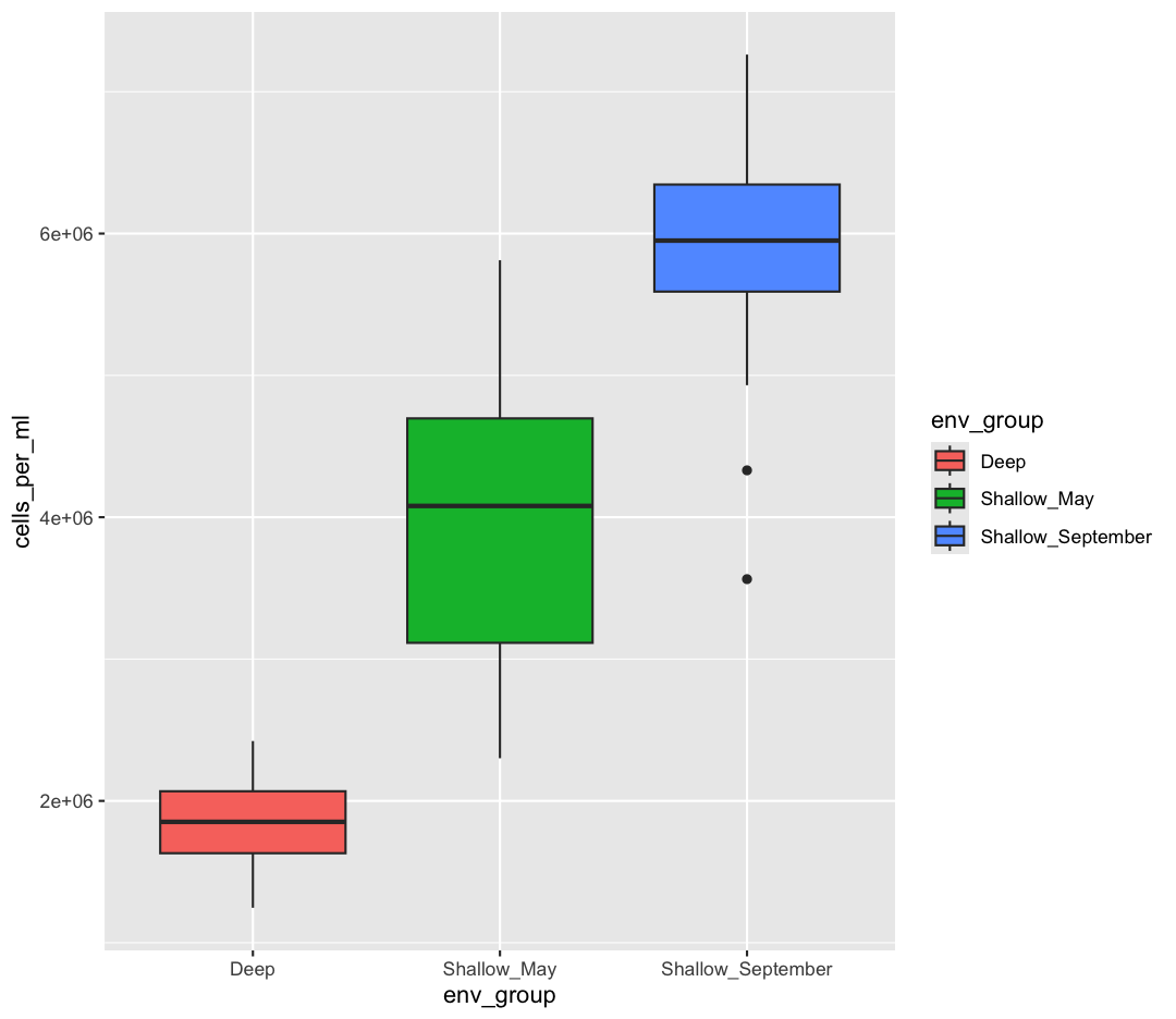
This type of visualization makes it easy to compare the range and spread of values across groups. The “middle” 50% of the data is located inside the box and outliers that are far away from the central mass of the data are drawn as points.
Bonus Exercise: Other discrete geoms
Take a look a the ggplot “data visualization” cheat sheet. Find all the geoms listed under “one discrete, one continuous”. Try replacing
geom_boxplotwith one of these other functions.Example solution
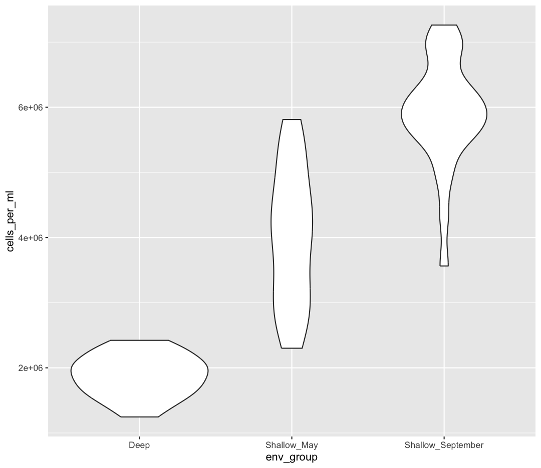
ggplot(data = sample_data) + aes(x = env_group, y = cells_per_ml) + geom_violin()
Layers
So far we’ve only been adding one geom to each plot, but each plot object can actually contain multiple layers and each layer has it’s own geom. Let’s start with a basic boxplot:
ggplot(data = sample_data) +
aes(x = env_group, y = cells_per_ml) +
geom_boxplot()
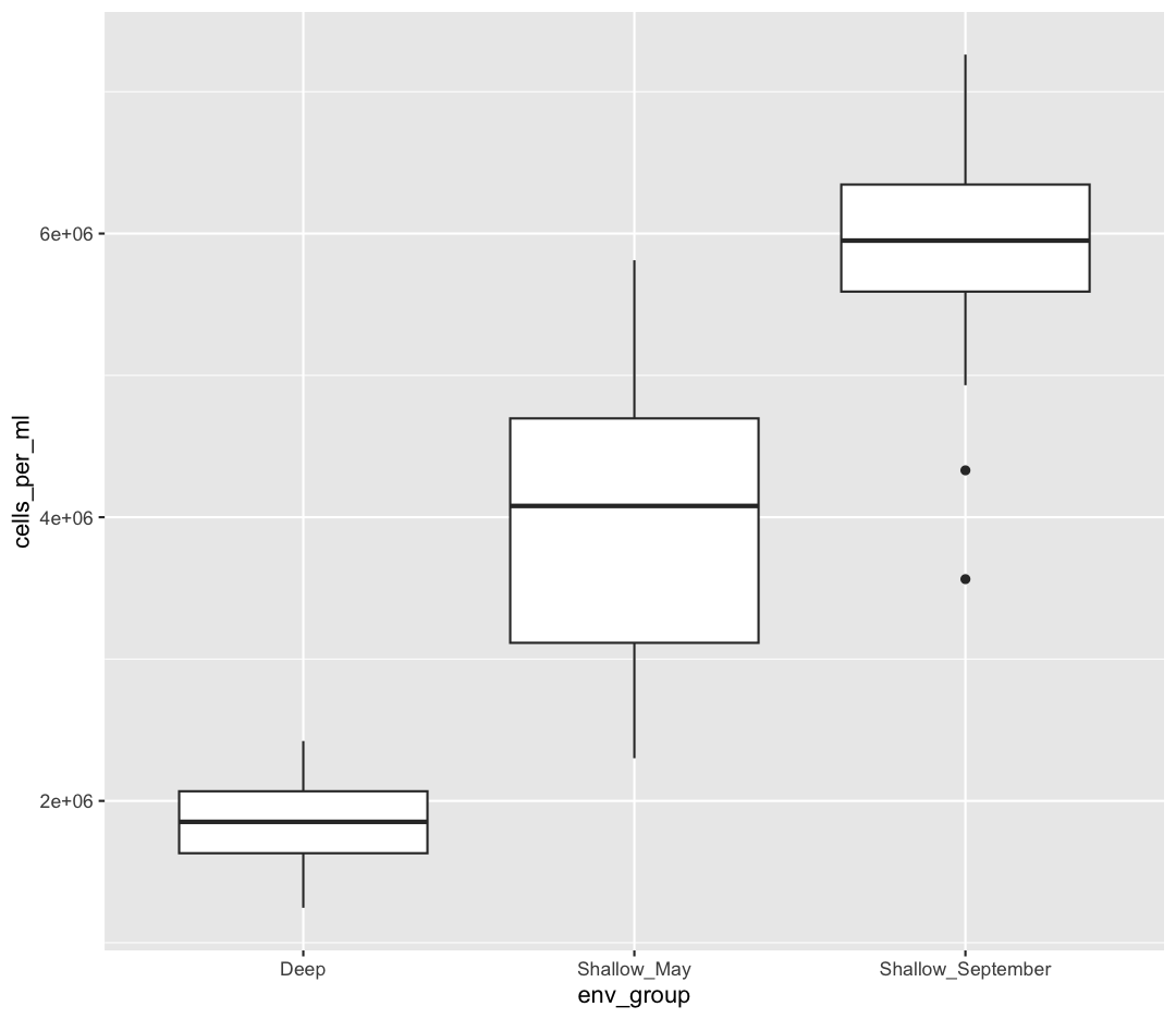
Box plots are a great way to see the overall spread of your data. However, it is good practice to also give your reader as sense of how many observations have gone into your boxplots. To do so, we can plot each observation as an individual point, on top of the boxplot.
ggplot(data = sample_data) +
aes(x = env_group, y = cells_per_ml) +
geom_boxplot() +
geom_point()
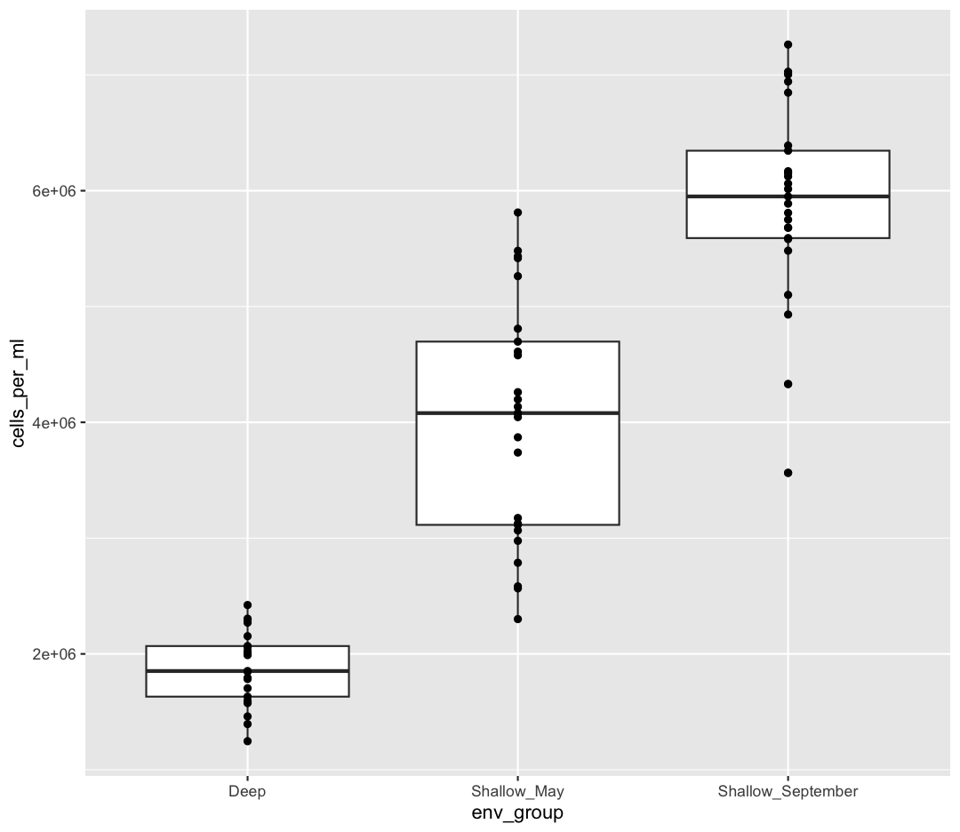
OK, we’ve drawn the points but most of them stack up on top of each other. One way to make it easier to see all the data is to “jitter” the points, or move them around randomly so they don’t stack up on top of each other. To do this, we use geom_jitter rather than geom_point
ggplot(data = sample_data) +
aes(x = env_group, y = cells_per_ml) +
geom_boxplot() +
geom_jitter()
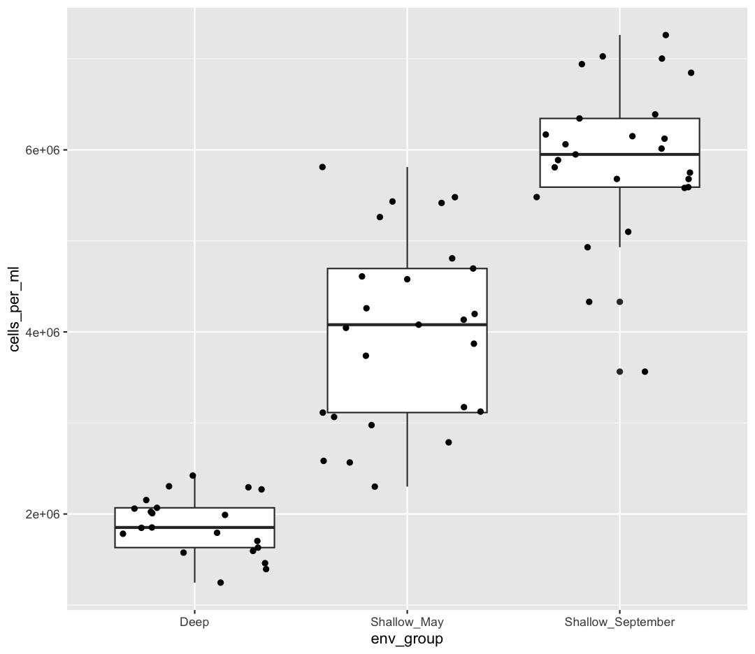
Be aware that these movements are random so your plot will look a bit different each time you run it!
Now let’s try switching the order of geom_boxplot and geom_jitter. What happens? Why?
ggplot(data = sample_data) +
aes(x = env_group, y = cells_per_ml) +
geom_jitter() +
geom_boxplot()
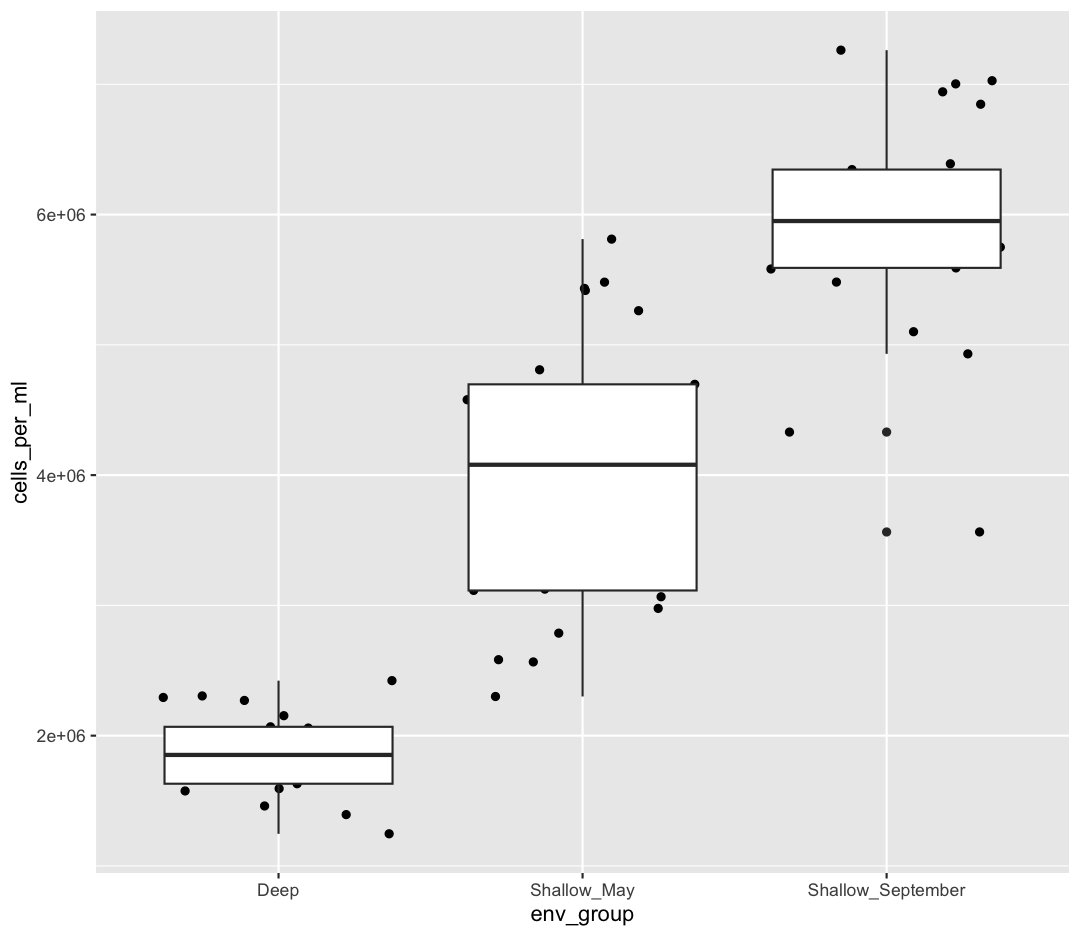
Since we plot the geom_jitter layer first, the boxplot layer is placed on top of the geom_jitter layer, so we cannot see most of the points.
Note that each layer can have it’s own set of aesthetic mappings. So far we’ve been using aes() outside of the other functions. When we do this, we are setting the “default” aesthetic mappings for the plot. We could do the same thing by passing the values to the ggplot() function call as is sometimes more common:
ggplot(data = sample_data, mapping = aes(x = env_group, y = cells_per_ml)) +
geom_boxplot() +
geom_jitter()
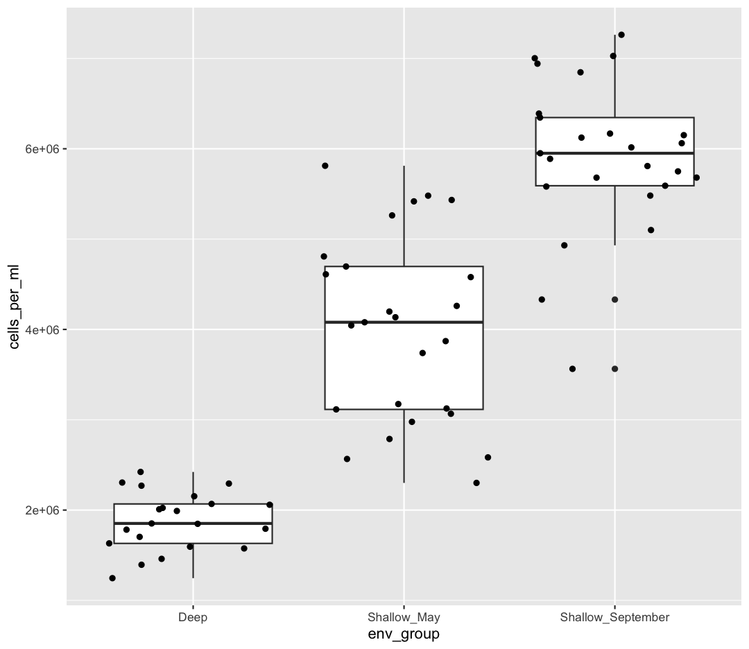
However, we can also use aesthetic values for only one layer of our plot. To do that, you an place an additional aes() inside of that layer. For example, what if we want to change the size for the points so they are scaled by chlorophyll, but we don’t want to change the box plot? We can do:
ggplot(data = sample_data) +
aes(x = env_group, y = cells_per_ml) +
geom_boxplot() +
geom_jitter(aes(size = chlorophyll))
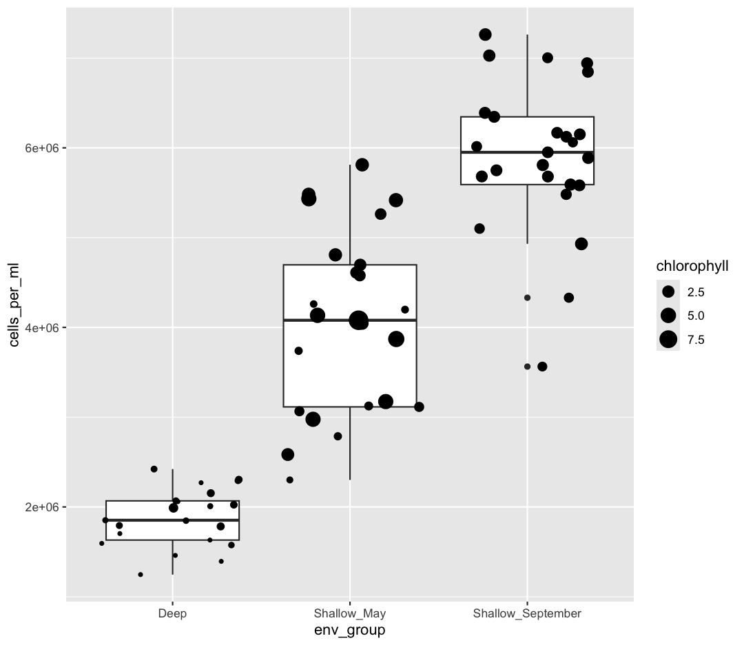
Both geom_boxplot and geom_jitter will inherit the default values of aes(env_group, cells_per_ml) but only geom_jitter will also use aes(size = chlorophyll).
Functions within functions
In the two examples above, we placed the
aes()function inside another function – see how in the line of codegeom_jitter(aes(size = chlorophyll)),aes()is nested insidegeom_jitter()? When this happens, R evaluates the inner function first, then passes the output of that function as an argument to the outer function.Take a look at this simpler example. Suppose we have:
sum(2, max(6,8))First R calculates the maximum of the numbers 6 and 8 and returns the value 8. It passes the output 8 into the sum function and evaluates:
sum(2, 8)[1] 10
Color vs. Fill
Let’s say we want to spice up our plot a bit by adding some color. Maybe we want our boxplot to have a fancy color like “pink.” We can do this by explicitly setting the color aesthetic inside the geom_boxplot function. Note that because we are assigning a color directly and not using any values from our data to do so, we do not need to use the aes() mapping function. Let’s try it out:
ggplot(data = sample_data) +
aes(x = env_group, y = cells_per_ml) +
geom_boxplot(color="pink")
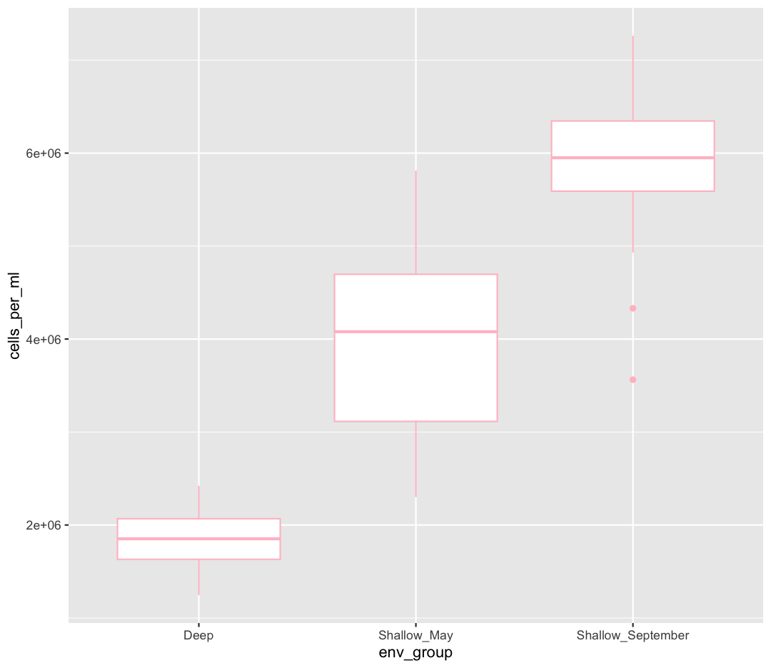
Well, that didn’t get all that colorful. That’s because objects like these boxplots have two different parts that have a color: the shape outline, and the inner part of the shape. For geoms that have an inner part, you change the fill color with fill= rather than color=, so let’s try that instead
ggplot(data = sample_data) +
aes(x = env_group, y = cells_per_ml) +
geom_boxplot(fill="pink")
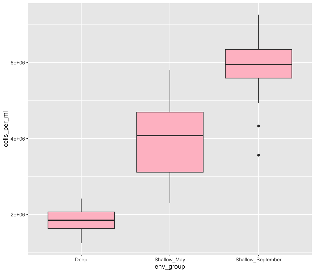
That’s some plot now isn’t it! So “pink” maybe wasn’t the prettiest color. R knows lots of color names. You can see the full list if you run colors() in the console. Since there are so many, you can randomly choose 10 if you run sample(colors(), size = 10).
choosing a color
Use
sample(colors(), size = 10)a few times until you get an interesting sounding color name and swap that out for “pink” in the violin plot example.
We could also use a variable to determine the fill. Compare this to what you see when you map the fill property to your data rather than setting a specific value.
ggplot(data = sample_data) +
aes(x = env_group, y = cells_per_ml) +
geom_boxplot(aes(fill=env_group))

But what if we want to specify specific colors for our plots? The colors that
ggplot uses are determined by the color “scale”. Each aesthetic value we can
supply (x, y, color, etc) has a corresponding scale. Let’s change the colors to
make them a bit prettier. We can do that by using the function scale_fill_manual
ggplot(data = sample_data) +
aes(x = env_group, y = cells_per_ml) +
geom_boxplot(aes(fill=env_group)) +
scale_fill_manual(values = c("pink", "tomato","orange1"))
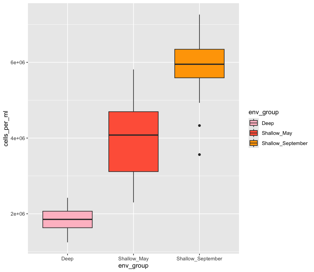
Sometimes manually choosing colors is frustrating. There are many packages which produce pre-made palettes which you can supply to your data. A common one is RColorBrewer. We can use the palettes from RColorBrewer using the scale_color_brewer function.
ggplot(data = sample_data) +
aes(x = env_group, y = cells_per_ml) +
geom_boxplot(aes(fill=env_group)) +
scale_fill_brewer(palette = "Set1")
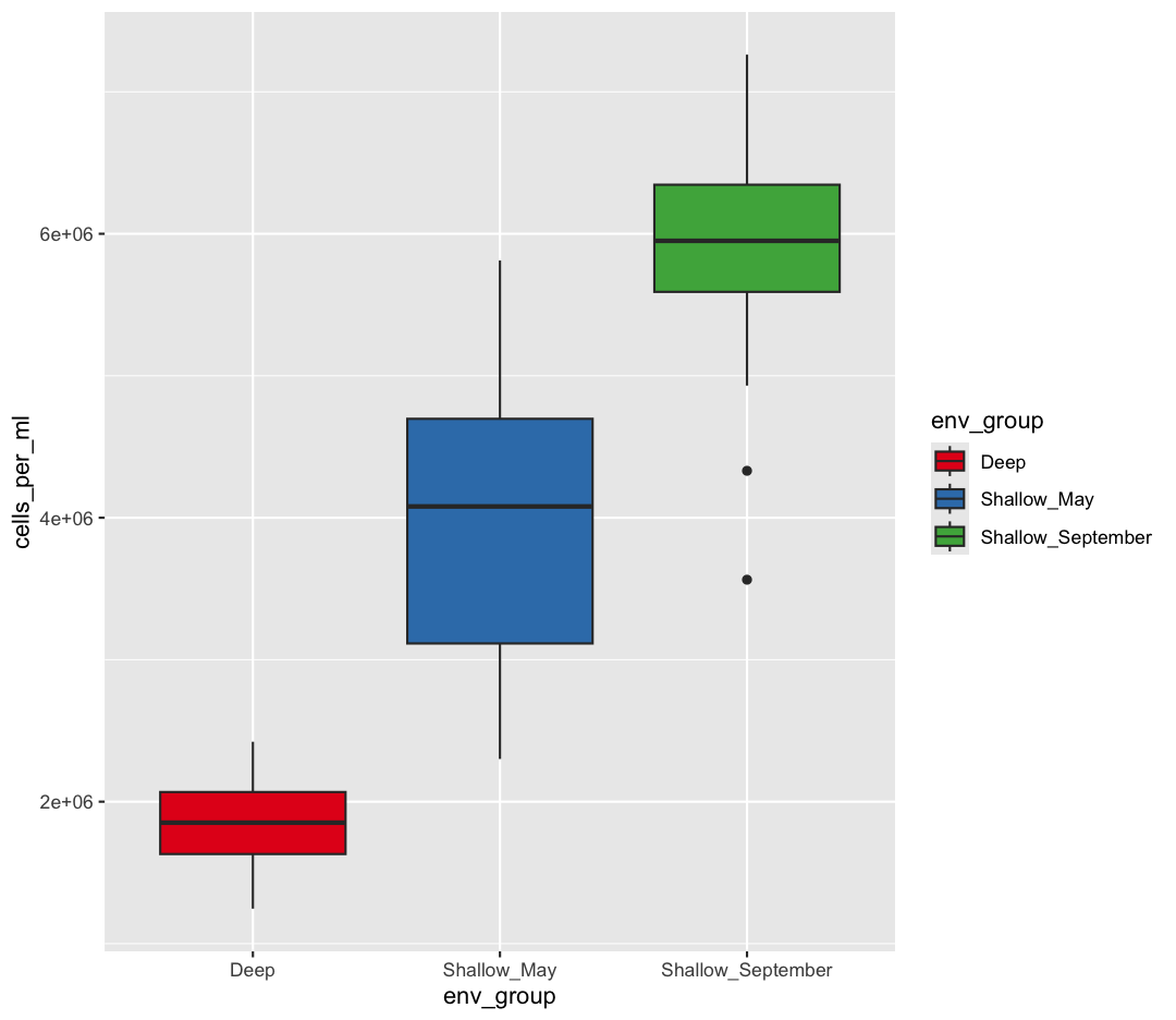
The scale_color_brewer() function is just one of many you can use to change
colors. There are bunch of “palettes” that are built-in. You can view them all
by running RColorBrewer::display.brewer.all() or check out the Color Brewer
website for more info about choosing plot colors.
There are also lots of other fun options:
Bonus Exercise: Lots of different palettes!
Play around with different color palettes. Feel free to install another package and choose one of those if you want. Pick your favorite!
Solution
You can use RColorBrewer::display.brewer.all() to pick a color palette. As a bonus, you can also use one of the packages listed above. Here’s an example:
#install.packages("wesanderson") # install package library(wesanderson) ggplot(data = sample_data) + aes(x = temperature) + labs(x = "Temperature (C)") + aes(y = cells_per_ml) + labs(y = "Cells per mL") + geom_point() + labs(title = "Does temperature affect microbial abundance?") + aes(color = env_group) + scale_color_manual(values = wes_palette('Cavalcanti1'))
Bonus Exercise: Transparency
Another aesthetic that can be changed is how transparent our colors/fills are. The
alphaparameter decides how transparent to make the colors. By default,alpha = 1, and our colors are completely opaque. Decreasingalphaincreases the transparency of our colors/fills. Try changing the transparency of our boxplot. (Hint: Should alpha be inside or outsideaes()?)Solution
ggplot(data = sample_data) + aes(x = env_group, y = cells_per_ml) + geom_boxplot(fill="darkblue", alpha = 0.5)
Changing colors
What happens if you run:
ggplot(data = sample_data) + aes(x = env_group, y = cells_per_ml) + geom_boxplot(aes(fill = "springgreen"))
Why doesn’t this work? How can you fix it? Where does that color come from?
Solution
In this example, you placed the fill inside the
aes()function. Because you are using an aesthetic mapping, the “scale” for the fill will assign colors to values - in this case, you only have one value: the word “springgreen.” Instead, trygeom_boxplot(fill = "springgreen").
Univariate Plots
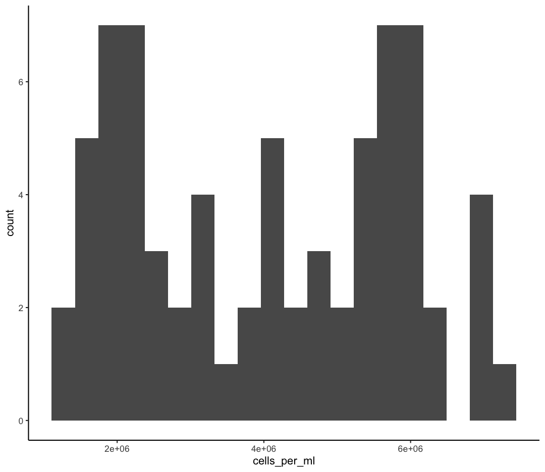
We jumped right into making plots using multiple variables. But what if we wanted to take a look at just one column? In that case, we only need to specify a mapping for x and choose an appropriate geom. Let’s start with a histogram to see the range and spread of the cell abundance values
ggplot(sample_data) +
aes(x = cells_per_ml) +
geom_histogram()
`stat_bin()` using `bins = 30`. Pick better value with `binwidth`.
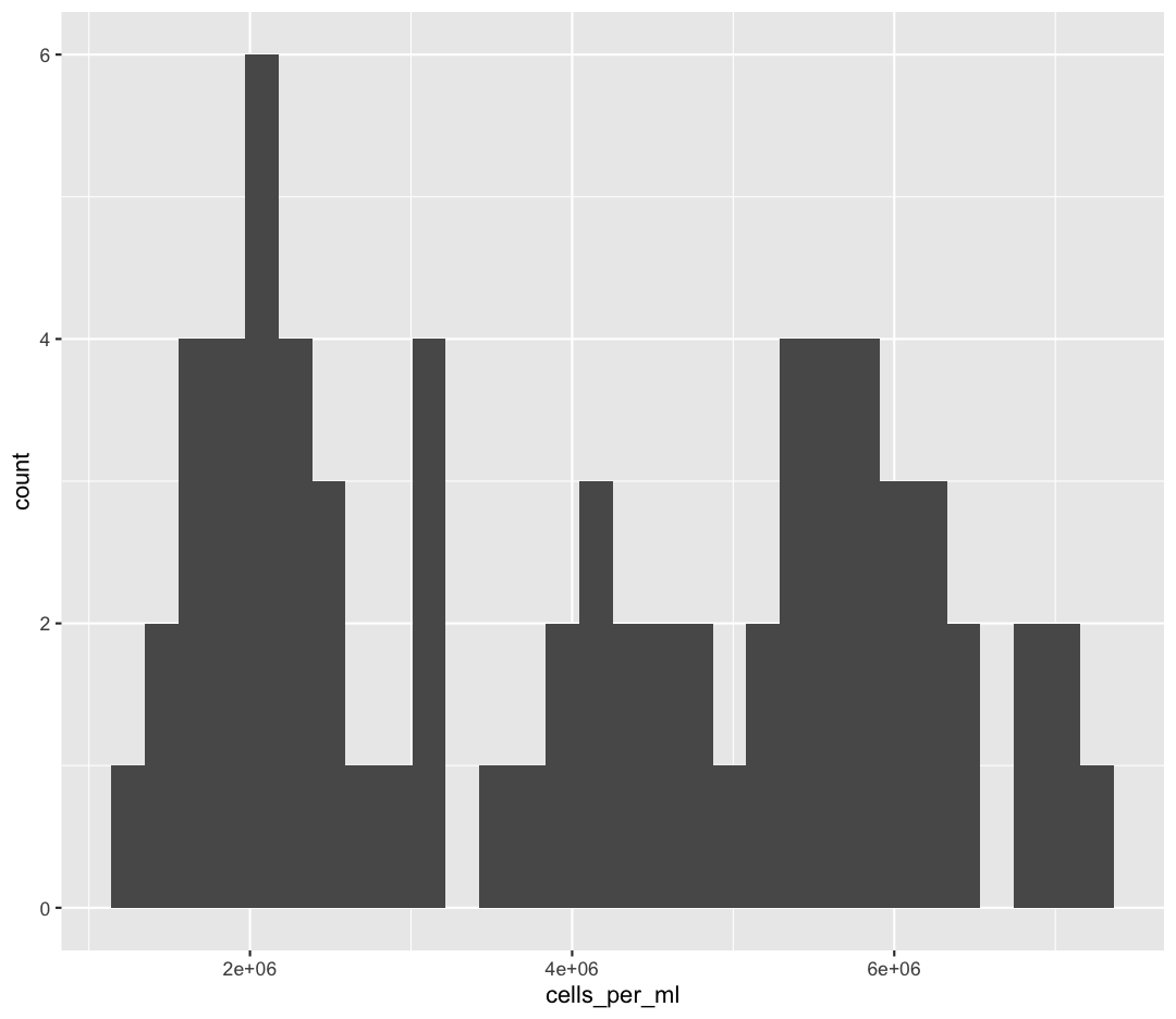
You should not only see the plot in the plot window, but also a message telling you to choose a better bin value. Histograms can look very different depending on the number of bars you decide to draw. The default is 30. Let’s try setting a different value by explicitly passing a bin= argument to the geom_histogram later.
ggplot(sample_data) +
aes(x = cells_per_ml) +
geom_histogram(bins=10)
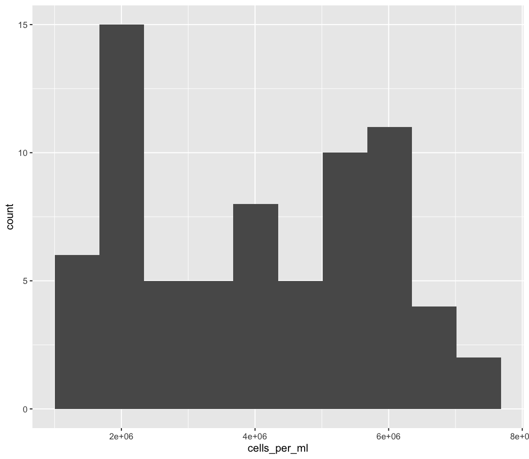
Try different values like 5 or 50 to see how the plot changes.
Bonus Exercise: One variable plots
Rather than a histogram, choose one of the other geometries listed under “One Variable” plots on the ggplot cheat sheet. Note that we used
cells_per_mlhere which has continuous values. If you want to try the discrete options, try mappingenv_groupto x instead.Example solution
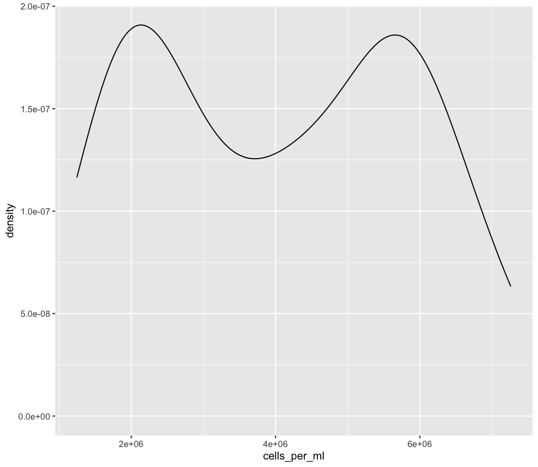
ggplot(sample_data) + aes(x = cells_per_ml) + geom_density()
Bonus Exercise: One variable plots with a fill parameter
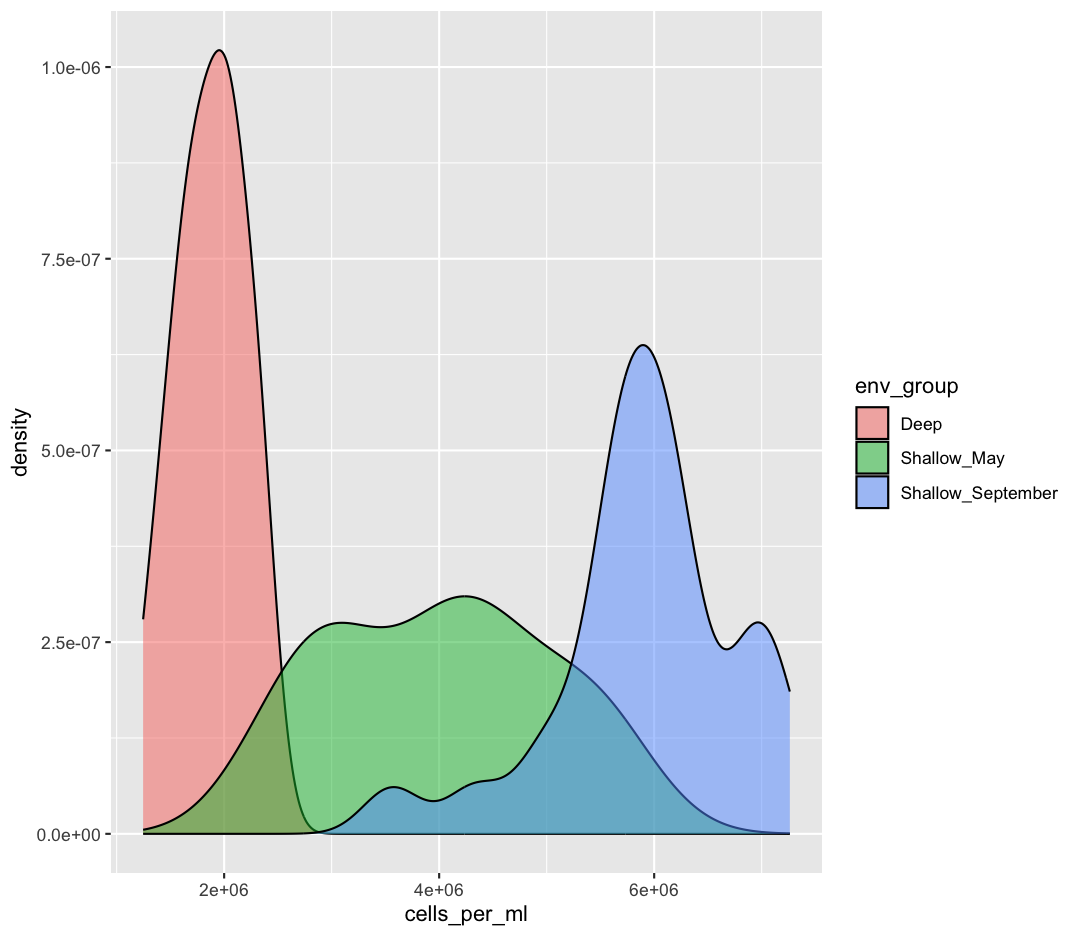
From our previous work, we know that the distributions of cell abundances are very different between our environmental groups. How can we modulate the
fillparameter of our density plot to show the differences between these groups?Example solution
ggplot(sample_data) + aes(x = cells_per_ml) + geom_density(aes(fill = env_group), alpha = 0.5)
Plot Themes
Our plots are looking pretty nice, but what’s with that grey background? While you can change various elements of a ggplot object manually (background color, grid lines, etc.) the ggplot package also has a bunch of nice built-in themes to change the look of your graph. For example, let’s try adding theme_classic() to our histogram:
ggplot(data = sample_data) +
aes(x = env_group, y = cells_per_ml) +
geom_boxplot() +
theme_classic()
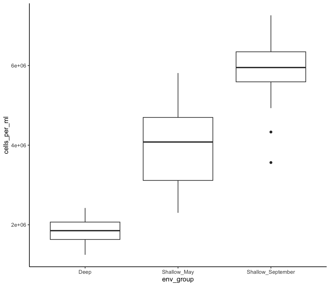
Try out a few other themes, to see which you like: theme_bw(), theme_linedraw(), theme_minimal().
Rotating x axis labels
Often, you’ll want to change something about the theme that you don’t know how to do off the top of your head. When this happens, you can do an Internet search to help find what you’re looking for. To practice this, search the Internet to figure out how to rotate the x axis labels 90 degrees. Then try it out using the boxplot we made above.
Solution
ggplot(sample_data) + aes(x = env_group, y = cells_per_ml) + geom_boxplot() + theme(axis.text.x = element_text(angle = 90, vjust = 0.5, hjust=1))
Saving plots
We’ve made a bunch of plots today, but we never talked about how to share them with your friends who aren’t running R! It’s wise to keep all the code you used to draw the plot, but sometimes you need to make a PNG or PDF version of the plot so you can share it with your PI or post it to your Instagram story.
One that’s easy if you are working in RStudio interactively is to use “Export” menu on the Plots tab. Clicking that button gives you three options “Save as Image”, “Save as PDF”, and “Copy To Clipboard”. These options will bring up a window that will let you resize and name the plot however you like.
A better option if you will be running your code as a script from the command line or just need your code to be more reproducible is to use the ggsave() function. When you call this function, it will write the last plot printed to a file in your local directory. It will determine the file type based on the name you provide. So if you call ggsave("plot.png") you’ll get a PNG file or if you call ggsave("plot.pdf") you’ll get a PDF file. By default the size will match the size of the Plots tab. To change that you can also supply width= and height= arguments. By default these values are interpreted as inches. So if you want a wide 4x6 image you could do something like:
ggsave("awesome_plot.jpg", width=6, height=4)
Saving a plot
Try rerunning one of your plots and then saving it using
ggsave(). Find and open the plot to see if it worked!Example solution
ggplot(sample_data) + aes(x = cells_per_ml) + geom_histogram(bins = 20)+ theme_classic()
ggsave("awesome_histogram.jpg", width=6, height=4)Check your current working directory to find the plot!
You also might want to just temporarily save a plot while you’re using R, so that you can come back to it later. Luckily, a plot is just an object, like any other object we’ve been working with! Let’s try storing our boxplot from earlier in an object called box_plot:
box_plot <- ggplot(data = sample_data) +
aes(x = env_group, y = cells_per_ml) +
geom_boxplot(aes(fill=env_group))
Now if we want to see our plot again, we can just run:
box_plot

We can also add changes to the plot. Let’s say we want our boxplot to have the black-and-white theme:
box_plot + theme_bw()
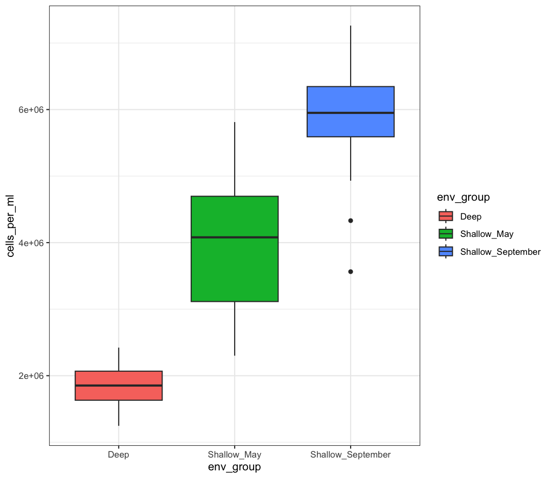
Watch out! Adding the theme does not change the box_plot object! If we want to change the object, we need to store our changes:
box_plot
box_plot <- box_plot + theme_bw()
box_plot

We can also save any plot object we have named, even if they were not the plot that we ran most recently. We just have to tell ggsave() which plot we want to save:
ggsave("awesome_box_plot.jpg", plot = box_plot, width=6, height=4)
Bonus Exercise: Create and save a plot
Now try it yourself! Create your own plot using
ggplot(), store it in an object namedmy_plot, and save the plot usingggsave().Example solution
my_plot <- ggplot(data = sample_data)+ aes(x = env_group, y = temperature)+ geom_boxplot(fill = "orange")+ theme_bw()+ labs(x = "env_group", y = "Temperature (C)") ggsave("my_awesome_plot.jpg", plot = my_plot, width=6, height=4)
Glossary of terms
- Aesthetic: a visual property of the objects (geoms) drawn in your plot (like x position, y position, color, size, etc)
- Aesthetic mapping (aes): This is how we connect a visual property of the plot to a column of our data
- Comments: lines of text in our code after a
#that are ignored (not evaluated) by R - Geometry (geom): this describes the things that are actually drawn on the plot (like points or lines)
- Facets: Dividing your data into non-overlapping groups and making a small plot for each subgroup
- Layer: Each ggplot is made up of one or more layers. Each layer contains one geometry and may also contain custom aesthetic mappings and private data
- Factor: a way of storing data to let R know the values are discrete so they get special treatment
Key Points
R is a free programming language used by many for reproducible data analysis.
Geometries are the visual elements drawn on data visualizations (lines, points, etc.), and aesthetics are the visual properties of those geometries (color, position, etc.).
Use
ggplot()and geoms to create data visualizations, and save them usingggsave().
The Unix Shell
Overview
Teaching: 90 min
Exercises: 15 minQuestions
What is a command shell and why would I use one?
How can I move around on my computer?
How can I see what files and directories I have?
How can I specify the location of a file or directory on my computer?
How can I create, copy, and delete files and directories?
How can I edit files?
Objectives
Explain how the shell relates to users’ programs.
Explain when and why command-line interfaces should be used instead of graphical interfaces.
Construct absolute and relative paths that identify specific files and directories.
Demonstrate the use of tab completion and explain its advantages.
Create a directory hierarchy that matches a given diagram.
Create files in the directory hierarchy using an editor or by copying and renaming existing files.
Delete, copy, and move specified files and/or directories.
Contents
Introducing the Shell
Motivation
Usually you move around your computer and run programs through graphical user interfaces (GUIs). For example, Finder for Mac and Explorer for Windows. These GUIs are convenient because you can use your mouse to navigate to different folders and open different files. However, there are some things you simply can’t do from these GUIs.
The Unix Shell (or the command line) allows you to do everything you would do through Finder/Explorer, and a lot more. But it’s so scary! I thought so at first, too. Since then, I’ve learned that it’s just another way to navigate your computer and run programs, and it can be super useful for your work. For instance, you can use it to combine existing tools into a pipeline to automate analyses, you can write a script to do things for you and improve reproducibility, you can interact with remote machines and supercomputers that are far away from you, and sometimes it’s the only option for the program you want to run.
We’re going to use it to:
- Organize our R code and plots from the R plotting lesson.
- Perform version control using git during the rest of the workshop.
What the Shell looks like
When you open up the terminal for the first time, it can look pretty scary - it’s basically just a blank screen. Don’t worry - we’ll take you through how to use it step by step.
The first line of the shell shows a prompt - the shell is waiting for an input. When you’re following along in the lesson, don’t type the prompt when typing commands. To make the prompt the same for all of us, run this command:
PS1='$ '
Tree Structure
The first thing we need to learn when using the shell is how to get around our computer.
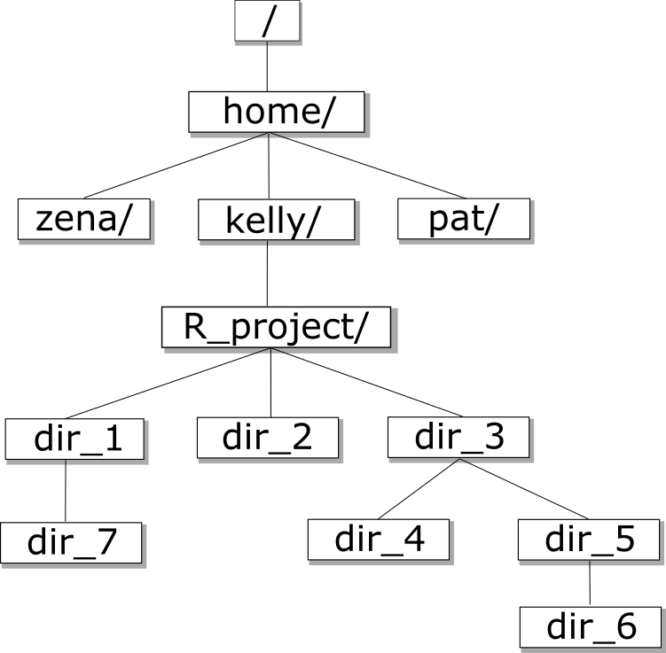
The shell folder (directory) structure is the same file structure as you’re used to.
We call the way that different directories are nested the “directory tree”.
You start at the root directory (/) and you can move “up” and “down” the tree. Here’s an example:
Now that we understand directory trees a bit, let’s check it out from the command line.
We can see where we are by using the command pwd which stands for “print working directory”, or the directory we are currently in:
pwd
/home/USERNAME/
Congrats! You just ran your first command from the command line. The output is a file path to a location (a directory) on your computer.
The output will look a little different depending on what operating system you’re using:
- Mac:
/Users/USERNAME - Linux:
/home/USERNAME - Windows:
/c/Users/USERNAME
Let’s check to see what’s in your home directory using the ls command, which lists all of the files in your working directory:
ls
Desktop Downloads Movies Pictures
Documents Library Music Public
You should see some files and directories you’re familiar with such as Documents and Desktop.
If you make a typo, don’t worry. If the shell can’t find a command you type, it will show you a helpful error message.
ks
ks: command not found
This error message tells us the command we tried to run, ks, is not a command that is recognized, letting us know we might have made a mistake when typing.
Man and Help
Often we’ll want to learn more about how to use a certain command such as ls. There are several different ways you can
learn more about a specific command.
Some commands have additional information that can be found by using the -h or --help
flags. Others require a special command called man to print the help manual for that command. Let’s run an experiment - try finding help with the ls command using either flags (ls --help) or the man command (man ls). What worked for you?
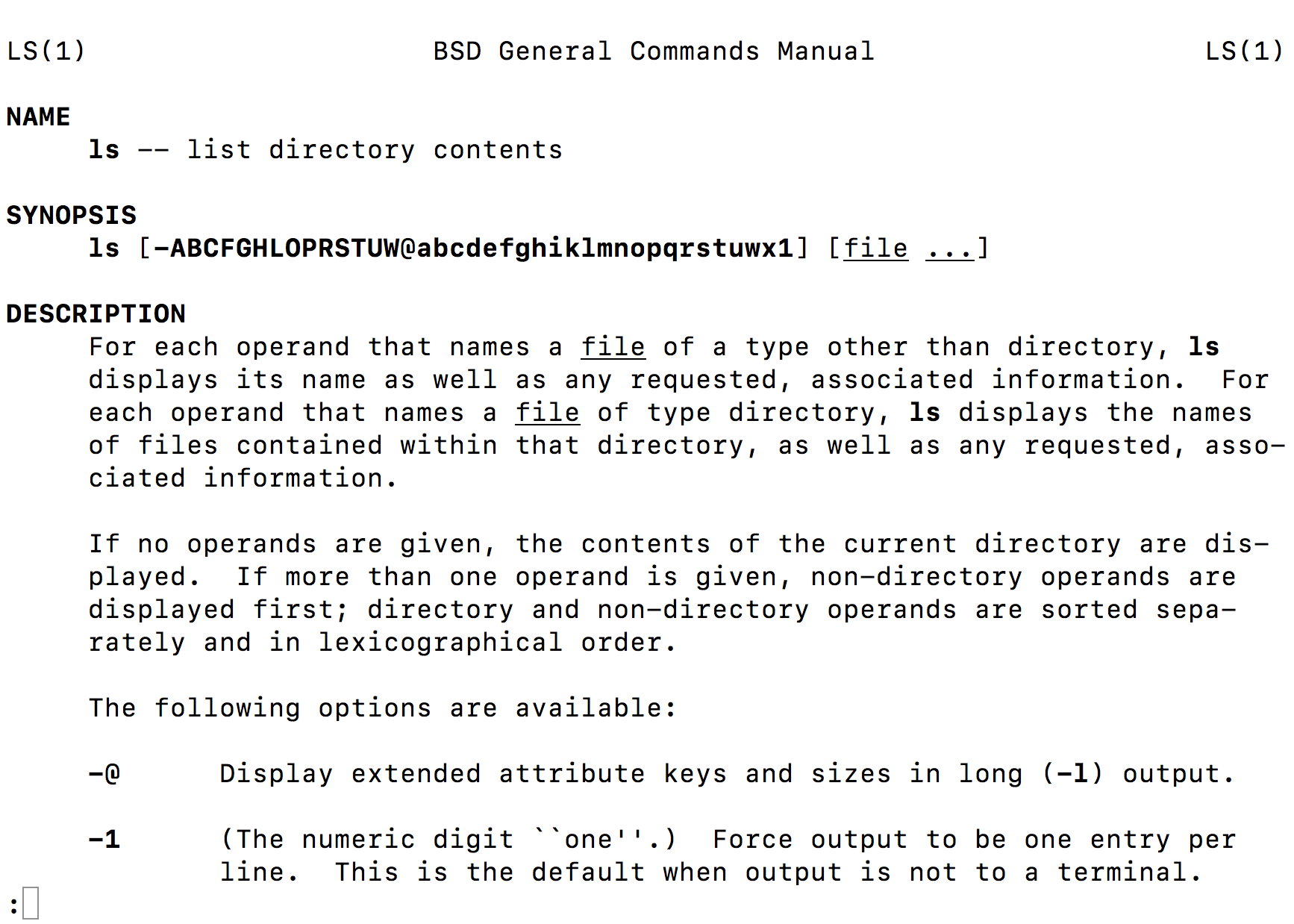
For Macs and Linux operating systems, we need the man command, while the bash emulator on windows uses the help flags.
On the manual page for ls, we see a section titled options. These options, also called flags, are similar to arguments in R functions, and allow us to customize how ls runs.
To get out of the man page on a Mac, click q.
Sometimes, commands will have multiple flags that we want to use at the same time. For example,
ls has a flag -F that displays a slash after all directories, as well as a flag -a that
includes hidden files and directories (ones that begin with a .). There are two ways to run
ls using both of these flags:
ls -F -a
ls -Fa
Note that when we run the -a command, we see a . and a .. in the directory. The . corresponds to the current directory we are in and the .. corresponds to the directory directly above us in the directory tree. We’ll learn more about why this is useful in a bit.
Using the Manual Pages
Use
manto open the manual for the commandls.What flags would you use to…
- Print files in order of size?
- Print files in order of the last time they were edited?
- Print more information about the files?
- Print more information about the files with unit suffixes?
- Print files in order of size AND also print more information about the files?
Solution
ls -Sls -tls -lls -lhls -lS
Next, let’s move to our Desktop. To do this, we use cd to change directories.
Run the following command:
cd Desktop
Copy: Ctrl Ins Paste: Shift Ins
Copy and Paste in Windows Bash Emulator
One of my biggest frustrations when I began using a bash emulator on Windows is that my normal commands for copy (Ctrl+c) paste (Ctrl+v) didn’t work! In Git Bash (our bash emulator), we can instead right click and select those options manually, or use Ctrl+Ins for copy and Shift+Ins.
Let’s see if we’re in the right place:
pwd
/home/USERNAME/Desktop
We just moved down the directory tree into the Desktop directory.
What files and directories do you have on your Desktop? How can you check?
ls
list.txt
ontario-report
notes.pdf
Untitled.png
Your Desktop will likely look different, but the important thing is that you see the folder we worked in for the R plotting lesson.
Is the ontario-report directory listed on your Desktop?
Finding Your Desktop on OneDrive
Many windows use OneDrive to backup their files to cloud storage (this is a great idea!). However, it can make navigating file paths a little more complicated. When you type
lsin your home directory, do you see something likeOneDrive - Cornell University?If so, we may need to explicitly navigate to the Desktop directory that lives in our Cornell OneDrive. We can do so with the following command:
cd 'OneDrive - Cornell University/Desktop'The apostrophes are necessary, because our file path has spaces in it, which Unix will otherwise interpret as separate arguments. If you run
ls, do you see the ontario-report folder now?
How can we get into the ontario-report directory?
cd ontario-report
We just went down the directory tree again.
Let’s see what files are in ontario-report:
ls
awesome_plot.jpg
awesome_box_plot.jpg
buoy_data.csv
plotting.R
sample_data.csv
taxon_abundance.csv
Is it what you expect? Are the files you made in the R plotting lesson there?
Now let’s move back up the directory tree. First, let’s try this command:
cd Desktop
cd: Desktop: No such file or directory
This doesn’t work because the Desktop directory is not within the directory that we are currently in.
To move up the directory tree, you can use .., which is the parent of the current directory:
cd ..
pwd
/home/USERNAME/Desktop
/c/Users/USERNAME/Desktop
/c/Users/USERNAME/OneDrive - Cornell University/Desktop
Everything that we’ve been doing is working with file paths. We tell the computer where we want to go using cd plus the file path. We can also tell the computer what files we want to list by giving a file path to ls:
ls ontario-report
awesome_plot.jpg
awesome_box_plot.jpg
buoy_data.csv
plotting.R
sample_data.csv
taxon_abundance.csv
What happens if you just type cd without a file path?
cd
pwd
/home/USERNAME
/c/home/USERNAME
It takes you back to your home directory!
To get back to your projects directory you can use the following commands, depending on your operating system:
cd Desktop/ontario-report
cd "OneDrive - Cornell University/Desktop/ontario-report"
We have been using relative paths, meaning you use your current working directory to get to where you want to go.
You can also use the absolute path, or the entire path from the root directory. What’s listed when you use the pwd command is the absolute path:
pwd
You can also use ~ for the path to your home directory:
cd ~
pwd
/home/USERNAME
/c/Users/USERNAME
Absolute vs Relative Paths
Starting from
/Users/amanda/data, which of the following commands could Amanda use to navigate to her home directory, which is/Users/amanda?
cd .cd /cd /home/amandacd ../..cd ~cd homecd ~/data/..cdcd ..Solution
- No:
.stands for the current directory.- No:
/stands for the root directory.- No: Amanda’s home directory is
/Users/amanda.- No: this goes up two levels, i.e. ends in
/Users.- Yes:
~stands for the user’s home directory, in this case/Users/amanda.- No: this would navigate into a directory
homein the current directory if it exists.- Yes: unnecessarily complicated, but correct.
- Yes: shortcut to go back to the user’s home directory.
- Yes: goes up one level.
Working with files and directories
Now that we know how to move around your computer using the command line, our next step is to organize the project that we started in the R plotting lesson You might ask: why would I use the command line when I could just use the GUI? My best response is that if you ever need to use a high-performance computing cluster (such as BioHPC at Cornell), you’ll have no other option. You might also come to like it more than clicking around to get places once you get comfortable, because it’s a lot faster! This is especially true if you are managing many files (like hundreds of sequencing files or BLAST hits) and want to sort and move them programmatically.
First, let’s make sure we’re in the right directory (the ontario-reports directory):
pwd
/home/USERNAME/Desktop/ontario-report
/c/Users/USERNAME/Desktop/ontario-report
/c/Users/USERNAME/OneDrive - Cornell University/Desktop/ontario-report
If you’re not there, cd to the correct place.
Next, let’s remind ourselves what files are in this directory:
ls
awesome_plot.jpg
awesome_box_plot.jpg
buoy_data.csv
plotting.R
sample_data.csv
taxon_abundance.csv
You can see that right now all of our files are in our main directory. However, it can start to get crazy if you have too many different files of different types all in one place! We’re going to create a better project directory structure that will help us organize our files. This is really important, particularly for larger projects. If you’re interested in learning more about structuring computational biology projects in particular, here is a useful article.
What do you think good would be a good way to organize our files?
One way is the following:
.
├── code
│ ├── plotting.R
├── data
│ ├── buoy_data.csv
└── sample_data.csv
└── taxon_abundance.csv
└── figures
| ├── awesome_plot.jpg
└── awesome_box_plot.jpg
The R script goes in the code directory, the datasets go in the data directory, and the figures go in the figures directory. This way, all of the files are organized into a clearer overall structure.
A few notes about naming files and directories:
- Don’t use whitespaces because they’re used to break arguments on the command line, so it makes things like moving and viewing files more complicated.
Instead you can use a dash (
-) or an underscore (_). - Don’t start names with a dash (
-) because the shell will interpret it incorrectly. - Stick with letters, numbers, periods, dashes, and underscores, because other symbols (e.g.
^,&) have special meanings. - If you have to refer to names of files or directories with whitespace or other special characters, use double quotes. For example, if you wanted to change into a directory called
My Code, you will want to typecd "My Code", notcd My Code.
So how do we make our directory structure look like this?
First, we need to make a new directory. Let’s start with the code directory. To do this, we use the command mkdir plus the name of the directory we want to make:
mkdir code
Now, let’s see if that directory exists now:
ls
awesome_plot.jpg
awesome_box_plot.jpg
buoy_data.csv
code
plotting.R
sample_data.csv
taxon_abundance.csv
How can we check to see if there’s anything in the code directory?
ls code
Nothing in there yet, which is expected since we just made the directory.
The next step is to move the .R file into the code directory. To do this, we use the mv command. The first argument after mv is the file you want to move, and the second argument is the place you want to move it:
mv plotting.R code
Okay, let’s see what’s in our current directory now:
ls
awesome_plot.jpg
awesome_box_plot.jpg
buoy_data.csv
code
sample_data.csv
taxon_abundance.csv
plotting.R is no longer there! Where did it go? Let’s check the code directory, where we moved it to:
ls code
plotting.R
There it is!
My plotting.R file has disappeared!
If you can’t find your plotting.R file anywhere, make sure to call a helper over. In Unix, the
mvcommand is also how we rename a file. Recall that the command has three parts: the mv command itself, the file we want to move, and the destination for that file. If second argument (the destination), is not a directory, or does not yet exist, the shell renames the first argument (the file) as the second argument. As such, if the code directory did not exist before running ourmvcommand, we have now renamed our plotting.R file to “code”. Remember that we can use ls -F to see if outputs are directories or files, and if necessary, we can use a second mv command to fix our mistake. Then we can remake a code directory, and try moving our plotting.R file into it.
Creating directories and moving files
Create a
datadirectory and move all your csv files into the newly createddatadirectory.Solution
From the
ontario-reportdirectory:mkdir data mv buoy_data.csv data mv sample_data.csv data mv taxon_abundance.csv data
Okay, now we have the code and data in the right place. But we have several figures that should still be in their own directory.
First, let’s make a figures directory:
mkdir figures
Next, we have to move the figures. But we have so many figures! It’d be annoying to move them one at a time. Thankfully, we can use a wildcard to move them all at once. Wildcards are used to match files and directories to patterns.
One example of a wildcard is the asterisk, *. This special character is interpreted as “multiple characters of any kind”.
Let’s see how we can use a wildcard to list only files with the extension .jpg:
ls *jpg
awesome_plot.jpg
awesome_box_plot.jpg
See how only the files ending in .jpg were listed? The shell expands the wildcard to create a list of matching file names before running the commands. Can you guess how we move all of these files at once to the figures directory?
mv *jpg figures
We can also use the wildcard to list all of the files in all of the directories:
ls *
code:
plotting.R
data:
buoy_data.csv sample_data.csv taxon_abundance.csv
figures:
awesome_plot.jpg awesome_box_plot.jpg
This output shows each directory name, followed by its contents on the next line. As you can see, all of the files are now in the right place!
Working with Wildcards
Suppose we are in a directory containing the following files:
cubane.pdb ethane.pdb methane.pdb octane.pdb pentane.pdb propane.pdb README.mdWhat would be the output of the following commands?
ls *ls *.pdbls *ethane.pdbls *anels p*Solution
cubane.pdb ethane.pdb methane.pdb octane.pdb pentane.pdb propane.pdb README.mdcubane.pdb ethane.pdb methane.pdb octane.pdb pentane.pdb propane.pdbethane.pdb methane.pdb- None. None of the files end in only
ane. This would have listed files ifls *ane*were used instead.pentane.pdb propane.pdb
Viewing Files
To view and navigate the contents of a file we can use the command less. This will open a full screen view of the file.
For instance, we can run the command less on our sample_data.csv file:
less data/sample_data.csv
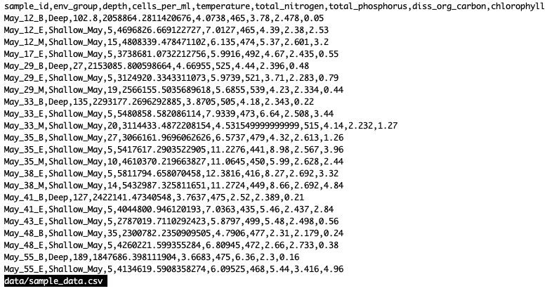
To navigate, press spacebar to scroll to the next page and b to scroll up to the previous page. You can also use the up and down arrows to scroll line-by-line. Note that less defaults to line wrapping, meaning that any lines longer than the width of the screen will be wrapped to the next line. To exit less, press the letter q.
One particularly useful flag for less is -S which cuts off really long lines (rather than having the text wrap around):
less -S data/sample_data.csv
To navigate, press spacebar to scroll to the next page and b to scroll up to the previous page. You can also use the up and down arrows to scroll line-by-line. Note that less defaults to line wrapping, meaning that any lines longer than the width of the screen will be wrapped to the next line, (to disable this use the option -S when running less, ex less -S file.txt). To exit less, press the letter q.
Note that not all file types can be viewed with less. While we can open PDFs and excel spreadsheets easily with programs on our computer, less doesn’t render them well on the command line. For example, if we try to less a .pdf file we will see a warning.
less figures/awesome_plot.jpg
figures/awesome_plot.jpg may be a binary file. See it anyway?
If we say “yes”, less will render the file but it will appear as a seemingly random display of characters that won’t make much sense to us.
Editing Files
Beyond viewing the content of files, we may want to be able to edit or write files on the command line. There are many different text editors you can use to edit files on the command line, but we will talk about nano since it is a bit easier to learn. To edit a file with nano type nano file.txt. If the file exists, it will open the file in a nano window, if the file does not exist it will be created. One nice feature of nano is that it has a cheat sheet along the bottom with some common commands you’ll need. When you are ready to save (write) your file, you type Ctrl+O. Along the bottom will appear a prompt for the file name to write to. The current name of the file will appear here, to keep the name as it is hit enter otherwise you can change the name of the file then hit enter. To exit nano, press Ctrl+X. If you forget to save before exiting, no worries nano will prompt you to first save the file.
Since we moved around files when we organized our project directory we will have to update our R script. The path we use to read in our dataset is no longer correct. We will use nano to update the path to our new directory structure.
nano code/plotting.R
sample_data <- read_csv("data/sample_data.csv")
Great! Now as an exercise we can change the paths to write out figures.
Editing file paths with nano
Use nano to edit the file paths of the figures saved in
code/plotting.Rto match our new directory structure.Solution
nano code/plotting.REdit the lines in
code/plotting.Rwhere plots are saved:ggsave("figures/awesome_plot.jpg", width=6, height=4) ggsave("figures/awesome_box_plot.jpg", width=6, height=4)
Glossary of terms
- root: the very top of the file system tree
- absolute path: the location of a specific file or directory starting from the root of the file system tree
-
relative path: the location of a specific file or directory starting from where you currently are in the file system tree
pwd: Print working directory - prints the absolute path from the root directory to the directory where you currently are.ls: List files - lists files in the current directory. You can provide a path to list files to another directory as well (ls [path]).cd [path]: Change directories - move to another folder.mkdir: Make directory - creates a new directory..: This will move you up one level in the file system treemv: Move - move a file to a new location (mv [file] [/path/to/new/location]) OR remaning a file (mv [oldfilename] [newfilename])less: - quick way to view a document without using a full text editorman: Manual - allows you to view the bash manual for another command (e.g.man ls)-h/--help: Help - argument that pulls up the help manual for a programnano: a user-friendly text editor*: Wildcard - matches zero of more characters in a filename
Key Points
A shell is a program whose primary purpose is to read commands and run other programs.
Tab completion can help you save a lot of time and frustration.
The shell’s main advantages are its support for automating repetitive tasks and its capacity to access network machines.
Information is stored in files, which are stored in directories (folders).
Directories nested in other directories for a directory tree.
cd [path]changes the current working directory.
ls [path]prints a listing of a specific file or directory.
lslists the current working directory.
pwdprints the user’s current working directory.
/is the root directory of the whole file system.A relative path specifies a location starting from the current location.
An absolute path specifies a location from the root of the file system.
Directory names in a path are separated with
/on Unix, but\on Windows.
..means ‘the directory above the current one’;.on its own means ‘the current directory’.
cp [old] [new]copies a file.
mkdir [path]creates a new directory.
mv [old] [new]moves (renames) a file or directory.
rm [path]removes (deletes) a file.
*matches zero or more characters in a filename.The shell does not have a trash bin — once something is deleted, it’s really gone.
Intro to Git & GitHub
Overview
Teaching: 90 min
Exercises: 30 minQuestions
What is version control and why should I use it?
How do I get set up to use Git?
How do I share my changes with others on the web?
How can I use version control to collaborate with other people?
Objectives
Explain what version control is and why it’s useful.
Configure
gitthe first time it is used on a computer.Learn the basic git workflow.
Push, pull, or clone a remote repository.
Describe the basic collaborative workflow with GitHub.
Contents
- Background
- Setting up git
- Creating a Repository
- Tracking Changes
- Intro to GitHub
- Collaborating with GitHub
- BONUS
Background
We’ll start by exploring how version control can be used to keep track of what one person did and when. Even if you aren’t collaborating with other people, automated version control is much better than this situation:
“Piled Higher and Deeper” by Jorge Cham, http://www.phdcomics.com
We’ve all been in this situation before: it seems ridiculous to have multiple nearly-identical versions of the same document. Some word processors let us deal with this a little better, such as Microsoft Word’s Track Changes, Google Docs’ version history, or LibreOffice’s Recording and Displaying Changes.
Version control systems start with a base version of the document and then record changes you make each step of the way. You can think of it as a recording of your progress: you can rewind to start at the base document and play back each change you made, eventually arriving at your more recent version.
Once you think of changes as separate from the document itself, you can then think about “playing back” different sets of changes on the base document, ultimately resulting in different versions of that document. For example, two users can make independent sets of changes on the same document.
Unless multiple users make changes to the same section of the document - a conflict - you can incorporate two sets of changes into the same base document.
A version control system is a tool that keeps track of these changes for us, effectively creating different versions of our files. It allows us to decide which changes will be made to the next version (each record of these changes is called a commit), and keeps useful metadata about them. The complete history of commits for a particular project and their metadata make up a repository. Repositories can be kept in sync across different computers, facilitating collaboration among different people.
Paper Writing
Imagine you drafted an excellent paragraph for a paper you are writing, but later ruin it. How would you retrieve the excellent version of your conclusion? Is it even possible?
Imagine you have 5 co-authors. How would you manage the changes and comments they make to your paper? If you use LibreOffice Writer or Microsoft Word, what happens if you accept changes made using the
Track Changesoption? Do you have a history of those changes?Solution
Recovering the excellent version is only possible if you created a copy of the old version of the paper. The danger of losing good versions often leads to the problematic workflow illustrated in the PhD Comics cartoon at the top of this page.
Collaborative writing with traditional word processors is cumbersome. Either every collaborator has to work on a document sequentially (slowing down the process of writing), or you have to send out a version to all collaborators and manually merge their comments into your document. The ‘track changes’ or ‘record changes’ option can highlight changes for you and simplifies merging, but as soon as you accept changes you will lose their history. You will then no longer know who suggested that change, why it was suggested, or when it was merged into the rest of the document. Even online word processors like Google Docs or Microsoft Office Online do not fully resolve these problems.
Setting up Git
When we use Git on a new computer for the first time, we need to configure a few things. Below are a few examples of configurations we will set as we get started with Git:
- our name and email address,
- what our preferred text editor is,
- and that we want to use these settings globally (i.e. for every project).
On a command line, Git commands are written as git verb options,
where verb is what we actually want to do and options is additional optional information which may be needed for the verb. So let’s start by setting a few basic settings for Git:
$ git config --global user.name "YOUR GIT USERNAME"
$ git config --global user.email "THE EMAIL YOU USED ON GITHUB"
This user name and email will be associated with your subsequent Git activity, which means that any changes pushed to GitHub, BitBucket, GitLab or another Git host server in a later lesson will include this information.
For these lessons, we will be interacting with GitHub and so the email address used should be the same as the one used when setting up your GitHub account.
GitHub, GitLab, & BitBucket
GitHub, GitLab, & BitBucket are websites where you can store your git repositories, share them with the world, and collaborate with others. You can think of them like email applications. You may have a gmail address, and you can choose to manage your email through one of many services such as the Gmail app, Microsoft Outlook, Apple’s Mail app, etc. They have different interfaces and features, but all of them allow you to manage your email. Similarly, GitHub, GitLab, & BitBucket have different interfaces and features, but they all allow you to store, share, and collaborate with others on your git repos.
Line Endings
As with other keys, when you hit Return on your keyboard, your computer encodes this input as a character. Different operating systems use different character(s) to represent the end of a line. (You may also hear these referred to as newlines or line breaks.) Because Git uses these characters to compare files, it may cause unexpected issues when editing a file on different machines. Though it is beyond the scope of this lesson, you can read more about this issue in the Pro Git book.
You can change the way Git recognizes and encodes line endings using the
core.autocrlfcommand togit config. The following settings are recommended:On macOS and Linux:
$ git config --global core.autocrlf inputAnd on Windows:
$ git config --global core.autocrlf true
When we initialize a new repository, we operate on a “branch”, which will typically be called “main” or “master”. We won’t discuss branches much today, but it’s enough to know that they exist, and that we’ll be using one branch today. By default, Git will create a branch called master when you create a new repository with git init (as explained soon). This term evokes the racist practice of human slavery and the software development community has moved to adopt more inclusive language.
In 2020, most Git code hosting services transitioned to using main as the default branch. As an example, any new repository that is opened in GitHub and GitLab default to main. However, Git has not yet made the same change. As a result, local repositories must be manually configured have the same main branch name as most cloud services.
$ git config --global init.defaultBranch main
When Git requires our input, it will automatically open up a text editor for us to enter messages and fix conflicts. We learned about one text editor - nano - in our Unix lesson. By default, Git uses a different text editor called Vim. Vim can be challenging for new (and experienced!) users to navigate, so we should change our default editor to one with which we’re already familiar.
$ git config --global core.editor "nano -w"
If you have a different preferred text editor, it is possible to reconfigure the text editor for Git to other editors whenever you want to change it. If you did not change your editor and are stuck in Vim, the following instructions will help you exit.
Exiting Vim
Note that Vim is the default editor for many programs. If you haven’t used Vim before and wish to exit a session without saving your changes, press Esc then type
:q!and hit Return. If you want to save your changes and quit, press Esc then type:wqand hit Return.
The four commands we just ran above only need to be run once: the flag --global tells Git
to use the settings for every project, in your user account, on this computer.
You can check your settings at any time:
$ git config --list
You can change your configuration as many times as you want: use the same commands to choose another editor or update your email address.
Proxy
In some networks you need to use a proxy. If this is the case, you may also need to tell Git about the proxy:
$ git config --global http.proxy proxy-url $ git config --global https.proxy proxy-urlTo disable the proxy, use
$ git config --global --unset http.proxy $ git config --global --unset https.proxy
Git Help and Manual
Always remember that if you forget a
gitcommand, you can access the list of commands by using-hand access the Git manual by using--help:$ git config -h $ git config --helpWhile viewing the manual, remember the
:is a prompt waiting for commands and you can press Q to exit the manual.
Creating a Repository
Once Git is configured, we can start using it.
First, let’s make sure we are in our ontario-report directory, if not we need to move into that directory:
$ pwd
$ /home/USERNAME/Desktop/ontario-report
What is currently in our directory?
$ ls
code data figures
Now we tell Git to make ontario-report a repository
– a place where Git can store versions of our files:
$ git init
It is important to note that git init will create a repository that
includes subdirectories and their files—there is no need to create
separate repositories nested within the ontario-report repository, whether
subdirectories are present from the beginning or added later. Also, note
that the creation of the ontario-report directory and its initialization as a
repository are completely separate processes.
If we use ls to show the directory’s contents,
it appears that nothing has changed:
$ ls
But if we add the -a flag to show everything,
we can see that Git has created a hidden directory within ontario-report called .git:
$ ls -a
. .. .git code data figures
Git uses this special subdirectory to store all the information about the project,
including all files and sub-directories located within the project’s directory.
If we ever delete the .git subdirectory,
we will lose the project’s history.
We can check that everything is set up correctly by asking Git to tell us the status of our project:
$ git status
On branch main
No commits yet
Untracked files:
(use "git add <file>..." to include in what will be committed)
nothing added to commit but untracked files present (use "git add" to track)
If you are using a different version of git, the exact
wording of the output might be slightly different.
Places to Create Git Repositories
Along with tracking information about ontario-report (the project we have already created), Riley would also like to track information about Lake Erie. Despite our concerns, Riley creates an
erieproject inside theirontario-reportproject with the following sequence of commands:$ cd ~/Desktop # return to Desktop directory $ cd ontario-report # go into ontario-report directory, which is already a Git repository $ ls -a # ensure the .git subdirectory is still present in the ontario-report directory $ mkdir erie # make a subdirectory ontario-report/erie $ cd erie # go into erie subdirectory $ git init # make the erie subdirectory a Git repository $ ls -a # ensure the .git subdirectory is present indicating we have created a new Git repositoryIs the
git initcommand, run inside theeriesubdirectory, required for tracking files stored in theeriesubdirectory?Solution
No. Riley does not need to make the
eriesubdirectory a Git repository because theontario-reportrepository will track all files, sub-directories, and subdirectory files under theontario-reportdirectory. Thus, in order to track all information about erie, Riley only needed to add theeriesubdirectory to theontario-reportdirectory.Additionally, Git repositories can interfere with each other if they are “nested”: the outer repository will try to version-control the inner repository. Therefore, it’s best to create each new Git repository in a separate directory. To be sure that there is no conflicting repository in the directory, check the output of
git status. If it looks like the following, you are good to go to create a new repository as shown above:$ git statusfatal: Not a git repository (or any of the parent directories): .git
Correcting
git initMistakesWe explain to Riley how a nested repository is redundant and may cause confusion down the road. Riley would like to remove the nested repository. How can Riley undo their last
git initin theeriesubdirectory?Solution – USE WITH CAUTION!
Background
Removing files from a git repository needs to be done with caution. To remove files from the working tree and not from your working directory, use
$ rm filenameThe file being removed has to be in sync with the branch head with no updates. If there are updates, the file can be removed by force by using the
-foption. Similarly a directory can be removed from git usingrm -r dirnameorrm -rf dirname.Solution
Git keeps all of its files in the
.gitdirectory. To recover from this little mistake, Riley can just remove the.gitfolder in the erie subdirectory by running the following command from inside theontario-reportdirectory:$ rm -rf erie/.gitBut be careful! Running this command in the wrong directory, will remove the entire Git history of a project you might want to keep. Therefore, always check your current directory using the command
pwd.
Tracking Changes
Let’s make sure we’re still in the right directory.
You should be in the ontario-report directory.
$ cd ~/Desktop/ontario-report
Let’s create a file called notes.txt. We’ll write some notes about the plot we
have made so far – later we’ll add more details about the project. We’ll use
nano to edit the file; you can use whatever text editor you like.
$ nano notes.txt
Type the text below into the notes.txt file:
We plotted temperature and cell abundance.
Let’s first verify that the file was properly created by running the list command (ls):
$ ls
notes.txt
notes.txt contains a single line, which we can see by running:
$ cat notes.txt
We plotted temperature and cell abundance.
If we check the status of our project again, Git tells us that it’s noticed the new file, alongside directories containing our other files:
$ git status
On branch main
No commits yet
Untracked files:
(use "git add <file>..." to include in what will be committed)
notes.txt
code/
data/
figures/
nothing added to commit but untracked files present (use "git add" to track)
The “untracked files” message means that there’s a file in the directory
that Git isn’t keeping track of.
We can tell Git to track a file using git add:
$ git add notes.txt
and then check that the right thing happened:
$ git status
On branch main
No commits yet
Changes to be committed:
(use "git rm --cached <file>..." to unstage)
new file: notes.txt
Untracked files:
(use "git add <file>..." to include in what will be committed)
code/
data/
figures/
Git now knows that it’s supposed to keep track of notes.txt,
but it hasn’t recorded these changes as a commit yet.
To get it to do that,
we need to run one more command:
$ git commit -m "Start notes on analysis"
[main (root-commit) f22b25e] Start notes on analysis
1 file changed, 1 insertion(+)
create mode 100644 notes.txt
When we run git commit,
Git takes everything we have told it to save by using git add
and stores a copy permanently inside the special .git directory.
This permanent copy is called a commit
(or revision) and its short identifier is f22b25e. Your commit may have another identifier.
We use the -m flag (for “message”)
to record a short, descriptive, and specific comment that will help us remember later on what we did and why.
If we just run git commit without the -m option,
Git will launch nano (or whatever other editor we configured as core.editor)
so that we can write a longer message.
Good commit messages start with a brief (<50 characters) statement about the
changes made in the commit. Generally, the message should complete the sentence “If applied, this commit will”
If we run git status now:
$ git status
On branch main
Untracked files:
(use "git add <file>..." to include in what will be committed)
code/
data/
figures/
nothing added to commit but untracked files present (use "git add" to track)
it tells us everything is up to date.
If we want to know what we’ve done recently,
we can ask Git to show us the project’s history using git log:
$ git log
commit f22b25e3233b4645dabd0d81e651fe074bd8e73b
Author: USERNAME <your.email@address>
Date: Tue Jan 14 09:51:46 2025 -0400
Start notes on analysis
git log lists all commits made to a repository in reverse chronological order.
The listing for each commit includes
the commit’s full identifier
(which starts with the same characters as
the short identifier printed by the git commit command earlier),
the commit’s author,
when it was created,
and the log message Git was given when the commit was created.
Where Are My Changes?
If we run
lsat this point, we will still see just one file callednotes.txt. That’s because Git saves information about files’ history in the special.gitdirectory mentioned earlier so that our filesystem doesn’t become cluttered (and so that we can’t accidentally edit or delete an old version).
Now suppose we add more information to the file.
(Again, we’ll edit with nano and then cat the file to show its contents;
you may use a different editor, and don’t need to cat.)
$ nano notes.txt
$ cat notes.txt
We plotted temperature and cell abundance.
Each point represents a sample.
When we run git status now,
it tells us that a file it already knows about has been modified:
$ git status
On branch main
Changes not staged for commit:
(use "git add <file>..." to update what will be committed)
(use "git restore <file>..." to discard changes in working directory)
modified: notes.txt
Untracked files:
(use "git add <file>..." to include in what will be committed)
code/
data/
figures/
no changes added to commit (use "git add" and/or "git commit -a")
The last line is the key phrase:
“no changes added to commit”.
We have changed this file,
but we haven’t told Git we will want to save those changes
(which we do with git add)
nor have we saved them (which we do with git commit).
So let’s do that now. It is good practice to always review
our changes before saving them. We do this using git diff.
This shows us the differences between the current state
of the file and the most recently saved version:
$ git diff
diff --git a/notes.txt b/notes.txt
index df0654a..315bf3a 100644
--- a/notes.txt
+++ b/notes.txt
@@ -1 +1,2 @@
We plotted temperature and cell abundance.
+Each point represents a sample.
The output is cryptic because
it is actually a series of commands for tools like editors and patch
telling them how to reconstruct one file given the other.
If we break it down into pieces:
- The first line tells us that Git is producing output similar to the Unix
diffcommand comparing the old and new versions of the file. - The second line tells exactly which versions of the file
Git is comparing;
df0654aand315bf3aare unique computer-generated labels for those versions. - The third and fourth lines once again show the name of the file being changed.
- The remaining lines are the most interesting, they show us the actual differences
and the lines on which they occur.
In particular,
the
+marker in the first column shows where we added a line.
After reviewing our change, it’s time to commit it:
$ git commit -m "Add information on points"
$ git status
On branch main
Changes not staged for commit:
(use "git add <file>..." to update what will be committed)
(use "git restore <file>..." to discard changes in working directory)
modified: notes.txt
Untracked files:
(use "git add <file>..." to include in what will be committed)
code/
data/
figures/
no changes added to commit (use "git add" and/or "git commit -a")
Whoops:
Git won’t commit because we didn’t use git add first.
Let’s fix that:
$ git add notes.txt
$ git commit -m "Add information on points"
[main 34961b1] Add information on points
1 file changed, 1 insertion(+)
Git insists that we add files to the set we want to commit before actually committing anything. This allows us to commit our changes in stages and capture changes in logical portions rather than only large batches. For example, suppose we’re adding a few citations to relevant research to our thesis. We might want to commit those additions, and the corresponding bibliography entries, but not commit some of our work drafting the conclusion (which we haven’t finished yet).
To allow for this, Git has a special staging area where it keeps track of things that have been added to the current changeset but not yet committed.
Staging Area
If you think of Git as taking snapshots of changes over the life of a project,
git addspecifies what will go in a snapshot (putting things in the staging area), andgit committhen actually takes the snapshot, and makes a permanent record of it (as a commit). If you don’t have anything staged when you typegit commit, Git will prompt you to usegit commit -aorgit commit --all, which is kind of like gathering everyone to take a group photo! However, it’s almost always better to explicitly add things to the staging area, because you might commit changes you forgot you made. (Going back to the group photo simile, you might get an extra with incomplete makeup walking on the stage for the picture because you used-a!) Try to stage things manually, or you might find yourself searching for “how to undo a commit” more than you would like! We’ll show you how to do this a little later in this lesson.
Let’s watch as our changes to a file move from our editor to the staging area and into long-term storage. First, we’ll add another line to the file:
$ nano notes.txt
$ cat notes.txt
We plotted temperature and cell abundance.
Each point represents a sample.
Environmental groups are shown by color.
$ git diff
diff --git a/notes.txt b/notes.txt
index 315bf3a..b36abfd 100644
--- a/notes.txt
+++ b/notes.txt
@@ -1,2 +1,3 @@
We plotted temperature and cell abundance.
Each point represents a sample.
+Environmental groups are shown by color.
So far, so good:
we’ve added one line to the end of the file
(shown with a + in the first column).
Now let’s put that change in the staging area
and see what git diff reports:
$ git add notes.txt
$ git diff
There is no output: as far as Git can tell, there’s no difference between what it’s been asked to save permanently and what’s currently in the directory. However, if we do this:
$ git diff --staged
diff --git a/notes.txt b/notes.txt
index 315bf3a..b36abfd 100644
--- a/notes.txt
+++ b/notes.txt
@@ -1,2 +1,3 @@
We plotted temperature and cell abundance.
Each point represents a sample.
+Environmental groups are shown by color.
it shows us the difference between the last committed change and what’s in the staging area. Let’s save our changes:
$ git commit -m "Add note about point color"
[main 005937f] Add note about point color
1 file changed, 1 insertion(+)
check our status:
$ git status
On branch main
Untracked files:
(use "git add <file>..." to include in what will be committed)
code/
data/
figures/
no changes added to commit (use "git add" and/or "git commit -a")
and look at the history of what we’ve done so far:
$ git log
commit 005937fbe2a98fb83f0ade869025dc2636b4dad5
Author: USERNAME <your.email@address>
Date: Tue Jan 14 10:14:07 2025 -0400
Add note about point color
commit 34961b159c27df3b475cfe4415d94a6d1fcd064d
Author: USERNAME <your.email@address>
Date: Tue Jan 14 10:07:21 2025 -0400
Add information on points
commit f22b25e3233b4645dabd0d81e651fe074bd8e73b
Author: USERNAME <your.email@address>
Date: Tue Jan 14 09:51:46 2025 -0400
Start notes on analysis
Word-based diffing
Sometimes, e.g. in the case of the text documents a line-wise diff is too coarse. That is where the
--color-wordsoption ofgit diffcomes in very useful as it highlights the changed words using colors.
Paging the Log
When the output of
git logis too long to fit in your screen,gituses a program to split it into pages of the size of your screen. When this “pager” is called, you will notice that the last line in your screen is a:, instead of your usual prompt.
- To get out of the pager, press Q.
- To move to the next page, press Spacebar.
- To search for
some_wordin all pages, press / and typesome_word. Navigate through matches pressing N.
Limit Log Size
To avoid having
git logcover your entire terminal screen, you can limit the number of commits that Git lists by using-N, whereNis the number of commits that you want to view. For example, if you only want information from the last commit you can use:$ git log -1commit 005937fbe2a98fb83f0ade869025dc2636b4dad5 Author: USERNAME <your.email@address> Date: Tue Jan 14 10:14:07 2025 -0400 Add note about point colorYou can also reduce the quantity of information using the
--onelineoption:$ git log --oneline005937f Add note about point color 34961b1 Add information on points f22b25e Start notes on analysisYou can also combine the
--onelineoption with others. One useful combination adds--graphto display the commit history as a text-based graph and to indicate which commits are associated with the currentHEAD, the current branchmain, or other Git references:$ git log --oneline --graph* 005937f (HEAD -> main) Add note about point color * 34961b1 Add information on points * f22b25e Start notes on analysis
Directories
Two important facts you should know about directories in Git.
Git does not track directories on their own, only files within them. Try it for yourself:
$ mkdir analysis $ git status $ git add analysis $ git statusNote, our newly created empty directory
analysisdoes not appear in the list of untracked files even if we explicitly add it (viagit add) to our repository. This is the reason why you will sometimes see.gitkeepfiles in otherwise empty directories. Unlike.gitignore, these files are not special and their sole purpose is to populate a directory so that Git adds it to the repository. In fact, you can name such files anything you like.If you create a directory in your Git repository and populate it with files, you can add all files in the directory at once by:
git add <directory-with-files>Try it for yourself:
$ touch analysis/file-1.txt analysis/file-2.txt $ git status $ git add analysis $ git statusNote: the
touchcommand creates blank text files that you can later edit with your preferred text editor.Before moving on, we will commit these changes.
$ git commit -m "Create blank text files"
To recap, when we want to add changes to our repository,
we first need to add the changed files to the staging area
(git add) and then commit the staged changes to the
repository (git commit):
Choosing a Commit Message
Which of the following commit messages would be most appropriate for the last commit made to
notes.txt?
- “Changes”
- “Added line ‘Environmental groups are denoted by color.’ to notes.txt”
- “Describe grouping”
Solution
Answer 1 is not descriptive enough, and the purpose of the commit is unclear; and answer 2 is redundant to using “git diff” to see what changed in this commit; but answer 3 is good: short, descriptive, and imperative.
Committing Changes to Git
Which command(s) below would save the changes of
myfile.txtto my local Git repository?
$ git commit -m "my recent changes"$ git init myfile.txt $ git commit -m "my recent changes"$ git add myfile.txt $ git commit -m "my recent changes"$ git commit -m myfile.txt "my recent changes"Solution
- Would only create a commit if files have already been staged.
- Would try to create a new repository.
- Is correct: first add the file to the staging area, then commit.
- Would try to commit a file “my recent changes” with the message myfile.txt.
Committing Multiple Files
The staging area can hold changes from any number of files that you want to commit as a single snapshot.
- Add some text to
notes.txtnoting your decision to consider writing a manuscript.- Create a new file
manuscript.txtwith your initial thoughts.- Add changes from both files to the staging area, and commit those changes.
Solution
First we make our changes to the
notes.txtandmanuscript.txtfiles:$ nano notes.txt $ cat notes.txtMaybe I should start with a draft manuscript.$ nano manuscript.txt $ cat manuscript.txtThis is where I will write an awesome manuscript.Now you can add both files to the staging area. We can do that in one line:
$ git add notes.txt manuscript.txtOr with multiple commands:
$ git add notes.txt $ git add manuscript.txtNow the files are ready to commit. You can check that using
git status. If you are ready to commit use:$ git commit -m "Note plans to start a draft manuscript"[main cc127c2] Note plans to start a draft manuscript 2 files changed, 2 insertions(+) create mode 100644 manuscript.txt
workshopRepository
- Create a new Git repository on your computer called
workshop.- Write a three lines about what you have learned about R and bash a file called
notes.txt, commit your changes- Modify one line, add a fourth line
- Display the differences between its updated state and its original state.
Solution
If needed, move out of the
ontario-reportfolder:$ cd ..Create a new folder called
workshopand ‘move’ into it:$ mkdir workshop $ cd workshopInitialise git:
$ git initCreate your file
notes.txtusingnanoor another text editor. Once in place, add and commit it to the repository:$ git add notes.txt $ git commit -m "Add notes file"Modify the file as described (modify one line, add a fourth line). To display the differences between its updated state and its original state, use
git diff:$ git diff notes.txt
Intro to GitHub
Now that you’ve created a git repo and gotten the hang of the basic git workflow, it’s time to share your repo with the world. Systems like Git allow us to move work between any two repositories. In practice, though, it’s easiest to use one copy as a central hub, and to keep it on the web rather than on someone’s laptop. Most programmers use hosting services like GitHub, Bitbucket or GitLab to hold those main copies.
Let’s start by sharing the changes we’ve made to our current project with the
world. Log in to GitHub, then click on the icon in the top right corner to
create a new repository called ontario-report.

Name your repository ontario-report and then click Create Repository.
Important options
Since this repository will be connected to a local repository, it needs to be empty. Leave “Initialize this repository with a README” unchecked, and keep “None” as options for both “Add .gitignore” and “Add a license.” See the “GitHub License and README files” exercise below for a full explanation of why the repository needs to be empty.
You should see your own username for the Owner and you should name the
repository ontario-report.

As soon as the repository is created, GitHub displays a page with a URL and some information on how to configure your local repository.
This effectively does the following on GitHub’s servers:
$ mkdir ontario-report
$ cd ontario-report
$ git init
If you remember back to when we added and committed our earlier work on
notes.txt, we had a diagram of the local repository which looked like this:
Now that we have two repositories, we need a diagram like this:
Note that our local repository still contains our earlier work on notes.txt, but the
remote repository on GitHub appears empty as it doesn’t contain any files yet.
Linking a local repository to GitHub
The next step is to connect the two repositories. We do this by making the GitHub repository a remote for the local repository. The home page of the repository on GitHub includes the string we need to identify it:

Make sure SSH is highlighted, not HTTPS! Copy that URL from the browser, go into the local ontario-report repository, and run
this command:
$ git remote add origin git@github.com:USERNAME/ontario-report.git
Make sure to replace USERNAME with your actual GitHub username so it will use
the correct URL for your repository; that should be the only difference.
origin is a local name used to refer to the remote repository. It could be called
anything, but origin is a convention that is often used by default in git
and GitHub, so it’s helpful to stick with this unless there’s a reason not to.
We can check that the command has worked by running git remote -v:
$ git remote -v
origin https://github.com/USERNAME/ontario-report.git (push)
origin https://github.com/USERNAME/ontario-report.git (fetch)
Now we want to send our local git information to GitHub. While the default for code you put on GitHub is that anyone can view or make copies of your code, in order to make changes to your repository, you need to be able to log in so GitHub can recognize you as someone who is authorized to make changes.
Setting up your SSH Key to access GitHub
When you use the GitHub website, you need to login with a username and password. By default, only you will be able to make any changes to the repositories you create. In order to perform git commands on your own computer that interact with GitHub, we need a way to tell GitHub that your computer is authorized to make changes inside your repos. Rather than requiring you to type your password every time, you can create a “key” that is unique to your computer, and then give Github that key so that it can trust your computer. This SSH key is useful, because you can also use it to access other remote servers on the command line, like the Cornell BioHPC!
SSH uses what is called a key pair. This is two keys that work together to validate access. One key is publicly known and called the public key, and the other key called the private key is kept private. Very descriptive names.
You can think of the public key as a padlock, and only you have the key (the private key) to open it. You use the public key where you want a secure method of communication, such as your GitHub account. You give this padlock, or public key, to GitHub and say “lock the communications to my account with this so that only computers that have my private key can unlock communications and send git commands as my GitHub account.”
What we will do now is the minimum required to set up the SSH keys and add the public key to a GitHub account.
The first thing we are going to do is check if this has already been done on the computer you’re on. Generally speaking, this setup only needs to happen once and then you can forget about it.
$ ls -al ~/.ssh
Your output is going to look a little different depending on whether or not SSH has ever been set up on the computer you are using. If you haven’t set up an SSH key, it will look something like:
ls: cannot access '/c/Users/USERNAME/.ssh': No such file or directory
If SSH has been set up on the computer you’re using, the public and private key pairs will be listed. The file names are either id_ed25519/id_ed25519.pub or id_rsa/id_rsa.pub depending on how the key pairs were set up. If you do already have a key pair, you won’t need to do the next step.
We’ll use ssh-keygen to make a new key pair. Change the email address to the one you used on Github.
$ ssh-keygen -t ed25519 -C "your.email@address"
One some older computers, the ed25519 algorithm isn’t supported, and you may receive an error. Instead, run the following command:
ssh-keygen -t rsa -b 4096 -C "your.email@address"
Generating public/private ed25519 key pair.
Enter file in which to save the key (/c/Users/USERNAME/.ssh/id_ed25519):
We want to use the default file, so just press Return.
Created directory '/c/Users/USERNAME/.ssh'.
Enter passphrase (empty for no passphrase):
It is up to you whether you set a password or not. Typically, you are the only one using your laptop, which is password protected, and I already wouldn’t recommend placing sensitive information on Github. As such, I usually don’t enter a passphrase. You can just press Return without any other input. If you do choose to set a passphrase, note that you won’t see your characters as you type them. Please remember this password - you’ll need it every time you push changes to Github!
After moving through the password phase, you’ll see something like below:
Your identification has been saved in /c/Users/USERNAME/.ssh/id_ed25519
Your public key has been saved in /c/Users/USERNAME/.ssh/id_ed25519.pub
The key fingerprint is:
SHA256:SMSPIStNyA00KPxuYu94KpZgRAYjgt9g4BA4kFy3g1o your.email@address
The key's randomart image is:
+--[ED25519 256]--+
|^B== o. |
|%*=.*.+ |
|+=.E =.+ |
| .=.+.o.. |
|.... . S |
|.+ o |
|+ = |
|.o.o |
|oo+. |
+----[SHA256]-----+
The “identification” is actually the private key. You should never share it. The public key is appropriately named. The “key fingerprint” is a shorter version of a public key.
Now that we have generated the SSH keys, we will find the SSH files when we check.
$ ls -al ~/.ssh
drwxr-xr-x 1 USERNAME 197121 0 Jul 16 14:48 ./
drwxr-xr-x 1 USERNAME 197121 0 Jul 16 14:48 ../
-rw-r--r-- 1 USERNAME 197121 419 Jul 16 14:48 id_ed25519
-rw-r--r-- 1 USERNAME 197121 106 Jul 16 14:48 id_ed25519.pub
Next, we need to provide Github our public key, so it can recognize our computer. First, let’s copy it:
$ cat ~/.ssh/id_ed25519.pub
ssh-ed25519 AAAAC3NzaC1lZDI1NTE5AAAAIDmRA3d51X0uu9wXek559gfn6UFNF69yZjChyBIU2qKI your.email@address
Now, going to GitHub.com, click on your profile icon in the top right corner to get the drop-down menu. Click “Settings”, then on the settings page, click “SSH and GPG keys”, on the left side “Access” menu. Click the “New SSH key” button on the right side. Now, you can add the title (I’ll typically use “Work Laptop” or “Personal Laptop”), paste your SSH key into the field, and click the “Add SSH key” to complete the setup.
Now that we’ve set that up, let’s check our authentication from the command line.
$ ssh -T git@github.com
Hi USERNAME! You've successfully authenticated, but GitHub does not provide shell access.
Good! This output confirms that the SSH key works as intended (do not worry about the shell part). We are now ready to push our work to the remote repository.
Pushing changes to github
Now that we’ve set up the remote server information and have generated an ssh key, we are ready to send our data to GitHub. This command will push the changes from our local repository to the repository on GitHub:
$ git push -u origin main
If it prompts you for a passphrase, use the one you just set while setting up your SSD key. We should see something like this:
Enumerating objects: 16, done.
Counting objects: 100% (16/16), done.
Delta compression using up to 8 threads.
Compressing objects: 100% (11/11), done.
Writing objects: 100% (16/16), 1.45 KiB | 372.00 KiB/s, done.
Total 16 (delta 2), reused 0 (delta 0)
remote: Resolving deltas: 100% (2/2), done.
To https://github.com/USERNAME/ontario-report.git
* [new branch] main -> main
This indicates we successfully pushed our local changes to the remote repo! Go to Github, and explore the state of the repo there.
The ‘-u’ Flag
You may see a
-uoption used withgit pushin some documentation. This option is synonymous with the--set-upstream-tooption for thegit branchcommand, and is used to associate the current branch with a remote branch so that thegit pullcommand can be used without any arguments. To do this, simply usegit push -u origin mainonce the remote has been set up.
We can pull changes from the remote repository to the local one as well:
$ git pull origin main
From https://github.com/USERNAME/ontario-report
* branch main -> FETCH_HEAD
Already up-to-date.
Pulling has no effect in this case because the two repositories are already synchronized. If someone else had pushed some changes to the repository on GitHub, though, this command would download them to our local repository.
GitHub GUI
Browse to your
ontario-reportrepository on GitHub. Under the Code tab, find and click on the text that says “XX commits” (where “XX” is some number). Hover over, and click on, the three buttons to the right of each commit. What information can you gather/explore from these buttons? How would you get that same information in the shell?Solution
The left-most button (with the picture of a clipboard) copies the full identifier of the commit to the clipboard. In the shell,
git logwill show you the full commit identifier for each commit.When you click on the middle button, you’ll see all of the changes that were made in that particular commit. Green shaded lines indicate additions and red ones removals. In the shell we can do the same thing with
git diff. In particular,git diff ID1..ID2where ID1 and ID2 are commit identifiers (e.g.git diff a3bf1e5..041e637) will show the differences between those two commits.The right-most button lets you view all of the files in the repository at the time of that commit. To do this in the shell, we’d need to checkout the repository at that particular time. We can do this with
git checkout IDwhere ID is the identifier of the commit we want to look at. If we do this, we need to remember to put the repository back to the right state afterwards!
Uploading files directly in GitHub browser
Github also allows you to skip the command line and upload files directly to your repository without having to leave the browser. There are two options. First you can click the “Upload files” button in the toolbar at the top of the file tree. Or, you can drag and drop files from your desktop onto the file tree. You can read more about this on this GitHub page
Push vs. Commit
In this lesson, we introduced the “git push” command. How is “git push” different from “git commit”?
Solution
When we push changes, we’re interacting with a remote repository to update it with the changes we’ve made locally (often this corresponds to sharing the changes we’ve made with others). Commit only updates your local repository.
GitHub License and README files
In this section we learned about creating a remote repository on GitHub, but when you initialized your GitHub repo, you didn’t add a readme or a license file. If you had, what do you think would have happened when you tried to link your local and remote repositories?
Solution
In this case, we’d see a merge conflict due to unrelated histories. When GitHub creates a readme file, it performs a commit in the remote repository. When you try to pull the remote repository to your local repository, Git detects that they have histories that do not share a common origin and refuses to merge.
$ git pull origin mainwarning: no common commits remote: Enumerating objects: 3, done. remote: Counting objects: 100% (3/3), done. remote: Total 3 (delta 0), reused 0 (delta 0), pack-reused 0 Unpacking objects: 100% (3/3), done. From https://github.com/USERNAME/ontario-report * branch main -> FETCH_HEAD * [new branch] main -> origin/main fatal: refusing to merge unrelated historiesYou can force git to merge the two repositories with the option
--allow-unrelated-histories. Be careful when you use this option and carefully examine the contents of local and remote repositories before merging.$ git pull --allow-unrelated-histories origin mainFrom https://github.com/USERNAME/ontario-report * branch main -> FETCH_HEAD Merge made by the 'recursive' strategy. notes.txt | 1 + 1 file changed, 1 insertion(+) create mode 100644 notes.txt
Adding all your files to Github
Now, you’ve learned to add files to the staging area (git add), commit those files (git commit), and push those files to your remote repo (git push origin main). Work with your neighbors to add the other files in your ontario-report directory to your Github remote repository. Feel free to call over helpers with stickies or a hand if you get stuck!
Collaborating with GitHub
For the next step, get into pairs. One person will be the “Owner” and the other will be the “Collaborator”. The goal is that the Collaborator add changes into the Owner’s repository. We will switch roles at the end, so both persons will play Owner and Collaborator.
Practicing By Yourself
If you’re working through this lesson on your own, you can carry on by opening a second terminal window. This window will represent your partner, working on another computer. You won’t need to give anyone access on GitHub, because both ‘partners’ are you.
The Owner needs to give the Collaborator access. On GitHub, click the settings button on the right, select Manage access, click Invite a collaborator, and then enter your partner’s username.

To accept access to the Owner’s repo, the Collaborator needs to go to https://github.com/notifications. Once there they can accept access to the Owner’s repo.
Next, the Collaborator needs to download a copy of the Owner’s repository to her
machine. This is called “cloning a repo”. To clone the Owner’s repo into
their Desktop folder, the Collaborator enters:
$ git clone git@github.com:USERNAME/ontario-report.git ~/Desktop/USERNAME-ontario-report
Replace USERNAME with the Owner’s username. Remember that if you have a more complicated path to your Desktop (like OneDrive), you’ll need to change this file path.
The Collaborator can now make a change in their clone of the Owner’s repository, exactly the same way as we’ve been doing before:
$ cd ~/Desktop/USERNAME-ontario-report
$ nano notes.txt
$ cat notes.txt
You can write anything you like. Now might be a good time to list the dependencies of the project – the tools and packages that are needed to run the code.
Dependencies:
- R >= 4.0
- tidyverse
$ git add notes.txt
$ git commit -m "List dependencies"
1 file changed, 1 insertion(+)
create mode 100644 notes.txt
Then push the change to the Owner’s repository on GitHub:
$ git push origin main
Enumerating objects: 4, done.
Counting objects: 4, done.
Delta compression using up to 4 threads.
Compressing objects: 100% (2/2), done.
Writing objects: 100% (3/3), 306 bytes, done.
Total 3 (delta 0), reused 0 (delta 0)
To https://github.com/USERNAME/ontario-report.git
9272da5..29aba7c main -> main
Note that we didn’t have to create a remote called origin: Git uses this
name by default when we clone a repository. (This is why origin was a
sensible choice earlier when we were setting up remotes by hand.)
Take a look at the Owner’s repository on its GitHub website now (you may need to refresh your browser.) You should be able to see the new commit made by the Collaborator.
To download the Collaborator’s changes from GitHub, the Owner now enters:
$ git pull origin main
remote: Enumerating objects: 4, done.
remote: Counting objects: 100% (4/4), done.
remote: Compressing objects: 100% (2/2), done.
remote: Total 3 (delta 0), reused 3 (delta 0), pack-reused 0
Unpacking objects: 100% (3/3), done.
From https://github.com/USERNAME/ontario-report
* branch main -> FETCH_HEAD
9272da5..29aba7c main -> origin/main
Updating 9272da5..29aba7c
Fast-forward
notes.txt | 1 +
1 file changed, 1 insertion(+)
create mode 100644 notes.txt
Now the three repositories (Owner’s local, Collaborator’s local, and Owner’s on GitHub) are back in sync!
A Basic Collaborative Workflow
In practice, it is good to be sure that you have an updated version of the repository you are collaborating on, so you should
git pullbefore making your changes. The basic collaborative workflow would be:
- update your local repo with
git pull,- make your changes and stage them with
git add,- commit your changes with
git commit -m, and- upload the changes to GitHub with
git pushIt is better to make many commits with smaller changes rather than one commit with massive changes: small commits are easier to read and review.
Switch Roles and Repeat
Switch roles and repeat the whole process.
Review Changes
The Owner pushed commits to the repository without giving any information to the Collaborator. How can the Collaborator find out what has changed on GitHub?
Solution
On GitHub, the Collaborator can go to the repository and click on “commits” to view the most recent commits pushed to the repository.
Version History, Backup, and Version Control
Some backup software (e.g. Time Machine on macOS, Google Drive) can keep a history of the versions of your files. They also allow you to recover specific versions. How is this functionality different from version control? What are some of the benefits of using version control, Git and GitHub?
Solution
Automated backup software gives you less control over how often backups are created and it is often difficult to compare changes between backups. However, Git has a steeper learning curve than backup software. Advantages of using Git and GitHub for version control include:
- Great control over which files to include in commits and when to make commits.
- Very popular way to collaborate on code and analysis projects among programmers, data scientists, and researchers.
- Free and open source.
- GitHub allows you to share your project with the world and accept contributions from outside collaborators.
Some more about remotes
In this episode and the previous one, our local repository has had a single “remote”, called
origin. A remote is a copy of the repository that is hosted somewhere else, that we can push to and pull from, and there’s no reason that you have to work with only one. For example, on some large projects you might have your own copy in your own GitHub account (you’d probably call thisorigin) and also the main “upstream” project repository (let’s call thisupstreamfor the sake of examples). You would pull fromupstreamfrom time to time to get the latest updates that other people have committed.Remember that the name you give to a remote only exists locally. It’s an alias that you choose - whether
origin, orupstream, orfred- and not something intrinstic to the remote repository.The
git remotefamily of commands is used to set up and alter the remotes associated with a repository. Here are some of the most useful ones:
git remote -vlists all the remotes that are configured (we already used this in the last episode)git remote add [name] [url]is used to add a new remotegit remote remove [name]removes a remote. Note that it doesn’t affect the remote repository at all - it just removes the link to it from the local repo.git remote set-url [name] [newurl]changes the URL that is associated with the remote. This is useful if it has moved, e.g. to a different GitHub account, or from GitHub to a different hosting service. Or, if we made a typo when adding it!git remote rename [oldname] [newname]changes the local alias by which a remote is known - its name. For example, one could use this to changeupstreamtofred.
Glossary of terms
- Git: a version control software which tracks changes within your files and projects
- Github: a cloud service which hosts Git repositories
-
ssh key: a special identifier that allows remote servers to recognize and trust your computer
git init: Initialize a git repo inside your current directorygit status: List the status of your Git repo, including untracked files, new changes, staged changes, and relationship to the remote origingit add: Add files or changes to files to the staging areagit commit: Commit staged changes to the permanent git repository with a commit messagegit push: Send local commits to the remote origingit pull: Retrieve remote commits to your local system
Key Points
Version control is like an unlimited ‘undo’.
Version control also allows many people to work in parallel.
R for Data Analysis
Overview
Teaching: 150 min
Exercises: 15 minQuestions
How can I summarize my data in R?
How can R help make my research more reproducible?
How can I combine two datasets from different sources?
How can data tidying facilitate answering analysis questions?
Objectives
To become familiar with the functions of the
dplyrandtidyrpackages.To be able to use
dplyrandtidyrto prepare data for analysis.To be able to combine two different data sources using joins.
To be able to create plots and summary tables to answer analysis questions.
Contents
- Getting started
- An introduction to data analysis in R using
dplyr - Cleaning up data
- Joining data frames
- Analyzing combined data
- Finishing with Git and GitHub
Getting Started
First, navigate to the ontario-reports directory however you’d like and open ontario-report.Rproj.
This should open the ontario-report R project in RStudio.
You can check this by seeing if the Files in the bottom right of RStudio are the ones in your ontario-report directory.
Yesterday we spent a lot of time making plots in R using the ggplot2 package. Visualizing data using plots is a very powerful skill in R, but what if we would like to work with only a subset of our data? Or clean up messy data, calculate summary statistics, create a new variable, or join two datasets together? There are several different methods for doing this in R, and we will touch on a few today using functions the dplyr package.
First, we will create a new RScript file for our work. Open RStudio. Choose “File” > “New File” > “RScript”. We will save this file as data_analysis.R
Loading in the data
We will start by importing the complete sample dataset that we used yesterday into our fresh new R session. Today let’s type them into the console ourselves: sample_data <- read_csv("data/sample_data.csv")
Exercise
If we look in the console now, we’ll see we’ve received an error message saying that R “could not find the function
read_csv()”. Hint: Packages…Solution
What this means is that R cannot find the function we are trying to call. The reason for this usually is that we are trying to run a function from a package that we have not yet loaded. This is a very common error message that you will probably see a lot when using R. It’s important to remember that you will need to load any packages you want to use into R each time you start a new session. The
read_csvfunction comes from thereadrpackage which is included in thetidyversepackage so we will just load thetidyversepackage and run the import code again.
Now that we know what’s wrong, We will use the read_csv() function from the Tidyverse readr package. Load the tidyverse package and sample dataset using the code below.
library(tidyverse)
Warning: package 'lubridate' was built under R version 4.3.3
── Attaching core tidyverse packages ─────────────────────────────────────────────────────────────────────── tidyverse 2.0.0 ──
✔ dplyr 1.1.4 ✔ readr 2.1.5
✔ forcats 1.0.0 ✔ stringr 1.5.1
✔ ggplot2 3.5.1 ✔ tibble 3.2.1
✔ lubridate 1.9.4 ✔ tidyr 1.3.1
✔ purrr 1.0.2
── Conflicts ───────────────────────────────────────────────────────────────────────────────────────── tidyverse_conflicts() ──
✖ dplyr::filter() masks stats::filter()
✖ dplyr::lag() masks stats::lag()
ℹ Use the conflicted package (<http://conflicted.r-lib.org/>) to force all conflicts to become errors
The output in your console shows that by doing this, we attach several useful packages for data wrangling, including readr. Check out these packages and their documentation at tidyverse.org
Reminder: Many of these packages, including
dplyr, come with “Cheatsheets” found under the Help RStudio menu tab.
Reload your data:
sample_data <- read_csv("data/sample_data.csv")
Rows: 71 Columns: 9
── Column specification ───────────────────────────────────────────────────────────────────────────────────────────────────────
Delimiter: ","
chr (2): sample_id, env_group
dbl (7): depth, cells_per_ml, temperature, total_nitrogen, total_phosphorus, diss_org_carbon, chlorophyll

ℹ Use `spec()` to retrieve the full column specification for this data.
ℹ Specify the column types or set `show_col_types = FALSE` to quiet this message.
Notice that the output of the read_csv() function is pretty informative. It tells us the name of all of our column headers as well as how it interpreted the data type. This birds-eye-view can help you take a quick look that everything is how we expect it to be.
Now we have the tools necessary to work through this lesson.
An introduction to data analysis in R using dplyr
Get stats fast with summarize()
Let’s say we would like to know what is the mean (average) cell abundance in our dataset. R has a built in function function called mean() that will calculate this value for us. We can apply that function to our cells_per_ml column using the summarize() function. Here’s what that looks like:
summarize(sample_data, average_cells=mean(cells_per_ml))
# A tibble: 1 × 1
  average_cells
          <dbl>
1      4046023.
When we call summarize(), we can use any of the column names of our data object as values to pass to other functions. summarize() will return a new data object and our value will be returned as a column.
Note: The
summarize()andsummarise()perform identical functions.
We name this new column so we can use in a future argument. So the average_cells= part tells summarize() to use “average_cells” as the name of the new column. Note that you don’t have to quotes around this new name as long as it starts with a letter and doesn’t include a space.
Instead of including the data as an argument, we can use the pipe operator %>% to pass the data value into the summarize function.
sample_data %>% summarize(average_cells=mean(cells_per_ml))
# A tibble: 1 × 1
  average_cells
          <dbl>
1      4046023.
This line of code will do the exact same thing as our first summary command, but the piping function tells R to use the sample_data dataframe as the first argument in the next function.
This lets us “chain” together multiple functions, which will be helpful later. Note that the pipe (%>%) is a bit different from using the ggplot plus (+). Pipes take the output from the left side and use it as input to the right side. Plusses layer on additional information (right side) to a preexisting plot (left side).
We can also add an
sample_data %>%
  summarize(average_cells=mean(cells_per_ml))
# A tibble: 1 × 1
  average_cells
          <dbl>
1      4046023.
Using the pipe operator %>% and enter command makes our code more readable. The pipe operator %>% also helps to avoid using nested functions and minimizes the need for new variables.
Since we use the pipe operator so often, there is a keyboard shortcut for it in RStudio. You can press
Pro tip: Saving a new dataframe
Notice that when we run the following code, we are not actually saving a new variable:
sample_data %>%
  summarize(average_cells=mean(cells_per_ml))
This simply outputs what we have created, but does not change actually change
sample_dataor save a new dataframe. To save a new dataframe, we could run:sample_data_summarized <- sample_data %>% summarize(average_cells=mean(cells_per_ml))Or if we want to change
sample_dataitself:sample_data <- sample_data %>% summarize(average_cells=mean(cells_per_ml))IMPORTANT: This would overwrite the existing
sample_dataobject. Let’s not do this!For now, we will not be saving dataframes, since we are just experimenting with
dyplrfunctions, but it will be useful later on in this lesson.
Narrow down rows with filter()
Let’s take a look at the value we just calculated, which tells us the average cell abundance for all rows in the data was 4,046,023. However, we previously saw that cell abundance varied widely between our environmental groups. It may be more informative to calculate average cell abundance for each of those groups separately.
Let’s start by just calculating cell abundance within the Deep group. To do that, we will use the filter() function to only use rows for that group before calculating the mean value.
sample_data %>%
  filter(env_group == "Deep") %>%
  summarize(average=mean(cells_per_ml))
# A tibble: 1 × 1
   average
     <dbl>
1 1879707.
Filtering the dataset
What is the average chlorophyll concentration in Deep samples? Hint: the column headers identified by
read_csv()showed us there was a column called chlorophyll in the datasetSolution
sample_data %>%
filter(env_group == "Deep") %>%
summarize(average_chl=mean(chlorophyll))
# A tibble: 1 × 1 average_chl <dbl> 1 0.220By combining
filter()andsummarize()we were able to calculate the mean chlorophyll in the Deep samples.What about in shallow September?
Solution
sample_data %>%
filter(env_group == "Shallow_September") %>%
summarize(average_chl=mean(chlorophyll))
# A tibble: 1 × 1 average_chl <dbl> 1 2.09Wow - much higher than in the deep samples!.
Notice how the pipe operator (%>%) allows us to combine these two simple steps into a more complicated data extraction?. We took the data, filtered out the rows, then took the mean value. The argument we pass to filter() needs to be some expression that will return TRUE or FALSE. We can use comparisons like > (greater than) and < (less than) for example. Here we tested for equality using a double equals sign ==. You can also use != to mean “doesn’t equal”. You use == (double equals) when testing if two values are equal, and you use = (single equals) when naming arguments that you are passing to functions. Try changing it to use filter(env_group = "Deep") and see what happens.
Grouping rows using group_by()
We see that the cell abundance in Deep samples is much lower than the value we got using all of the rows. We saw that by using filtering, we can calculate statistics for each group separately, but we need to do this one at a time. Rather that doing a bunch of different filter() statements, we can instead use the group_by() function. The function allows us to tell the code to treat the rows in logical groups, so rather than summarizing over all the rows, we will get one summary value for each group. Here’s what that will look like:
sample_data %>%
  group_by(env_group) %>%
  summarize(average=mean(cells_per_ml))
# A tibble: 3 × 2
  env_group          average
  <chr>                <dbl>
1 Deep              1879707.
2 Shallow_May       4004784.
3 Shallow_September 5906967.
The group_by() function expects you to pass in the name of a column (or multiple columns separated by comma) in your data.
Note that you might get a message about the summarize function regrouping the output by ‘env_group’. This simply indicates what the function is grouping by.
Grouping the data
Try calculating the average temperature by env_group.
Solution
sample_data %>%
group_by(env_group) %>%
summarize(average=mean(temperature))
# A tibble: 3 × 2 env_group average <chr> <dbl> 1 Deep 4.28 2 Shallow_May 7.76 3 Shallow_September 18.3By combining
group_by()andsummarize()we are able to calculate the mean temperature by environmental group.
You can also create more than one new column when you call summarize(). To do so, you must separate your columns with a comma. Building on the code from the last exercise, let’s add a new column that calculates the minimum cell abundance for each env_group.
sample_data %>%
  group_by(env_group) %>%
  summarize(average=mean(cells_per_ml), min=min(cells_per_ml))
# A tibble: 3 × 3
  env_group          average      min
  <chr>                <dbl>    <dbl>
1 Deep              1879707. 1246414.
2 Shallow_May       4004784. 2300782.
3 Shallow_September 5906967. 3563527.
Make new variables with mutate()
Each time we ran summarize(), we got back fewer rows than passed in. We either got one row back, or one row per group. But sometimes we want to create a new column in our data without changing the number of rows. The function we use to create new columns is called mutate().
We have a column for the total nitrogen and the total phosphorus. Often, we also want to report the ratio between these two nutrients (researchers often report this as a molar ratio, but for simplicity we’ll just use their masses). Here’s what such a mutate() command would look like:
sample_data %>%
  mutate(tn_tp_ratio = total_nitrogen / total_phosphorus)
# A tibble: 71 × 10
   sample_id env_group   depth cells_per_ml temperature total_nitrogen total_phosphorus diss_org_carbon chlorophyll tn_tp_ratio
   <chr>     <chr>       <dbl>        <dbl>       <dbl>          <dbl>            <dbl>           <dbl>       <dbl>       <dbl>
 1 May_12_B  Deep         103.     2058864.        4.07            465             3.78            2.48        0.05       123.
 2 May_12_E  Shallow_May    5      4696827.        7.01            465             4.39            2.38        2.53       106.
 3 May_12_M  Shallow_May   15      4808339.        6.14            474             5.37            2.60        3.2         88.3
 4 May_17_E  Shallow_May    5      3738681.        5.99            492             4.67            2.44        0.55       105.
 5 May_29_B  Deep          27      2153086.        4.67            525             4.44            2.40        0.48       118.
 6 May_29_E  Shallow_May    5      3124920.        5.97            521             3.71            2.28        0.79       140.
 7 May_29_M  Shallow_May   19      2566156.        5.69            539             4.23            2.33        0.44       127.
 8 May_33_B  Deep         135      2293177.        3.87            505             4.18            2.34        0.22       121.
 9 May_33_E  Shallow_May    5      5480859.        7.93            473             6.64            2.51        3.44        71.2
10 May_33_M  Shallow_May   20      3114433.        4.53            515             4.14            2.23        1.27       124.
# ℹ 61 more rows
This will add a new column called “tn_tp_ratio” to our data. We use the column names as if they were regular values that we want to perform mathematical operations on and provide the name in front of an equals sign like we have done with summarize()
mutate()We can also multiply by constants or other numbers using mutate - remember how in the plotting lesson we made a plot with cells_per_ml in millions? Try making a new column for this dataframe called cellsInMillions that is the cell abundance in millions.
Solution:
sample_data %>%
mutate(tn_tp_ratio = total_nitrogen / total_phosphorus,
       cellsInMillions = cells_per_ml / 1000000)
# A tibble: 71 × 11 sample_id env_group depth cells_per_ml temperature total_nitrogen total_phosphorus diss_org_carbon chlorophyll tn_tp_ratio cellsInMillions <chr> <chr> <dbl> <dbl> <dbl> <dbl> <dbl> <dbl> <dbl> <dbl> <dbl> 1 May_12_B Deep 103. 2058864. 4.07 465 3.78 2.48 0.05 123. 2.06 2 May_12_E Shallow_… 5 4696827. 7.01 465 4.39 2.38 2.53 106. 4.70 3 May_12_M Shallow_… 15 4808339. 6.14 474 5.37 2.60 3.2 88.3 4.81 4 May_17_E Shallow_… 5 3738681. 5.99 492 4.67 2.44 0.55 105. 3.74 5 May_29_B Deep 27 2153086. 4.67 525 4.44 2.40 0.48 118. 2.15 6 May_29_E Shallow_… 5 3124920. 5.97 521 3.71 2.28 0.79 140. 3.12 7 May_29_M Shallow_… 19 2566156. 5.69 539 4.23 2.33 0.44 127. 2.57 8 May_33_B Deep 135 2293177. 3.87 505 4.18 2.34 0.22 121. 2.29 9 May_33_E Shallow_… 5 5480859. 7.93 473 6.64 2.51 3.44 71.2 5.48 10 May_33_M Shallow_… 20 3114433. 4.53 515 4.14 2.23 1.27 124. 3.11 # ℹ 61 more rows
Subset columns using select()
We use the filter() function to choose a subset of the rows from our data, but when we want to choose a subset of columns from our data we use select(). For example, if we only wanted to see the sample IDs (“sample_id”) and depth values, we can do:
sample_data %>%
  select(sample_id, depth)
# A tibble: 71 × 2
   sample_id depth
   <chr>     <dbl>
 1 May_12_B   103.
 2 May_12_E     5
 3 May_12_M    15
 4 May_17_E     5
 5 May_29_B    27
 6 May_29_E     5
 7 May_29_M    19
 8 May_33_B   135
 9 May_33_E     5
10 May_33_M    20
# ℹ 61 more rows
We can also use select() to drop/remove particular columns by putting a minus sign (-) in front of the column name. For example, if we want everything but the env_group column, we can do:
sample_data %>%
  select(-env_group)
# A tibble: 71 × 8
   sample_id depth cells_per_ml temperature total_nitrogen total_phosphorus diss_org_carbon chlorophyll
   <chr>     <dbl>        <dbl>       <dbl>          <dbl>            <dbl>           <dbl>       <dbl>
 1 May_12_B   103.     2058864.        4.07            465             3.78            2.48        0.05
 2 May_12_E     5      4696827.        7.01            465             4.39            2.38        2.53
 3 May_12_M    15      4808339.        6.14            474             5.37            2.60        3.2
 4 May_17_E     5      3738681.        5.99            492             4.67            2.44        0.55
 5 May_29_B    27      2153086.        4.67            525             4.44            2.40        0.48
 6 May_29_E     5      3124920.        5.97            521             3.71            2.28        0.79
 7 May_29_M    19      2566156.        5.69            539             4.23            2.33        0.44
 8 May_33_B   135      2293177.        3.87            505             4.18            2.34        0.22
 9 May_33_E     5      5480859.        7.93            473             6.64            2.51        3.44
10 May_33_M    20      3114433.        4.53            515             4.14            2.23        1.27
# ℹ 61 more rows
selecting columns
Create a dataframe with only the
sample_id,env_group,depth,temperature, andcells_per_mlcolumns.Solution:
There are multiple ways to do this exercise. Here are two different possibilities.
sample_data %>%
  select(sample_id, env_group, depth, temperature, cells_per_ml)
# A tibble: 71 × 5 sample_id env_group depth temperature cells_per_ml <chr> <chr> <dbl> <dbl> <dbl> 1 May_12_B Deep 103. 4.07 2058864. 2 May_12_E Shallow_May 5 7.01 4696827. 3 May_12_M Shallow_May 15 6.14 4808339. 4 May_17_E Shallow_May 5 5.99 3738681. 5 May_29_B Deep 27 4.67 2153086. 6 May_29_E Shallow_May 5 5.97 3124920. 7 May_29_M Shallow_May 19 5.69 2566156. 8 May_33_B Deep 135 3.87 2293177. 9 May_33_E Shallow_May 5 7.93 5480859. 10 May_33_M Shallow_May 20 4.53 3114433. # ℹ 61 more rowssample_data %>% select(-total_nitrogen, -total_phosphorus, -diss_org_carbon, -chlorophyll)# A tibble: 71 × 5 sample_id env_group depth cells_per_ml temperature <chr> <chr> <dbl> <dbl> <dbl> 1 May_12_B Deep 103. 2058864. 4.07 2 May_12_E Shallow_May 5 4696827. 7.01 3 May_12_M Shallow_May 15 4808339. 6.14 4 May_17_E Shallow_May 5 3738681. 5.99 5 May_29_B Deep 27 2153086. 4.67 6 May_29_E Shallow_May 5 3124920. 5.97 7 May_29_M Shallow_May 19 2566156. 5.69 8 May_33_B Deep 135 2293177. 3.87 9 May_33_E Shallow_May 5 5480859. 7.93 10 May_33_M Shallow_May 20 3114433. 4.53 # ℹ 61 more rowsDid you notice that the order of columns also changed, to match the order of arguments in the select function?
Pro tip: Selecting a range of columns
Sometimes, we want to select a range of contiguous columns. Rather than writing out each column name, we can use the
:operator to select a range of columnssample_data %>% select(sample_id:temperature)We can also drop a range of columns in this way, though we need to include some extra parentheses:
sample_data %>%
  select(-(total_nitrogen:chlorophyll))
Bonus: Using helper functions with
select()The
select()function has a bunch of helper functions that are handy if you are working with a dataset that has a lot of columns. You can see these helper functions on the?selecthelp page. For example, let’s say we wanted to select the sample_id column and all the columns that start with “total”. You can do that with:sample_data %>% select(sample_id, starts_with("total"))# A tibble: 71 × 3 sample_id total_nitrogen total_phosphorus <chr> <dbl> <dbl> 1 May_12_B 465 3.78 2 May_12_E 465 4.39 3 May_12_M 474 5.37 4 May_17_E 492 4.67 5 May_29_B 525 4.44 6 May_29_E 521 3.71 7 May_29_M 539 4.23 8 May_33_B 505 4.18 9 May_33_E 473 6.64 10 May_33_M 515 4.14 # ℹ 61 more rowsThis returns just the three columns we are interested in.
Using
select()with a helper functionFind a helper function on the help page that will choose all the columns that have “n” as their last letter
Solution
The helper function
ends_with()can help us here.sample_data %>% select(ends_with("n"))# A tibble: 71 × 2 total_nitrogen diss_org_carbon <dbl> <dbl> 1 465 2.48 2 465 2.38 3 474 2.60 4 492 2.44 5 525 2.40 6 521 2.28 7 539 2.33 8 505 2.34 9 473 2.51 10 515 2.23 # ℹ 61 more rows
Cleaning up data
Researchers are often pulling data from several sources, and the process of making data compatible with one another and prepared for analysis can be a large undertaking. Luckily, there are many functions that allow us to do this in R. We’ve been working with the sample dataset, which contains metadata about each sample we collected. In this section, we practice cleaning and preparing a second dataset derived from sequencing data, which holds the relative abundances of the most abundant Phyla in our dataset.
It’s always good to go into data cleaning with a clear goal in mind. Here, we’d like to prepare the taxon data to be compatible with our sample data so we can directly compare the abundance of specific Phyla to our sample data. To make this work, we’d like a data frame that contains a column with the sample ID, and columns for the abundances of each Phyla. Let’s start with reading the data in using read_csv()
read_csv("data/taxon_abundance.csv")
New names:
• `` -> `...2`
• `` -> `...3`
• `` -> `...4`
• `` -> `...5`
• `` -> `...6`
• `` -> `...7`
• `` -> `...8`
• `` -> `...9`
• `` -> `...10`
Warning: One or more parsing issues, call `problems()` on your data frame for details, e.g.:
  dat <- vroom(...)
  problems(dat)
Rows: 73 Columns: 10
── Column specification ───────────────────────────────────────────────────────────────────────────────────────────────────────
Delimiter: ","
chr (10): Taxon Abundance from Lake Ontario, ...2, ...3, ...4, ...5, ...6, ...7, ...8, ...9, ...10

ℹ Use `spec()` to retrieve the full column specification for this data.
ℹ Specify the column types or set `show_col_types = FALSE` to quiet this message.
# A tibble: 73 × 10
   `Taxon Abundance from Lake Ontario` ...2                ...3                ...4                ...5         ...6  ...7  ...8  ...9  ...10
   <chr>                               <chr>               <chr>               <chr>               <chr>        <chr> <chr> <chr> <chr> <chr>
 1 Schmidt Lab                         2023                <NA>                <NA>                <NA>         <NA>  <NA>  <NA>  <NA>  ,
 2 sample_id                           Proteobacteria      Actinobacteriota    Bacteroidota        Chloroflexi  Verr… Cyan… Lot_… <NA>  <NA>
 3 Sep_43_B                            0.4750424903837557  0.14116870918686822 0.072457285982646   0.005154754… 0.11… 0.14… 1720… MiSeq <NA>
 4 Sep_29_E                            0.4532027397871533  0.18427745922670175 0.08144619709511161 0.006882934… 0.12… 0.11… <NA>  MiSeq <NA>
 5 Sep_62_B                            0.4445189001548922  0.22247366281816092 0.11902538695609188 0.008414715… 0.07… 0.08… <NA>  MiSeq <NA>
 6 May_8_E                             0.44319281443068753 0.1948738307322036  0.2632806490831948  0.052378234… 0.03… 6.94… 1720… MiSeq <NA>
 7 Sep_62_E                            0.44124389783423684 0.20572502270050613 0.09990919797538457 0.005726820… 0.10… 0.10… <NA>  MiSeq <NA>
 8 May_38_E                            0.4396651527295396  0.17521595867842193 0.3104016386143022  0.016430670… 0.03… 8.01… 1720… MiSeq <NA>
 9 Sep_12_E                            0.43588136704802166 0.21974786854186404 0.07703854842235662 0.009706332… 0.10… 0.11… 1720… MiSeq <NA>
10 May_17_E                            0.4351187991214858  0.19107690632203736 0.21576243805928202 0.084983573… 0.05… 0.00… 1720… MiSeq <NA>
# ℹ 63 more rows
Hmmm, this looks a little weird. It is telling us that our table has 74 rows and 10 columns. What in the world is going on here?
Let’s go to the file in the Files pane and select “View File”.

Now, we begin to see at least one of the problems. It looks like there are two descriptive titles at the top of our file, which aren’t part of the data table itself. Ideally, we’d skip those. We can do this using the skip= argument in read_csv by giving it a number of lines to skip.
read_csv("data/taxon_abundance.csv", skip=2)
New names:
• `` -> `...9`
• `` -> `...10`
Warning: One or more parsing issues, call `problems()` on your data frame for details, e.g.:
  dat <- vroom(...)
  problems(dat)
Rows: 71 Columns: 10
── Column specification ───────────────────────────────────────────────────────────────────────────────────────────────────────
Delimiter: ","
chr (2): sample_id, ...9
dbl (7): Proteobacteria, Actinobacteriota, Bacteroidota, Chloroflexi, Verrucomicrobiota, Cyanobacteria, Lot_Number
lgl (1): ...10

ℹ Use `spec()` to retrieve the full column specification for this data.
ℹ Specify the column types or set `show_col_types = FALSE` to quiet this message.
# A tibble: 71 × 10
   sample_id Proteobacteria Actinobacteriota Bacteroidota Chloroflexi Verrucomicrobiota Cyanobacteria Lot_Number ...9  ...10
   <chr>              <dbl>            <dbl>        <dbl>       <dbl>             <dbl>         <dbl>      <dbl> <chr> <lgl>
 1 Sep_43_B           0.475            0.141       0.0725     0.00515            0.114       0.141     172033163 MiSeq NA
 2 Sep_29_E           0.453            0.184       0.0814     0.00688            0.128       0.114            NA MiSeq NA
 3 Sep_62_B           0.445            0.222       0.119      0.00841            0.0747      0.0894           NA MiSeq NA
 4 May_8_E            0.443            0.195       0.263      0.0524             0.0376      0.000695  172033163 MiSeq NA
 5 Sep_62_E           0.441            0.206       0.0999     0.00573            0.100       0.102            NA MiSeq NA
 6 May_38_E           0.440            0.175       0.310      0.0164             0.0393      0.000801  172033163 MiSeq NA
 7 Sep_12_E           0.436            0.220       0.0770     0.00971            0.104       0.113     172033163 MiSeq NA
 8 May_17_E           0.435            0.191       0.216      0.0850             0.0575      0.00129   172033163 MiSeq NA
 9 May_66_E           0.431            0.139       0.315      0.0205             0.0693      0.00142   172033163 MiSeq NA
10 Sep_8_B            0.429            0.163       0.118      0.00483            0.165       0.0886           NA MiSeq NA
# ℹ 61 more rows
This is working better - we now have 71 rows and 10 columns. However, we’re also getting a message that read_csv has made some new column names. This can happen if your file has data in rows which lack a column name. In that case, dplyr creates new column names, which start with “…”. Here, it looks like the final column contains information about the sequencing machine which generated the data. There is also another column that looks completely empty.
Warnings and Errors
It’s important to differentiate between Warnings and Errors in R. A warning tells us, “you might want to know about this issue, but R still did what you asked”. An error tells us, “there’s something wrong with your code or your data and R didn’t do what you asked”. You need to fix any errors that arise. Warnings, are probably best to resolve or at least understand why they are coming up. {.callout}
Perhaps we should rename this column to something informative, and drop that empty column. We can use the rename function to do so. While we’re at it, let’s save this as an object which we can work with down the line. I’m going to use the glimpse function to see an overview of this table.
taxon_dirty <- read_csv("data/taxon_abundance.csv", skip=2) %>%
    select(-...10) %>%
    rename(sequencer = ...9)
New names:
• `` -> `...9`
• `` -> `...10`
Warning: One or more parsing issues, call `problems()` on your data frame for details, e.g.:
  dat <- vroom(...)
  problems(dat)
Rows: 71 Columns: 10
── Column specification ───────────────────────────────────────────────────────────────────────────────────────────────────────
Delimiter: ","
chr (2): sample_id, ...9
dbl (7): Proteobacteria, Actinobacteriota, Bacteroidota, Chloroflexi, Verrucomicrobiota, Cyanobacteria, Lot_Number
lgl (1): ...10

ℹ Use `spec()` to retrieve the full column specification for this data.
ℹ Specify the column types or set `show_col_types = FALSE` to quiet this message.
head(taxon_dirty, 6)
# A tibble: 6 × 9
  sample_id Proteobacteria Actinobacteriota Bacteroidota Chloroflexi Verrucomicrobiota Cyanobacteria Lot_Number sequencer
  <chr>              <dbl>            <dbl>        <dbl>       <dbl>             <dbl>         <dbl>      <dbl> <chr>
1 Sep_43_B           0.475            0.141       0.0725     0.00515            0.114       0.141     172033163 MiSeq
2 Sep_29_E           0.453            0.184       0.0814     0.00688            0.128       0.114            NA MiSeq
3 Sep_62_B           0.445            0.222       0.119      0.00841            0.0747      0.0894           NA MiSeq
4 May_8_E            0.443            0.195       0.263      0.0524             0.0376      0.000695  172033163 MiSeq
5 Sep_62_E           0.441            0.206       0.0999     0.00573            0.100       0.102            NA MiSeq
6 May_38_E           0.440            0.175       0.310      0.0164             0.0393      0.000801  172033163 MiSeq
Bonus: Modifying multiple column names at once
Many data analysts prefer to have their column headings and variable names be in all lower case. We can use a variation of
rename(), which isrename_all()that allows us to set all of the column headings to lower case by giving it the name of the tolower function, which makes everything lowercase.read_csv("data/taxon_abundance.csv", skip=2) %>% rename_all(tolower)New names: • `` -> `...9` • `` -> `...10`Warning: One or more parsing issues, call `problems()` on your data frame for details, e.g.: dat <- vroom(...) problems(dat)Rows: 71 Columns: 10 ── Column specification ─────────────────────────────────────────────────────────────────────────────────────────────────────── Delimiter: "," chr (2): sample_id, ...9 dbl (7): Proteobacteria, Actinobacteriota, Bacteroidota, Chloroflexi, Verrucomicrobiota, Cyanobacteria, Lot_Number lgl (1): ...10 ℹ Use `spec()` to retrieve the full column specification for this data. ℹ Specify the column types or set `show_col_types = FALSE` to quiet this message.# A tibble: 71 × 10 sample_id proteobacteria actinobacteriota bacteroidota chloroflexi verrucomicrobiota cyanobacteria lot_number ...9 ...10 <chr> <dbl> <dbl> <dbl> <dbl> <dbl> <dbl> <dbl> <chr> <lgl> 1 Sep_43_B 0.475 0.141 0.0725 0.00515 0.114 0.141 172033163 MiSeq NA 2 Sep_29_E 0.453 0.184 0.0814 0.00688 0.128 0.114 NA MiSeq NA 3 Sep_62_B 0.445 0.222 0.119 0.00841 0.0747 0.0894 NA MiSeq NA 4 May_8_E 0.443 0.195 0.263 0.0524 0.0376 0.000695 172033163 MiSeq NA 5 Sep_62_E 0.441 0.206 0.0999 0.00573 0.100 0.102 NA MiSeq NA 6 May_38_E 0.440 0.175 0.310 0.0164 0.0393 0.000801 172033163 MiSeq NA 7 Sep_12_E 0.436 0.220 0.0770 0.00971 0.104 0.113 172033163 MiSeq NA 8 May_17_E 0.435 0.191 0.216 0.0850 0.0575 0.00129 172033163 MiSeq NA 9 May_66_E 0.431 0.139 0.315 0.0205 0.0693 0.00142 172033163 MiSeq NA 10 Sep_8_B 0.429 0.163 0.118 0.00483 0.165 0.0886 NA MiSeq NA # ℹ 61 more rows
We previously saw how we can subset columns from a data frame using the select function. There are some columns with extraneous information in this dataset. For instance, while information like the sequencer and extraction kit lot_number might be useful to use in the lab, it won’t be a part of our analysis. Let’s subset out the columns we are interested in, which includes the sample IDs and taxon information (columns from Proteobacteria to Cyanobacteria).
Reviewing selecting columns
Select the columns of interest from our dataset. Note, there are multiple ways to do this.
Solution:
taxon_dirty %>%
  select(sample_id:Cyanobacteria)
# A tibble: 71 × 7 sample_id Proteobacteria Actinobacteriota Bacteroidota Chloroflexi Verrucomicrobiota Cyanobacteria <chr> <dbl> <dbl> <dbl> <dbl> <dbl> <dbl> 1 Sep_43_B 0.475 0.141 0.0725 0.00515 0.114 0.141 2 Sep_29_E 0.453 0.184 0.0814 0.00688 0.128 0.114 3 Sep_62_B 0.445 0.222 0.119 0.00841 0.0747 0.0894 4 May_8_E 0.443 0.195 0.263 0.0524 0.0376 0.000695 5 Sep_62_E 0.441 0.206 0.0999 0.00573 0.100 0.102 6 May_38_E 0.440 0.175 0.310 0.0164 0.0393 0.000801 7 Sep_12_E 0.436 0.220 0.0770 0.00971 0.104 0.113 8 May_17_E 0.435 0.191 0.216 0.0850 0.0575 0.00129 9 May_66_E 0.431 0.139 0.315 0.0205 0.0693 0.00142 10 Sep_8_B 0.429 0.163 0.118 0.00483 0.165 0.0886 # ℹ 61 more rowstaxon_dirty %>% select(-Lot_Number, -sequencer)# A tibble: 71 × 7 sample_id Proteobacteria Actinobacteriota Bacteroidota Chloroflexi Verrucomicrobiota Cyanobacteria <chr> <dbl> <dbl> <dbl> <dbl> <dbl> <dbl> 1 Sep_43_B 0.475 0.141 0.0725 0.00515 0.114 0.141 2 Sep_29_E 0.453 0.184 0.0814 0.00688 0.128 0.114 3 Sep_62_B 0.445 0.222 0.119 0.00841 0.0747 0.0894 4 May_8_E 0.443 0.195 0.263 0.0524 0.0376 0.000695 5 Sep_62_E 0.441 0.206 0.0999 0.00573 0.100 0.102 6 May_38_E 0.440 0.175 0.310 0.0164 0.0393 0.000801 7 Sep_12_E 0.436 0.220 0.0770 0.00971 0.104 0.113 8 May_17_E 0.435 0.191 0.216 0.0850 0.0575 0.00129 9 May_66_E 0.431 0.139 0.315 0.0205 0.0693 0.00142 10 Sep_8_B 0.429 0.163 0.118 0.00483 0.165 0.0886 # ℹ 61 more rowstaxon_dirty %>% select(sample_id, Proteobacteria, Actinobacteriota, Bacteroidota, Chloroflexi, Verrucomicrobiota, Cyanobacteria)# A tibble: 71 × 7 sample_id Proteobacteria Actinobacteriota Bacteroidota Chloroflexi Verrucomicrobiota Cyanobacteria <chr> <dbl> <dbl> <dbl> <dbl> <dbl> <dbl> 1 Sep_43_B 0.475 0.141 0.0725 0.00515 0.114 0.141 2 Sep_29_E 0.453 0.184 0.0814 0.00688 0.128 0.114 3 Sep_62_B 0.445 0.222 0.119 0.00841 0.0747 0.0894 4 May_8_E 0.443 0.195 0.263 0.0524 0.0376 0.000695 5 Sep_62_E 0.441 0.206 0.0999 0.00573 0.100 0.102 6 May_38_E 0.440 0.175 0.310 0.0164 0.0393 0.000801 7 Sep_12_E 0.436 0.220 0.0770 0.00971 0.104 0.113 8 May_17_E 0.435 0.191 0.216 0.0850 0.0575 0.00129 9 May_66_E 0.431 0.139 0.315 0.0205 0.0693 0.00142 10 Sep_8_B 0.429 0.163 0.118 0.00483 0.165 0.0886 # ℹ 61 more rows
Let’s go ahead and assign the output of this code chunk, which is the cleaned dataframe, to a variable name:
taxon_clean <- taxon_dirty %>%
select(sample_id:Cyanobacteria)
Looking at your data: You can get a look at your data-cleaning hard work by navigating to the Environment tab in RStudio and clicking the table icon next to the variable name. Notice when we do this, RStudio automatically runs the
View()command. We’ve made a lot of progress! {.callout}
Changing the shape of the data
Data comes in many shapes and sizes, and one way we classify data is either “wide” or “long.” Data that is “long” has one row per observation, and each column represents a unique, independent variable. The sample_data data is in a long format.
In wide data, each row represents a group of observations and each value is placed in a different column rather than a different row. Our taxon data is in wide format, as taxa abundance is spread out across multiple columns which represent different species. To be honest, the lines between “wide” and “long” can be blurry. One clue that your data might be wide is if you have multiple columns which all share the same units and scale, or add up to a larger whole. In our taxon abundance table, values in each row correspond to a fraction of that samples “whole” (100% of its composition).
The tidyr package contains the functions pivot_wider and pivot_longer that make it easy to switch between the two formats. The tidyr package is included in the tidyverse package so we don’t need to do anything to load it. Let’s convert out taxon_clean to long format.
taxon_long <- taxon_clean %>%
pivot_longer(cols = Proteobacteria:Cyanobacteria,
names_to = "Phylum",
values_to = "Abundance")
taxon_long
# A tibble: 426 × 3
sample_id Phylum Abundance
<chr> <chr> <dbl>
1 Sep_43_B Proteobacteria 0.475
2 Sep_43_B Actinobacteriota 0.141
3 Sep_43_B Bacteroidota 0.0725
4 Sep_43_B Chloroflexi 0.00515
5 Sep_43_B Verrucomicrobiota 0.114
6 Sep_43_B Cyanobacteria 0.141
7 Sep_29_E Proteobacteria 0.453
8 Sep_29_E Actinobacteriota 0.184
9 Sep_29_E Bacteroidota 0.0814
10 Sep_29_E Chloroflexi 0.00688
# ℹ 416 more rows
Notice how much longer our table is. We might describe this data as “tidy” because it makes it easy to work with ggplot2 and dplyr functions (this is where the “tidy” in “tidyverse” comes from). For example, this allows us to use group_by to calculate the average relative abundance for each Phylum:
taxon_long %>%
group_by(Phylum) %>%
summarize(avg_abund = mean(Abundance))
# A tibble: 6 × 2
Phylum avg_abund
<chr> <dbl>
1 Actinobacteriota 0.233
2 Bacteroidota 0.160
3 Chloroflexi 0.0805
4 Cyanobacteria 0.0363
5 Proteobacteria 0.334
6 Verrucomicrobiota 0.103
Long format is also, at times, necessary for specific types of plotting. For example, let’s make a very common plot in microbial ecology: the stacked bar plot. Notice how we are piping our dataframe into our ggplot call.
taxon_long %>%
ggplot(aes(x = sample_id, y = Abundance, fill = Phylum)) +
geom_col() +
theme(axis.text.x = element_text(angle = 90))
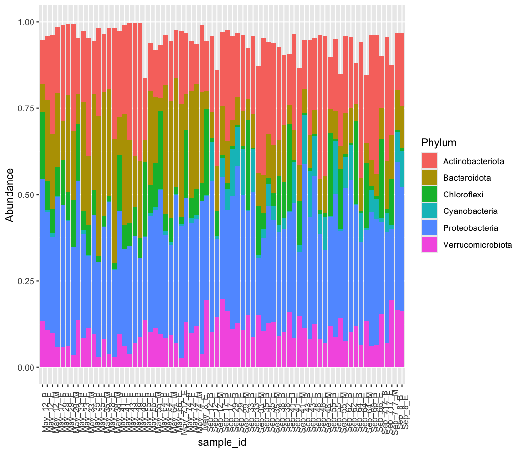
Our bars don’t add up perfectly to one, as our data doesn’t include all Phyla in the original dataset.
If we want to return our data to wide format, we can use pivot_wider
taxon_long %>%
pivot_wider(names_from = "Phylum", values_from = "Abundance")
# A tibble: 71 × 7
   sample_id Proteobacteria Actinobacteriota Bacteroidota Chloroflexi Verrucomicrobiota Cyanobacteria
   <chr>              <dbl>            <dbl>        <dbl>       <dbl>             <dbl>         <dbl>
 1 Sep_43_B           0.475            0.141       0.0725     0.00515            0.114       0.141
 2 Sep_29_E           0.453            0.184       0.0814     0.00688            0.128       0.114
 3 Sep_62_B           0.445            0.222       0.119      0.00841            0.0747      0.0894
 4 May_8_E            0.443            0.195       0.263      0.0524             0.0376      0.000695
 5 Sep_62_E           0.441            0.206       0.0999     0.00573            0.100       0.102
 6 May_38_E           0.440            0.175       0.310      0.0164             0.0393      0.000801
 7 Sep_12_E           0.436            0.220       0.0770     0.00971            0.104       0.113
 8 May_17_E           0.435            0.191       0.216      0.0850             0.0575      0.00129
 9 May_66_E           0.431            0.139       0.315      0.0205             0.0693      0.00142
10 Sep_8_B            0.429            0.163       0.118      0.00483            0.165       0.0886
# ℹ 61 more rows
Joining data frames
Now we’re ready to join our taxon data to the sample data. Previously we saw that we could read in and filter the sample data like this to get the data from the Americas for 2007 so we can create a new dataframe with our filtered data:
head(sample_data, 6)
# A tibble: 6 × 9
sample_id env_group depth cells_per_ml temperature total_nitrogen total_phosphorus diss_org_carbon chlorophyll
<chr> <chr> <dbl> <dbl> <dbl> <dbl> <dbl> <dbl> <dbl>
1 May_12_B Deep 103. 2058864. 4.07 465 3.78 2.48 0.05
2 May_12_E Shallow_May 5 4696827. 7.01 465 4.39 2.38 2.53
3 May_12_M Shallow_May 15 4808339. 6.14 474 5.37 2.60 3.2
4 May_17_E Shallow_May 5 3738681. 5.99 492 4.67 2.44 0.55
5 May_29_B Deep 27 2153086. 4.67 525 4.44 2.40 0.48
6 May_29_E Shallow_May 5 3124920. 5.97 521 3.71 2.28 0.79
head(taxon_clean, 6)
# A tibble: 6 × 7
sample_id Proteobacteria Actinobacteriota Bacteroidota Chloroflexi Verrucomicrobiota Cyanobacteria
<chr> <dbl> <dbl> <dbl> <dbl> <dbl> <dbl>
1 Sep_43_B 0.475 0.141 0.0725 0.00515 0.114 0.141
2 Sep_29_E 0.453 0.184 0.0814 0.00688 0.128 0.114
3 Sep_62_B 0.445 0.222 0.119 0.00841 0.0747 0.0894
4 May_8_E 0.443 0.195 0.263 0.0524 0.0376 0.000695
5 Sep_62_E 0.441 0.206 0.0999 0.00573 0.100 0.102
6 May_38_E 0.440 0.175 0.310 0.0164 0.0393 0.000801
Look at the data in taxon_clean and sample_data. If you had to merge these two data frames together, which column would you use to merge them together? If you said “sample_id” - good job!
We’ll call sample_id our “key”. Now, when we join them together, can you think of any problems we might run into when we merge things? We might not have taxon data for all of the samples in the sample dataset and vice versa.
The dplyr package has a number of tools for joining data frames together depending on what we want to do with the rows of the data that are not represented in both data frames. Here we’ll be using inner_join() and anti_join().
In an “inner join”, the new data frame only has those rows where the same key is found in both data frames. This is a very commonly used join.
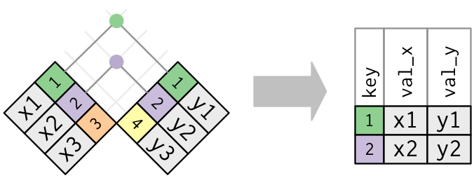
Bonus: Other dplyr join functions
Outer joins and can be performed using
left_join(),right_join(), andfull_join(). In a “left join”, if the key is present in the left hand data frame, it will appear in the output, even if it is not found in the the right hand data frame. For a right join, the opposite is true. For a full join, all possible keys are included in the output data frame.
Let’s give the inner_join() function a try.
inner_join(sample_data, taxon_clean)
Joining with `by = join_by(sample_id)`
# A tibble: 32 × 15
sample_id env_group depth cells_per_ml temperature total_nitrogen total_phosphorus diss_org_carbon chlorophyll Proteobacteria
<chr> <chr> <dbl> <dbl> <dbl> <dbl> <dbl> <dbl> <dbl> <dbl>
1 May_12_B Deep 103. 2058864. 4.07 465 3.78 2.48 0.05 0.412
2 May_12_E Shallow_May 5 4696827. 7.01 465 4.39 2.38 2.53 0.339
3 May_12_M Shallow_May 15 4808339. 6.14 474 5.37 2.60 3.2 0.276
4 May_17_E Shallow_May 5 3738681. 5.99 492 4.67 2.44 0.55 0.435
5 May_29_B Deep 27 2153086. 4.67 525 4.44 2.40 0.48 0.410
6 May_29_E Shallow_May 5 3124920. 5.97 521 3.71 2.28 0.79 0.362
7 May_29_M Shallow_May 19 2566156. 5.69 539 4.23 2.33 0.44 0.311
8 May_33_B Deep 135 2293177. 3.87 505 4.18 2.34 0.22 0.403
9 May_33_E Shallow_May 5 5480859. 7.93 473 6.64 2.51 3.44 0.301
10 May_33_M Shallow_May 20 3114433. 4.53 515 4.14 2.23 1.27 0.208
# ℹ 22 more rows
# ℹ 5 more variables: Actinobacteriota <dbl>, Bacteroidota <dbl>, Chloroflexi <dbl>, Verrucomicrobiota <dbl>, Cyanobacteria <dbl>
Do you see that we now have data from both data frames joined together in the same data frame? One thing to note about the output is that inner_join() tells us that that it joined by “sample_id”. We can make this explicit using the “by” argument in the join functions
inner_join(sample_data, taxon_clean, by="sample_id")
# A tibble: 32 × 15
sample_id env_group depth cells_per_ml temperature total_nitrogen total_phosphorus diss_org_carbon chlorophyll Proteobacteria
<chr> <chr> <dbl> <dbl> <dbl> <dbl> <dbl> <dbl> <dbl> <dbl>
1 May_12_B Deep 103. 2058864. 4.07 465 3.78 2.48 0.05 0.412
2 May_12_E Shallow_May 5 4696827. 7.01 465 4.39 2.38 2.53 0.339
3 May_12_M Shallow_May 15 4808339. 6.14 474 5.37 2.60 3.2 0.276
4 May_17_E Shallow_May 5 3738681. 5.99 492 4.67 2.44 0.55 0.435
5 May_29_B Deep 27 2153086. 4.67 525 4.44 2.40 0.48 0.410
6 May_29_E Shallow_May 5 3124920. 5.97 521 3.71 2.28 0.79 0.362
7 May_29_M Shallow_May 19 2566156. 5.69 539 4.23 2.33 0.44 0.311
8 May_33_B Deep 135 2293177. 3.87 505 4.18 2.34 0.22 0.403
9 May_33_E Shallow_May 5 5480859. 7.93 473 6.64 2.51 3.44 0.301
10 May_33_M Shallow_May 20 3114433. 4.53 515 4.14 2.23 1.27 0.208
# ℹ 22 more rows
# ℹ 5 more variables: Actinobacteriota <dbl>, Bacteroidota <dbl>, Chloroflexi <dbl>, Verrucomicrobiota <dbl>, Cyanobacteria <dbl>
One thing to notice is that sample data had 71 rows, but the output of our join only had 32. Let’s investigate. It appears that there must have been samples in the sample data that did not appear in our taxon_clean data frame.
Let’s use anti_join() for this - this will show us the data for the keys on the left that are missing from the data frame on the right.
anti_join(sample_data, taxon_clean, by="sample_id")
# A tibble: 39 × 9
sample_id env_group depth cells_per_ml temperature total_nitrogen total_phosphorus diss_org_carbon chlorophyll
<chr> <chr> <dbl> <dbl> <dbl> <dbl> <dbl> <dbl> <dbl>
1 September_12_B Deep 102 1703592. 4.20 564 1.69 2.42 0.05
2 September_12_E Shallow_September 5 4930739. 18.1 526 3.12 2.96 2.89
3 September_12_M Deep 52 2304545. 4.76 517 2.25 2.58 0.37
4 September_17_B Shallow_September 10.9 6942213. 18.1 385 2.67 2.69 2.28
5 September_17_E Shallow_September 5 7261861. 18.4 396 3.48 2.73 2.74
6 September_29_B Shallow_September 27.9 6168187. 19.0 358 4.28 2.88 2.12
7 September_29_E Shallow_September 5 5582205. 19.0 336 2.68 2.81 2.21
8 September_29_M Shallow_September 15 5681149. 19.0 378 5.08 2.75 2.24
9 September_33_B Deep 135. 1246414. 3.98 506 4.15 2.49 0.05
10 September_33_E Shallow_September 5 7027388. 19.2 370 4.72 2.58 2.5
# ℹ 29 more rows
We can see that none of the joining worked for September samples! What’s going on here? Well, let’s look closer at those sample IDs. If I want to pull just a single column from a datatable, I can use the $ notation
sample_data$sample_id
[1] "May_12_B" "May_12_E" "May_12_M" "May_17_E" "May_29_B" "May_29_E" "May_29_M"
[8] "May_33_B" "May_33_E" "May_33_M" "May_35_B" "May_35_E" "May_35_M" "May_38_E"
[15] "May_38_M" "May_41_B" "May_41_E" "May_43_E" "May_48_B" "May_48_E" "May_55_B"
[22] "May_55_E" "May_55_M" "May_64_B" "May_64_E" "May_64_M" "May_66_E" "May_717_E"
[29] "May_74_B" "May_74_E" "May_74_M" "May_8_E" "September_12_B" "September_12_E" "September_12_M"
[36] "September_17_B" "September_17_E" "September_29_B" "September_29_E" "September_29_M" "September_33_B" "September_33_E"
[43] "September_33_M" "September_35_B" "September_35_E" "September_35_M" "September_38_B" "September_38_E" "September_41_B"
[50] "September_41_E" "September_41_M" "September_43_B" "September_43_E" "September_48_B" "September_48_E" "September_48_M"
[57] "September_55_B" "September_55_E" "September_55_M" "September_62_B" "September_62_E" "September_64_B" "September_64_E"
[64] "September_64_M" "September_66_B" "September_66_E" "September_717_B" "September_717_E" "September_717_M" "September_8_B"
[71] "September_8_E"
taxon_clean$sample_id
[1] "Sep_43_B" "Sep_29_E" "Sep_62_B" "May_8_E" "Sep_62_E" "May_38_E" "Sep_12_E" "May_17_E" "May_66_E" "Sep_8_B" "Sep_48_B"
[12] "Sep_33_E" "May_64_B" "Sep_48_E" "Sep_55_E" "May_12_B" "May_29_B" "Sep_48_M" "May_35_E" "May_33_B" "Sep_66_E" "May_48_E"
[23] "Sep_35_B" "Sep_64_E" "Sep_41_E" "Sep_29_M" "Sep_66_B" "May_48_B" "May_717_E" "Sep_29_B" "May_64_E" "May_29_E" "May_38_M"
[34] "Sep_8_E" "May_35_M" "May_74_B" "Sep_717_E" "Sep_17_B" "May_41_B" "Sep_43_E" "Sep_64_B" "May_35_B" "May_64_M" "May_55_M"
[45] "May_33_M" "May_43_E" "May_12_E" "Sep_35_E" "May_55_E" "Sep_17_E" "May_41_E" "May_74_E" "May_33_E" "Sep_55_B" "May_29_M"
[56] "Sep_33_M" "May_74_M" "Sep_12_B" "Sep_38_B" "Sep_33_B" "Sep_35_M" "Sep_38_E" "Sep_41_B" "May_12_M" "Sep_41_M" "Sep_12_M"
[67] "Sep_717_B" "Sep_64_M" "Sep_55_M" "May_55_B" "Sep_717_M"
In our sample_data, our sample IDs used the full word “September”, but in our taxon table it looks like someone shortened it to “Sep”. As such, inner_join can’t recognize that these are matching keys. Let’s use what we know about mutate alongside a new function, str_replace, to help them match.
taxon_clean_goodSept <- taxon_clean %>%
mutate(sample_id = str_replace(sample_id, pattern = "Sep", replacement = "September"))
Now let’s try with that inner join again.
inner_join(sample_data, taxon_clean_goodSept, by = "sample_id")
# A tibble: 71 × 15
sample_id env_group depth cells_per_ml temperature total_nitrogen total_phosphorus diss_org_carbon chlorophyll Proteobacteria
<chr> <chr> <dbl> <dbl> <dbl> <dbl> <dbl> <dbl> <dbl> <dbl>
1 May_12_B Deep 103. 2058864. 4.07 465 3.78 2.48 0.05 0.412
2 May_12_E Shallow_May 5 4696827. 7.01 465 4.39 2.38 2.53 0.339
3 May_12_M Shallow_May 15 4808339. 6.14 474 5.37 2.60 3.2 0.276
4 May_17_E Shallow_May 5 3738681. 5.99 492 4.67 2.44 0.55 0.435
5 May_29_B Deep 27 2153086. 4.67 525 4.44 2.40 0.48 0.410
6 May_29_E Shallow_May 5 3124920. 5.97 521 3.71 2.28 0.79 0.362
7 May_29_M Shallow_May 19 2566156. 5.69 539 4.23 2.33 0.44 0.311
8 May_33_B Deep 135 2293177. 3.87 505 4.18 2.34 0.22 0.403
9 May_33_E Shallow_May 5 5480859. 7.93 473 6.64 2.51 3.44 0.301
10 May_33_M Shallow_May 20 3114433. 4.53 515 4.14 2.23 1.27 0.208
# ℹ 61 more rows
# ℹ 5 more variables: Actinobacteriota <dbl>, Bacteroidota <dbl>, Chloroflexi <dbl>, Verrucomicrobiota <dbl>, Cyanobacteria <dbl>
Woohoo! We matched all of the samples from each table. Let’s save this as a new dataframe, which we can use in later projects.
sample_and_taxon <- inner_join(sample_data, taxon_clean_goodSept, by = "sample_id")
We have reached our data cleaning goals! One of the best aspects of doing all of these steps coded in R is that our efforts are reproducible, and the raw data is maintained. With good documentation of data cleaning and analysis steps, we could easily share our work with another researcher who would be able to repeat what we’ve done. However, it’s also nice to have a saved csv copy of our clean data. That way we can access it later without needing to redo our data cleaning, and we can also share the cleaned data with collaborators. To save our dataframe, we’ll use write_csv().
write_csv(sample_and_taxon, "data/sample_and_taxon.csv")
Great - Now we can move on to the analysis!
Analyzing combined data
Now comes the fun part! All this cleaning and joining has given us a dataset which allows us to look at how environmental variables affects the abundance of different microbial Phyla. For this portion, we are going to focus on the Phylum Chloroflexi. We want to figure out - where do species in this Phylum tend to live in Lake Ontario? Are there differences in its abundance between environmental groups?
To answer the first question, we’ll plot the relative abundance of Chloroflexi against a station’s depth using a scatter plot:
ggplot(sample_and_taxon, aes(x=depth, y=Chloroflexi)) +
geom_point()+
labs(x="Depth (m)",
y="Chloroflexi (Relative Abundance)",
title="There is a strong association between a station's depth \nand the abundance of Chloroflexi"
)
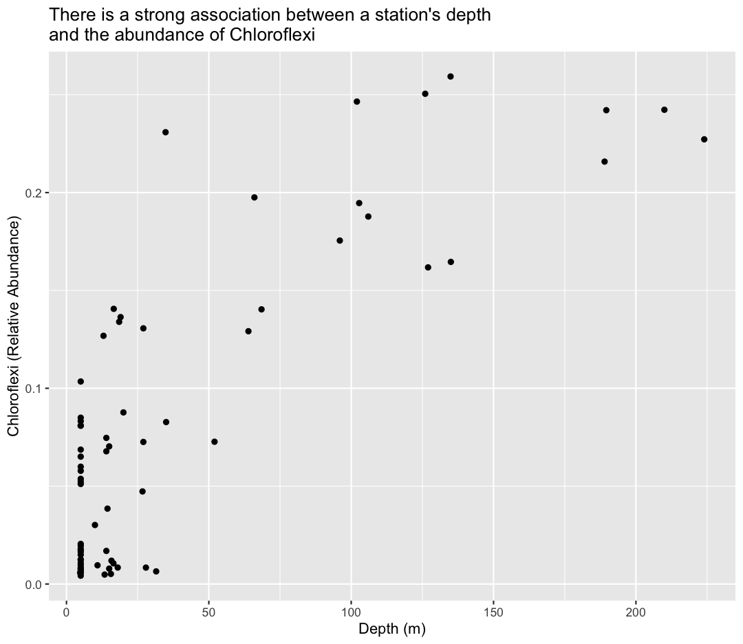
Tip: Notice we used the \n in our title to get a new line to prevent it from getting cut off.
To help clarify the association, we can add a fit line through the data using geom_smooth()
ggplot(sample_and_taxon, aes(x=depth, y=Chloroflexi)) +
geom_point()+
labs(x="Depth (m)",
y="Chloroflexi (Relative Abundance)",
title="There is a strong association between a station's depth \nand the abundance of Chloroflexi"
) +
geom_smooth()
`geom_smooth()` using method = 'loess' and formula = 'y ~ x'
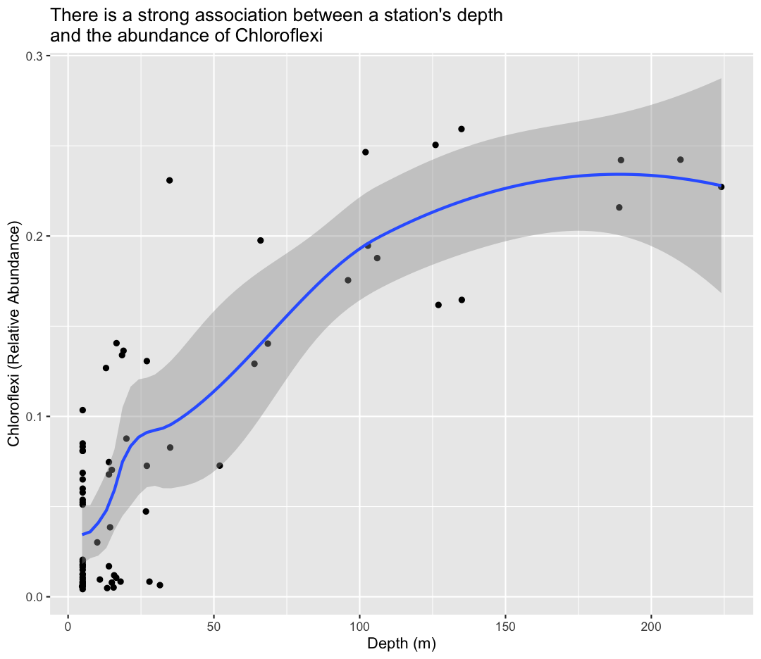
By default, ggplot uses a funky model called “loess estimation” We can force the line to be a linear model (straight) using method="lm" as an argument to geom_smooth
ggplot(sample_and_taxon, aes(x=depth, y=Chloroflexi)) +
geom_point()+
labs(x="Depth (m)",
y="Chloroflexi (Relative Abundance)",
title="There is a strong association between a station's depth \nand the abundance of Chloroflexi"
) +
geom_smooth(method="lm")
`geom_smooth()` using formula = 'y ~ x'
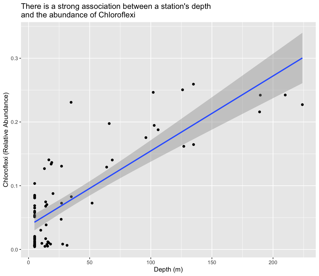
To answer our first question, Chloroflexi appears to be much more abundant in the deeper samples from Lake Ontario!
For the second question, we want to calculate the average abundance of Chloroflexi in our different environmental groups, using a combination of group_by and summarize. Let’s also calculate the standard deviation, to give us a sense of the variance in each group.
sample_and_taxon %>%
group_by(env_group) %>%
summarize(avg_chloro = mean(Chloroflexi),
sd_chloro = sd(Chloroflexi))
# A tibble: 3 × 3
env_group avg_chloro sd_chloro
<chr> <dbl> <dbl>
1 Deep 0.183 0.0539
2 Shallow_May 0.0631 0.0315
3 Shallow_September 0.0116 0.0101
We see that Chloroflexi is most abundant in the Deep groups, relatively rare in Shallow May, and very rare in Shallow September.
Bonus
Bonus content
Sort data with arrange()
The arrange() function allows us to sort our data by some value. Let’s use the sample_data dataframe. We will take the average value for each environmental group and then sort it so the environmental group with the highest cell abundance are on top. Which environmental group might you guess has the highest cell abundance before running the code?
sample_data %>%
group_by(env_group) %>%
summarise(average= mean(cells_per_ml)) %>%
arrange(desc(average))
# A tibble: 3 × 2
env_group average
<chr> <dbl>
1 Shallow_September 5906967.
2 Shallow_May 4004784.
3 Deep 1879707.
Notice there that we can use the column created the in the summarize() step (“average”) later in the arrange() step. We also use the desc() function here to sort the values in a descending order so the largest values are on top. The default is to put the smallest values on top.
Bonus exercises
Calculating absolute abundance
Our data contains total cell abundance (
cells_per_ml) alongside the relative abundance of each Phylum. If we wanted to get the absolute abundance of Chloroflexi (Cells of Chloroflexi per ml), how would we calculate that?Solution
Create a new variable using
mutate()that calculates absolute abundance of Chloroflexi.sample_and_taxon %>% mutate(abs_Chloroflexi = cells_per_ml * Chloroflexi) %>% glimpse()Rows: 71 Columns: 16 $ sample_id <chr> "May_12_B", "May_12_E", "May_12_M", "May_17_E", "May_29_B", "May_29_E", "May_29_M", "May_33_B", "May_33_E", "May_… $ env_group <chr> "Deep", "Shallow_May", "Shallow_May", "Shallow_May", "Deep", "Shallow_May", "Shallow_May", "Deep", "Shallow_May",… $ depth <dbl> 102.8, 5.0, 15.0, 5.0, 27.0, 5.0, 19.0, 135.0, 5.0, 20.0, 27.0, 5.0, 10.0, 5.0, 14.0, 127.0, 5.0, 5.0, 35.0, 5.0,… $ cells_per_ml <dbl> 2058864, 4696827, 4808339, 3738681, 2153086, 3124920, 2566156, 2293177, 5480859, 3114433, 3066162, 5417617, 46103… $ temperature <dbl> 4.07380, 7.01270, 6.13500, 5.99160, 4.66955, 5.97390, 5.68550, 3.87050, 7.93390, 4.53155, 6.57370, 11.22760, 11.0… $ total_nitrogen <dbl> 465, 465, 474, 492, 525, 521, 539, 505, 473, 515, 479, 441, 450, 416, 449, 475, 435, 499, 477, 472, 475, 468, 460… $ total_phosphorus <dbl> 3.78, 4.39, 5.37, 4.67, 4.44, 3.71, 4.23, 4.18, 6.64, 4.14, 4.32, 8.98, 5.99, 8.27, 8.66, 2.52, 5.46, 5.48, 2.31,… $ diss_org_carbon <dbl> 2.478, 2.380, 2.601, 2.435, 2.396, 2.283, 2.334, 2.343, 2.508, 2.232, 2.613, 2.567, 2.628, 2.692, 2.692, 2.389, 2… $ chlorophyll <dbl> 0.05, 2.53, 3.20, 0.55, 0.48, 0.79, 0.44, 0.22, 3.44, 1.27, 1.26, 3.96, 2.44, 3.32, 4.84, 0.21, 2.84, 0.56, 0.24,… $ Proteobacteria <dbl> 0.4120986, 0.3389293, 0.2762080, 0.4351188, 0.4100639, 0.3622527, 0.3110194, 0.4034387, 0.3012852, 0.2077626, 0.3… $ Actinobacteriota <dbl> 0.1288958, 0.1861232, 0.2866884, 0.1910769, 0.2801239, 0.2062492, 0.3100247, 0.1624027, 0.2048393, 0.3409799, 0.1… $ Bacteroidota <dbl> 0.08065717, 0.23470807, 0.21659843, 0.21576244, 0.11036293, 0.27980345, 0.20001474, 0.08615012, 0.31681303, 0.199… $ Chloroflexi <dbl> 0.194635644, 0.080866893, 0.070320609, 0.084983573, 0.130649915, 0.083230440, 0.136388756, 0.164581873, 0.0537443… $ Verrucomicrobiota <dbl> 0.13249532, 0.10878214, 0.09991639, 0.05752092, 0.06055977, 0.06269371, 0.03606823, 0.13660756, 0.08463046, 0.114… $ Cyanobacteria <dbl> 2.482454e-04, 9.574640e-03, 1.262830e-02, 1.288730e-03, 0.000000e+00, 4.535719e-04, 3.315772e-04, 2.399992e-04, 1… $ abs_Chloroflexi <dbl> 400728.37, 379817.78, 338125.36, 317726.48, 281300.48, 260088.49, 349994.76, 377415.41, 294565.42, 273092.26, 222…Previously, we found that Deep samples had the greatest relative abundance of Chloroflexi. Do they also have the greatest absolute abundance of this taxa?
sample_and_taxon %>% mutate(abs_Chloroflexi = cells_per_ml * Chloroflexi) %>% group_by(env_group) %>% summarize(avg_chloro_relative = mean(Chloroflexi), avg_chloro_absolute = mean(abs_Chloroflexi))# A tibble: 3 × 3 env_group avg_chloro_relative avg_chloro_absolute <chr> <dbl> <dbl> 1 Deep 0.183 332349. 2 Shallow_May 0.0631 229210. 3 Shallow_September 0.0116 62915.Looks like yes! However, the difference is much more slight between Deep and Shallow_May when we consider absolute abundance.
Key Points
Package loading is an important first step in preparing an R environment.
Data analsyis in R facilitates reproducible research.
There are many useful functions in the
tidyversepackages that can aid in data analysis.Assessing data source and structure is an important first step in analysis.
Preparing data for analysis can take significant effort and planning.
Writing Reports with R Markdown
Overview
Teaching: 105 min
Exercises: 30 minQuestions
How can I make reproducible reports using R Markdown?
How do I format text using Markdown?
Objectives
To create a report in R Markdown that combines text, code, and figures.
To use Markdown to format our report.
To understand how to use R code chunks to include or hide code, figures, and messages.
To be aware of the various report formats that can be rendered using R Markdown.
To practice using the Unix Shell, and R through paired programming exercises.
Contents
- What is R Markdown and why use it?
- Creating a reports directory
- Creating an R Markdown file
- Basic components of R Markdown
- Starting the report
- Formatting
- Integrating it all together: Paired exercise
Recall that our goal is to generate a report which analyses how environmental conditions change microbial communities in Lake Ontario.
Discussion
How do you usually share data analyses with your collaborators? Add your usual workflow to the Etherpad.
What is R Markdown and why use it?
In R Markdown, you can incorporate ordinary text (ex. experimental methods, analysis and discussion of results) alongside code and figures! (Some people write entire manuscripts in R Markdown - if you’re curious, talk to the Schmidt Lab!) This is useful for writing reproducible reports and publications, sharing work with collaborators, writing up homework, and keeping a bioinformatics notebook. Because the code is embedded in the document, the tables and figures are reproducible. Anyone can run the code and get the same results. If you find an error or want to add more to the report, you can just re-run the document and you’ll have updated tables and figures! This concept of combining text and code is called “literate programming”. To do this we use R Markdown, which combines Markdown (renders plain text) with R. You can output an html, PDF, or Word document that you can share with others. In fact, this webpage is an example of a rendered R markdown file!
(If you are familiar with Jupyter notebooks in the Python programming environment, R Markdown is R’s equivalent of a Jupyter notebook.)
Other Options for Literate Programming
There are many options for combining code and prose. If you are familiar with Jupyter notebooks in the Python programming environment, R Markdown is R’s equivalent of a Jupyter notebook. The company which manages RStudio, Posit, has also invested considerable energy in a new document type “Quarto”, which they encourage users to adopt as it does not rely on an R install. There are many similarities between Quarto and RMarkdown, but the community of Quarto users (and history of troubleshooting support) is still smaller. Maybe someday soon, we will be teaching Quarto documents instead!
Creating a reports directory
To get started, let’s use the Unix Shell to create a directory within ontario-report called reports where we will write our reports.
First, open the Unix Shell and cd to ontario-report:
pwd
mkdir reports
/home/USERNAME/Desktop/ontario-report/reports/
Note that there is an option to use the terminal from R Studio (tab next to Console), but on Windows computers this terminal might not be a Unix Shell.
Creating an R Markdown file
Now that we have a better understanding of what we can use R Markdown files for, let’s start writing a report!
To create an R Markdown file:
- Open RStudio
- Go to File → New File → R Markdown
- Give your document a title, something like “A Report on Lake Ontario’s Microbes” (Note: this is not the same as the file name - it’s just a title that will appear at the top of your report)
- Keep the default output format as HTML.
- R Markdown files always end in
.Rmd
R Markdown Outputs
The default output for an R Markdown report is HTML, but you can also use R Markdown to output other report formats. For example, you can generate PDF reports using R Markdown, but you must install some form of LaTeX to do this.
Basic components of R Markdown
Header
The first part is a header at the top of the file between the lines of ---. This contains instructions for R to specify the type of document to be created and options to choose (ex., title, author, date). These are in the form of key-value pairs (key: value; YAML).
Here’s an example:
---
title: 'Writing Reports with R Markdown'
author: "Augustus Pendleton"
date: "01/14/2025"
output: html_document
---
Code chunks
The next section is a code chunk, or embedded R code, that sets up options for all code chunks. Here is the default when you create a new R Markdown file:
```{r setup, include=FALSE}
knitr::opts_chunk$set(echo = TRUE)
```
All code chunks have this format:
```{r}
# Your code here
```
All of the code is enclosed in 3 back ticks and the {r} part indicates that it’s a chunk of R code.
You can also include other information within the curly brackets to indicate different information about that code chunk.
For instance, the first code block is named “setup”, and include=FALSE prevents code and results from showing up in the output file.
Inside the code chunk, you can put any R code that you want to run, and you can have as many code chunks as you want in your file.
As we mentioned above, in the first code chunk you set options for the entire file.
echo = TRUE means that you want your code to be shown in the output file. If you change this to echo = FALSE, then the code will be hidden and only the output of the code chunks will be seen in the output file.
There are also many other options that you can change, but we won’t go into those details in this workshop.
Text
Finally, you can include text in your R Markdown file. This is any text or explanation you want to include, and it’s formatted with Markdown. We’ll learn more about Markdown formatting soon!
Starting the report
Let’s return to the new R Markdown file you created and delete everything below the setup code chunk. (That stuff is just examples and reminders of how to use R Markdown.)
Next, let’s save our R markdown file to the reports directory.
You can do this by clicking the save icon in the top left or using control + s (command + s on a Mac). Make sure to end the file with a “.Rmd” file extension.
There’s one other thing that we need to do before we get started with our report.
To render our documents into html format, we can “knit” them in R Studio.
Usually, R Markdown renders documents from the directory where the document is saved (the location of the .Rmd file), but we want it to render from the main project directory where our .Rproj file is.
This is because that’s where all of our relative paths are from and it’s good practice to have all of your relative paths from the main project directory.
To change this default, click on the down arrow next to the “Knit” button at the top left of R Studio, go to “Knit Directory” and click “Project Directory”.
Now it will assume all of your relative paths for reading and writing files are from the ontario-report directory, rather than the reports directory.
Now that we have that set up, let’s start on the report!
We’re going to use the code you generated yesterday to plot cell abundance and temperature to include in the report. Recall that we needed a couple R packages to generate these plots. We can create a new code chunk to load the needed packages. You could also include this in the previous setup chunk, it’s up to your personal preference.
```{r packages}
library(tidyverse)
```
Now, in a real report this is when we would type out the background and purpose of our analysis to provide context to our readers. However, since writing is not a focus of this workshop we will avoid lengthy prose and stick to short descriptions. You can copy the following text into your own report below the package code chunk.
This report was prepared to analyze environmental and microbial data from Lake Ontario. Our goal is to determine to how environmental variables like temperature affect the abundance of different Phyla of bacteria.
Now, since we want to show our results comparing cell abundance and temperature, we need to read in this data so we can regenerate our plot. We will add another code chunk to prepare the data.
```{r data}
sample_and_taxon <- read_csv("data/sample_and_taxon.csv")
```
Now that we have the data, we need to produce the plot. Let’s create it!
```{r cell_vs_temp}
ggplot(data = sample_and_taxon) +
aes(x = temperature, y = cells_per_ml/1000000, color=env_group) +
geom_point() +
labs(x = "Temperature (Celsius)", y = "Cells(million/ml)",
title= "Are temperature and cell abundance linked?")
```
Now we can knit our document to see how our report looks! Use the knit button in the top left of the screen.
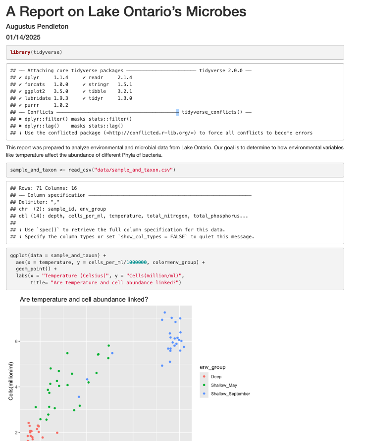
It’s looking pretty good, but there seem to be a few extra bits that we don’t need in the report. For example, the report shows that we load the tidyverse package and the accompanying messages.

To get rid of this, we can revise our packages code chunk by adding include=FALSE just like in the setup chunk to prevent code and messages in this chunk from showing up in our report.
```{r packages, include=FALSE}
library(tidyverse)
```
We can also see the code that was used to generate the plot. Depending on the purpose and audience for your report, you may want to include the code. If you don’t want the code to appear, how can you prevent it? What happens if we add include=FALSE to the plot code chunk, too? Try rendering the R Markdown report with this change.
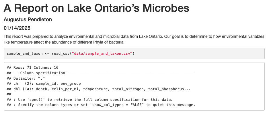
Oops! Now the plot doesn’t show up in our report at all. This is because setting include=FALSE prevents anything in the code chunk from appearing in the report. Instead we can add echo=FALSE to tell this code chunk that we don’t want to see the code but just the output.
```{r cell_vs_temp, echo = FALSE}
ggplot(data = sample_and_taxon) +
aes(x = temperature, y = cells_per_ml/1000000, color=env_group) +
geom_point() +
labs(x = "Temperature (Celsius)", y = "Cells(million/ml)",
title= "Are temperature and cell abundance linked?")
```
When we knit this again, our plot is back!

Before we finalize our report, let’s look at a few other cool features. Sometimes, you want to describe your data or results (like our plot) to the audience in text but the data and results may still change as you work things out. R Markdown offers an easy way to do this dynamically, so that the text updates as your data or results change. Here is how to do this.
First, let’s create a code chunk that summarizes features of our data that we can use to describe our plot to our audience. Note that we set include=FALSE because we only want this step to happen in the background. For our purposes, we will calculate how many samples were included in the analysis, as well as the minimum and maximum temperature values:
```{r data_summary, include=FALSE}
nSamples <- sample_and_taxon %>%
select(sample_id) %>%
n_distinct()
minTemp <- sample_and_taxon %>%
summarise(round(min(temperature))) %>%
pull()
maxTemp <- sample_and_taxon %>%
summarise(round(max(temperature))) %>%
pull()
```
Now, all we need to do is reference the values we just computed to describe our
plot. To do this, we enclose each value in one set of backticks
(`r some_R_variable_name `), while the r part once again
indicates that it’s a chunk of R code. When we knit our report, R will
automatically fill in the values we just created in the above code chunk. Note
that R will automatically update these values every time our data might change
(if we were to decide to drop or add samples to this analysis, for example).
The above plot shows the relationship between cell abundance and temperature for a total of `r nSamples ` samples. For this set of samples, temperature ranged from a minimum of `r minTemp`°C
to a maximum `r maxTemp`°C.
In addition to reporting specific values in the text, we may also want to show a table of values. With R Markdown there are multiple ways to product tables. One way to generate smaller tables is manually. Using a special format we can generate a table in our output. Note that this does not get generated in a code chunk because it is markdown formatting not R code.
|HEADER 1|HEADER 2|
|-------------|-------------|
|row 1, column1|row 1, column 2|
|row 2, column1|row 2, column 2|
Columns are separated by the pipe key | located above Enter on the keyboard. The dashes distinguish the header row from the rest of the table. This header could be a name for each column or a header for the whole table. Now that we know the basic structure we can fill in our table. This is how we could present the same numbers from the previous paragraph as a table instead, again using in-line code.
When we knit the report again, the code above will render like this:

Here’s the text that we need to include to create a summary table of our data:
|Summary of Data|
|------|------|
|Number of Samples|`r nSamples`|
|Minimum Temperature|`r minTemp`|
|Maximum Temperature|`r maxTemp`|
This will render like this:

This is useful if we are reporting a few values, but can get tedious for larger tables. Another way we can add tables to our reports is using an R function called kable(). Since this is an R function, we will use it within a code chunk. We can give the kable() function a data table and it will format it to a nice looking table in the report. For example, we could use the following code to generate a table of all the Deep samples. The rendered version should look almost exactly as it does on this webpage.
# load library
library(knitr)
# print kable
sample_and_taxon %>%
filter(env_group == "Deep") %>%
select(sample_id, env_group, cells_per_ml, temperature) %>%
kable()
| sample_id | env_group | cells_per_ml | temperature |
|---|---|---|---|
| May_12_B | Deep | 2058864 | 4.07380 |
| May_29_B | Deep | 2153086 | 4.66955 |
| May_33_B | Deep | 2293177 | 3.87050 |
| May_41_B | Deep | 2422141 | 3.76370 |
| May_55_B | Deep | 1847686 | 3.66830 |
| May_64_B | Deep | 1631065 | 3.67740 |
| May_74_B | Deep | 2270042 | 4.86530 |
| September_12_B | Deep | 1703592 | 4.19650 |
| September_12_M | Deep | 2304545 | 4.75550 |
| September_33_B | Deep | 1246414 | 3.97670 |
| September_33_M | Deep | 1793411 | 4.16960 |
| September_38_B | Deep | 1783244 | 5.26790 |
| September_38_E | Deep | 1989859 | 6.83795 |
| September_41_B | Deep | 1394350 | 3.83100 |
| September_41_M | Deep | 2067910 | 3.93275 |
| September_55_B | Deep | 1594241 | 3.77870 |
| September_55_M | Deep | 2008431 | 3.92295 |
| September_64_B | Deep | 1459993 | 3.76020 |
| September_64_M | Deep | 1852089 | 3.98550 |
| September_717_B | Deep | 1575429 | 4.02260 |
| September_717_M | Deep | 2024282 | 4.85345 |
Formatting
We now know how to create a report with R Markdown. Maybe we also want to format the report a little bit to structure our thought process in a useful way (e.g., sections) and make it visually appealing? Markdown is a very simple programming language when it comes to syntax. Let’s try to figure out some syntax together. Suppose we wanted to create sections in our report.
R Markdown headers
Try googling how to create sections by using headers and subheaders using R Markdown. What do you find?
Solution
We can easily create headers and subheaders by using the
#pound/hash sign. Our main headers have one#(e.g.# Main Header Here) and to create subheaders we add additinal#s (e.g.## First subheaderand### Second subheader)
OK, now that we know how to make headers, let’s practice some more Markdown syntax.
R Markdown syntax
Go ahead and do some online searches on how to do the following:
- create a bullet point list with three items
- as the first item, write the name of your currently favorite programming language in bold
- as the second item, write the name of a function you have so far found most useful in italics
- as the third item, write one thing you want to learn next on your programming journey in bold and italics
- turn your bullet point list into a numbered list
- create a fourth list item and find an online guide and/or cheat sheet for basic Markdown syntax, write its name down here and hyperlink its url
Solution
This link has some helpful basic R Markdown syntax.
Using the “Visual” view for easy formatting
In newer versions of RStudio, we can switch to the “Visual” view when editing our documents. This makes the experience much more similar to writing in software like Microsoft Word or Google Docs. We can use formatting tools (like bolding and italicizing), insert pictures, and create tables without manually typing out the markdown syntax. The best part? If you then switch back to the “Source” view, you can see the markdown syntax RStudio has automatically created for you.
Integrating it all together: Make your own report!
You’ve learned so much in the past two days - how to use the Unix Shell to move around your computer, how to make pretty plots and do data analysis in R, and how to incorporate it all into a report which you can share with Collaborators via Github! Don’t worry - if you have questions, the instructor and helpers are here to help you out!
- Make a new R Markdown file.
- Give it an informative title.
- Delete all the unnecessary Markdown and R code (everything below the setup R chunk).
- Save it to the
reportsdirectory as LASTNAME_Ontario_Report.Rmd
Work through the exercises below, adding code chunks to analyze and plot the data, and prose to explain what you’re doing. Make sure to knit as you go, to make sure everything is working.
The exercises below give you some ideas of directions to pursue. These are nice exercises because we have the solutions saved. However, you’re welcome to branch out as well! Maybe you have your own hypotheses you’d like to test. Maybe you want to explore a new type of ggplot. Perhaps you want to run some statistical tests.
Just remember to use a combination of prose (writing) and code to document the goals, process, and outputs of your analysis in your RMarkdown report.
Once you’re done, add your report to your Git repo, commit those changes, and push those changes to Github. If you feel comfortable, post a link to the repo on the Etherpad, and change your repo’s settings to Public, so that others in the class can admire what you’ve accomplished!
Bonus Exercises
[1] The very first step is to read in the sample_and_taxon dataset, so do that first! Also load the tidyverse package.
Solution
library(tidyverse) sample_and_taxon <- read_csv('data/sample_and_taxon.csv')Rows: 71 Columns: 15 ── Column specification ─────────────────────────────────────────────────────────────────────────────────────────────────────── Delimiter: "," chr (2): sample_id, env_group dbl (13): depth, cells_per_ml, temperature, total_nitrogen, total_phosphorus... ℹ Use `spec()` to retrieve the full column specification for this data. ℹ Specify the column types or set `show_col_types = FALSE` to quiet this message.
Investigating nutrients and cell density
[2] Make a scatter plot of total_nitrogen vs. cells_per_ml, separated into a plot for each env_group. Hint: you can use facet_wrap(~column_name) to separate into different plots based on that column.
Solution
ggplot(sample_and_taxon, aes(x=total_nitrogen,y=cells_per_ml)) + geom_point() + facet_wrap(~env_group)
[3] It seems like there is an outlier in Shallow_May with very high nitrogen levels. What is this sample? Use a combination of filter and arrange to find out.
Solution
sample_and_taxon %>% filter(env_group == "Shallow_May") %>% arrange(desc(total_nitrogen))# A tibble: 25 × 15 sample_id env_group depth cells_per_ml temperature total_nitrogen <chr> <chr> <dbl> <dbl> <dbl> <dbl> 1 May_8_E Shallow_May 5 4578830. 8.43 640 2 May_29_M Shallow_May 19 2566156. 5.69 539 3 May_29_E Shallow_May 5 3124920. 5.97 521 4 May_33_M Shallow_May 20 3114433. 4.53 515 5 May_43_E Shallow_May 5 2787020. 5.88 499 6 May_17_E Shallow_May 5 3738681. 5.99 492 7 May_66_E Shallow_May 5 5262156. 12.3 489 8 May_35_B Shallow_May 27 3066162. 6.57 479 9 May_48_B Shallow_May 35 2300782. 4.79 477 10 May_717_E Shallow_May 5 4197941. 10.2 477 # ℹ 15 more rows # ℹ 9 more variables: total_phosphorus <dbl>, diss_org_carbon <dbl>, # chlorophyll <dbl>, Proteobacteria <dbl>, Actinobacteriota <dbl>, # Bacteroidota <dbl>, Chloroflexi <dbl>, Verrucomicrobiota <dbl>, # Cyanobacteria <dbl>
[4] Where was this sample again? Let’s look at a map:

Wow! This sample is right outside of Toronto.
We also see that Shallow September has four strange points, with high nitrogen and low cell counts. Let’s use a new geom, geom_text to figure out what those samples are (this might take some googling!). Also, let’s use filter to only plot samples from “Shallow_September”.
Solution
sample_and_taxon %>% filter(env_group == "Shallow_September") %>% ggplot(aes(x = total_nitrogen, y = cells_per_ml)) + geom_text(aes(label = sample_id))
Interesting…these are mostly from Station 35. I wonder why these stations have such high nitrogen and such low cell abundances?
Solution
Here, I show surface temperatures across the lake in September. Station 35 was on the edge an upwelling event, where cold, nutrient rich water is pulled to the surface of the lake! Stn. 38, which was smack dab in the upwelling itself, was so similar to deep samples that its env_group is “Deep” rather than “Shallow_September”.
If you want to investigate this phenomenon further, spend time analyzing the relative composition of Phyla in these upwelling stations compared to the rest of Shallow_September. If you want to go further, you can use the buoy_data from the Niagara and South Shore buoys to see if you can detect when this upwelling event began.
Comparing Dominant Phylum Across Environmental Groups
[6] We want to know which Phyla tend to live in which environments. Previously, we focused on Chloroflexi, and found it preferred Deep environments. What if we want to look at the relative abundances of all our Phyla between env_groups at once?
First, let’s remind ourselves how we looked at Chloroflexi across env_groups. Make a boxplot with env_group on the x-axis, and Chloroflexi relative abundance on the y axis.
Solution
sample_and_taxon %>% ggplot(aes(x = env_group, y = Chloroflexi)) + geom_boxplot()
[7] Now, we want to analyze multiple Phyla at once. Because our taxa abundances are in wide format, we can’t use multiple Phyla in a single ggplot. As such, we will need to convert our data to long format. Using pivot_longer, convert the columns containing our Phyla abundances from wide to long.
Solution
sample_and_taxon %>% pivot_longer(cols = Proteobacteria:Cyanobacteria, names_to = "Phylum", values_to = "Abundance")# A tibble: 426 × 11 sample_id env_group depth cells_per_ml temperature total_nitrogen <chr> <chr> <dbl> <dbl> <dbl> <dbl> 1 May_12_B Deep 103. 2058864. 4.07 465 2 May_12_B Deep 103. 2058864. 4.07 465 3 May_12_B Deep 103. 2058864. 4.07 465 4 May_12_B Deep 103. 2058864. 4.07 465 5 May_12_B Deep 103. 2058864. 4.07 465 6 May_12_B Deep 103. 2058864. 4.07 465 7 May_12_E Shallow_May 5 4696827. 7.01 465 8 May_12_E Shallow_May 5 4696827. 7.01 465 9 May_12_E Shallow_May 5 4696827. 7.01 465 10 May_12_E Shallow_May 5 4696827. 7.01 465 # ℹ 416 more rows # ℹ 5 more variables: total_phosphorus <dbl>, diss_org_carbon <dbl>, # chlorophyll <dbl>, Phylum <chr>, Abundance <dbl>
You can see that we’ve now made size rows per sample, one for each Phylum. This does mean that our metadata has been duplicated, which is okay right now.
Now, our data is in the correct format for plotting with ggplot. In the end, we want a plot that shows, for each env_group, the relative abundance of each Phylum. There are actually many plotting styles we could use to answer that question! We’ll try out three.
[8] Pipe your long dataframe into a boxplot with env_group on the x-axis, and Abundance on the y-axis. Use fill to differentiate different Phyla
Solution
sample_and_taxon %>% pivot_longer(cols = Proteobacteria:Cyanobacteria, names_to = "Phylum", values_to = "Abundance") %>% ggplot(aes(x = env_group, y = Abundance, fill = Phylum)) + geom_boxplot()
[9] Okay, what does this plot tell us? Make sure to write a quick summary in your report. Next, make a new plot, where Phylum is now on the x-axis, and the fill is determined by the env_group.
Solution
sample_and_taxon %>% pivot_longer(cols = Proteobacteria:Cyanobacteria, names_to = "Phylum", values_to = "Abundance") %>% ggplot(aes(x = Phylum, y = Abundance, fill = env_group)) + geom_boxplot()
[10] Which do you prefer? Which do you feel is easier to understand? Finally, let’s use faceting, rather than fill, to separate out Phyla
Solution
sample_and_taxon %>% pivot_longer(cols = Proteobacteria:Cyanobacteria, names_to = "Phylum", values_to = "Abundance") %>% ggplot(aes(x = env_group, y = Abundance)) + geom_boxplot() + facet_wrap(~Phylum)
If you want to investigate this dataset further, consider changing the x-axis to a continuous variable, like temperature, rather than the categorical env_group. Can you find associations between different environmental conditions and the abundance of specific taxa?
Bonus-Bonus: Let your creativity shine!
If you’ve gotten this far, feel free to let your creativity shine. Consider:
- Make your plots beautiful and professional:
- Alter axis labels
- Use
themeto change the font size of axis and legend text - Using or creating a beautiful palette from a new package
- Render your report in different formats, including pdf or docx
- Find a partner and use Github to collaborate on a shared RMarkdown document.
Key Points
R Markdown is an easy way to create a report that integrates text, code, and figures.
Options such as
includeandechodetermine what parts of an R code chunk are included in the R Markdown report.R Markdown can render HTML, PDF, and Microsoft Word outputs.
Conclusion
Overview
Teaching: 15 min
Exercises: minQuestions
What do I do after the workshop to apply what I learned and keep learning more?
Where can I learn more coding skills?
How do I deal with coding errors (i.e. debug)?
What other coding resources do we have at Cornell?
What other coding concepts should I learn?
Objectives
Learn how to get help with code via the Internet and at Cornell
Learn about other coding concepts that would be good to learn in the future.
Where to go from here?: Departing on your own coding journey

We have come to the end of this workshop. You learned some basic procedures for importing, managing, visualizing and reporting your data.
As you continue on your coding journey, two things will happen:
- You will encounter bugs and need to figure out how to solve them (“debugging”), and
- You will want to learn new data processing and analysis techniques.
As we complete the course, we want to share with you some tips and tricks that have helped us on our own programming journeys.
Writing code at Cornell
There are many local opportunities at Cornell to find coding support, learn new programming skills, and connect with other users.
Get help and connect
- Attend Micro Hacky Hours :)
- Cornell Center for Advanced Computing Worshops
- Cornell BioHPC Office Hours
Dealing with coding errors
Even well seasoned coders run into bugs all the time. Here are some strategies of how programmers try to deal with coding errors:
- Don’t panic. Bugs are a normal part of the coding process. Think of each bug as a great opportunity for becoming better at writing code. When you’re debugging, you’re being a detective and trying to figure out what’s wrong. Think of it as a fun mystery to solve! You’ll become a better detective the more you practice.
- First, determine which type of problem you are having: either the code tries to run but returns an error message, or your code runs without error but you did not get the result you expect.
- If you are getting an error message, read the error message carefully. Unfortunately, not all error messages are well written and it may not be obvious at first what is wrong. Try to determine if you are getting a syntax error or a runtime error.
- A syntax error is when the program doesn’t understand how to run the code you provided. In R, these error messages usually contain the word “unexpected”. Often these are because of a typo. Check that your parentheses and quotes are balanced and check that you haven’t misspelled a variable or function name. It’s difficult to identify the exact location where an error starts so you may have to look at lines before the line where the error was reported. In RStudio, look at the code coloring to find anything that looks off. RStudio will also put a red x or an yellow exclamation point to the left of lines where there is a syntax error.
- A runtime error is when the program understood all the commands you wrote, but ran into an error when trying to run them. If you are running multiple commands, try running each on its own. Before each command, check that you are passing the values you expect; and after each command, verify that the results seem sensible.
- If you have been able to find parts of your code that cause the error, take some time to review the documentation for the functions or commands you are using. Even for functions or commands you’ve used before, there may still be parts of the documentation that you just haven’t needed to use before. See if there are examples in the documentation that you can compare your own code to. Most programs make finding the documentation pretty easy.
- R: Typing a question mark immediately followed by a function name, i.e.,
?<command>(e.g. ?print), pulls up the R documentation for that function. This provides a function description, as well as in-depth information about each function argument including its purpose, default and other available options. - Shell: Using
man <command>or<command> --helppulls up the manual page with more information. To quit, clickq.
- R: Typing a question mark immediately followed by a function name, i.e.,
- Search online for the error message along with the function that is not working. Most likely, someone encountered this error before you and the examples online will help you figure out your own issue.
- Perform a general online search for what you are trying to do, e.g., “how to import a comma separated spreadsheet into R”, “how to delete a directory from the command line”, “how to merge conflicts in git”. Typically, you will find step-by-step online documentation that you can adapt for your own purposes.
Debugging code
If searching for your particular code problem hasn’t turned up a solution, you may have to do a bit of debugging. Debugging is the process of finding exactly what caused your error, and changing only what is necessary to fix it. There are many strategies to debugging code. Consider checking out the following resources to learn more about it.
- “5 Essential Tips to Debug Any Piece of Code” by mayuko [video, 8min] - Good general advice for debugging.
- “Object of type ‘closure’ is not subsettable” by Jenny Bryan [video, 50min] - A great talk with R specific advice about dealing with errors as a data scientist.
Asking strangers for help
If you are unable to determine what’s wrong with your own code, the internet offers several possible ways to get help: asking questions on programming websites, interacting with developers on GitHub, chatting with other programmers on Slack, or reaching out on Twitter. If you’re intimidated by asking people on the internet, you can also reach out to folks in the department, or attend Hacky Hour. You don’t have to do this all on your own. However, there are some important things to keep in mind when asking questions - whether it be to people on the internet, or to people at the university. You may want to consider these tips to help you increase your chances of getting the support you need:
- First, provide a brief summary of what you are trying to accomplish. You may have been working on the problem for a long time but the person you are asking will have no idea of your work until now. Keep it short and focus on your ultimate goal rather than just talking about your code. Sometimes there may better ways to solve the problem than the solution you’ve attempted this far.
- Then, briefly mention what you’ve tried so far. Maybe mention the search terms you used online or the specific documentation you’ve looked at. It should be clear that you’ve at least tried to solve the problem yourself first (after all, that’s the way you’re most likely to learn the most).
- Now, describe the problem you are having. Don’t just say “the code doesn’t work.” Are you getting an error? If so, what is the exact message? Are you getting unexpected results? If so, then what exactly were you expecting to happen?
- Next, include a minimal, reproducible example. This means you need to take away any parts of your code that aren’t necessary to create the error you are dealing with. Often, this may mean starting a branch with a new program just for testing. Make sure the code itself can be run by including or randomly generating some sample data. If there’s no way to copy/paste and run the code on a computer, that means the individuals you are asking for help need to run the code in their head which is a lot harder than running code on a computer. Clearly describe the desired behavior so that possible solutions can be tested and verified. In the process of creating a minimal, reproducible example, it is possible you will solve your own problem.
- Keep in mind the person helping you is unlikely to know the solution off the top of their head. Even the best programmers don’t have all the documentation memorized. But with time, programmers get better at solving problems based on their past experiences. By providing a reproducible example, you allow someone else to use their debugging skills to help you rather than making them guess what might be wrong.
- If it’s not obvious from your question, it can be very useful to include details about the operation system you are using and the versions of the programs you are currently running. Sometimes, things work differently as programs change over time and the code you found on the web may have been for a different version.
- Make it easy to reply. Try to ask one specific question. Asking a bunch of questions takes more time and energy to respond, and you want to minimize the work you create for the kind stranger who is helping you out. Also, if you include sample data with which to test possible solutions, then someone can verify their suggestion works before replying. This will help minimize back-and-forth with your helper which can take time.
- Finally, recognize that asking a good question is an art, not a science. It is something you will get better at with more time. You can also get better by trying to help other people with their questions. That way, you can see what information is necessary to really help someone. It’s a delicate balance between providing enough detail so it’s possible to intelligently respond yet keeping things short enough to not overwhelm your helper (more isn’t always better).
Learning new code
Free open-source programming languages such as bash, Git and R are constantly evolving. As you try out new data processing and analysis techniques, you will continue to learn new coding logic, concepts, functions, and libraries. Widely available user tools and documentation are a main benefit of free open-source software.
In the following, we list some strategies and resources we find useful. As you move forward, you are likely to identify other resources that fit your own learning style.
General
- Stack Overflow: Users post questions or errors and other users respond. (This is a great place to search for help but might not be the best place to ask a question if you are a beginner.)
- Cheat Sheets!! You can find many different cheat sheets for entire languages or specific libraries or even functions online. Just search for “
cheat sheet" to see what is available. We have listed a few below. - Study other people’s code. Increasingly, people publish their code (e.g., in a GitHub repository) to facilitate reproducible research. You can take someone else’s code as a starting point and adapt it to your own needs.
- Other people in your department or lab are also great resources for asking about specific coding problems.
R
- RStudio Community Forum. This is a site that is welcoming to new R users where you can ask R programming questions.
- Search R Package Documentation. This site is very useful when you see someone using a function but don’t know which package it comes from. This site lets you search across the help pages for all R packages.
- RStudio Cheat Sheets. A good collection of cheat sheets to print out and hang at your desk. For example: base R, tidyverse, and ggplot
- If there is a specific R package that you want to use (e.g. mikropml for machine learning analysis), you can use the vignettes to help you learn the basics of the package. You can search for the vignette online, or use the
vignette()function in R to open them.
Plotting Resources
R Markdown
Unix
Some important advanced coding concepts that you will want to learn if you continue coding a lot
There are some coding concepts that we did not have time to cover in this workshop, but are important to learn as you continue on your journey and begin to perform more sophisticated data analysis projects. While we have not created resources for these topics, we provide some links to where you can learn more. Note that these are more advanced coding topics; you should be come comfortable with what you learned in the workshop before trying to delve deeper into these other concepts. However, you’ll likely come across situations where one of these will be useful, and that’s when you should learn it!
We’ve provided some links below, but feel free to search for other explanations and tutorials as well.
R coding topics
Some more advanced R coding topics include:
Here is a nice tutorial on conditionals, loops, and functions all together.
Domain-specific analyses
We encourage you to investigate domain-specific packages and software that will help you perform specific tasks related to your own research. The best way to find these packages is to either ask other people in your field and/or search for specific tasks that you would like to perform. If you’d like to perform the task in R, include that in your search (e.g. “find pairwise distances for DNA sequences in R” will help you find the R package ape which has a number of functions to perform phylogenetic and evolutionary analyses in R.)
High-performance computing clusters
If you’re performing computationally-intensive analyses, you’ll likely want to use a high-performance computing cluster. Cornell has the BioHPC where you can run bioinformatic analyses.
Key Points
When it comes to trying to figure out how to code something, and debugging, Internet searching is your best friend.
There are several resources at Cornell that you can take advantage of if you need help with your code.
We didn’t have time to cover all important coding concepts in this workshop, so definitely continue trying to learn more once you get comfortable with the material we covered.
There are often packages and tools that you can leverage to perform domain-specific analyses, so search for them!
